Traditional forms dump every question on the screen at once. You scroll, you fill, you scroll some more. It works, but it’s not particularly engaging.
Conversational forms take a different approach: one question at a time. You answer, and the next question appears. It feels less like a form and more like a chat. Typeform made this format famous, and for good reason — it works well for certain types of forms.
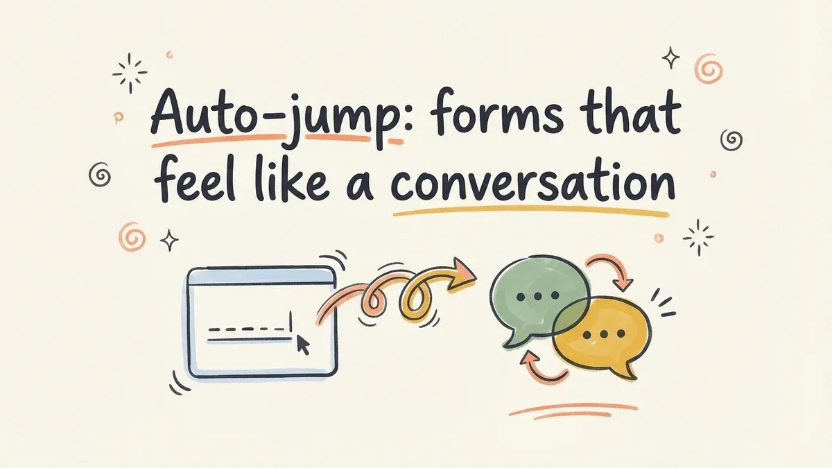
We just shipped auto-jump in Fomr.
How auto-jump works
Enable auto-jump on any form, and respondents automatically advance to the next question after answering the current one. No “Next” button needed for most question types.
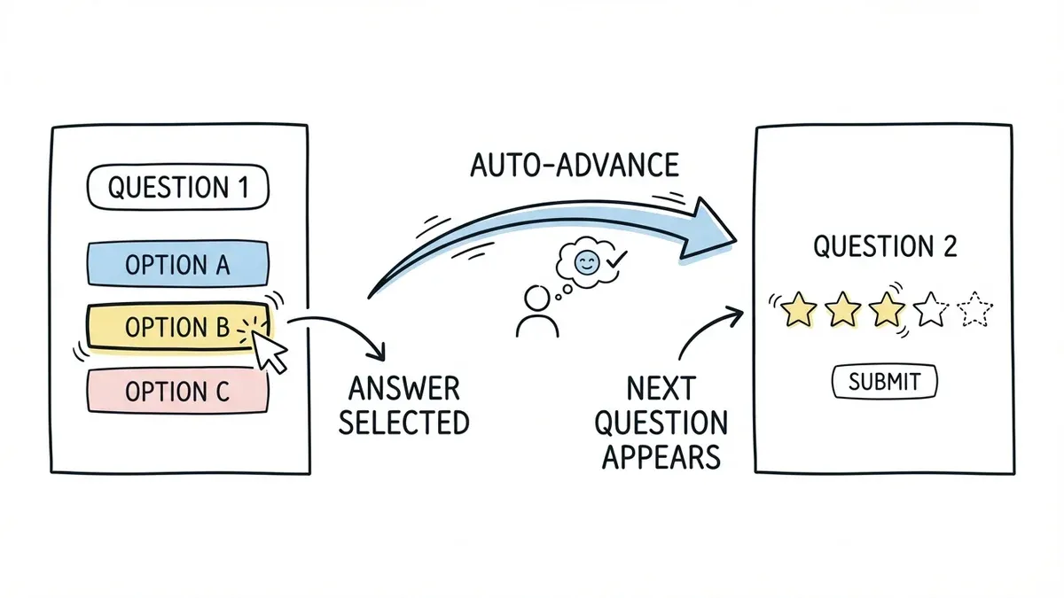
Select an option from a multiple choice question? The form slides to the next question. Pick a rating? It moves on. For text fields, respondents press Enter or click Next when they’re done typing.
The transitions are smooth and animated. Each question gets the full screen, with no other questions visible to distract. It creates a focused, one-thing-at-a-time experience that reduces cognitive load.
When auto-jump makes a real difference
Auto-jump isn’t the right choice for every form. A 3-field contact form doesn’t benefit from it — it’s faster as a single page. But for these scenarios, auto-jump consistently outperforms traditional layouts:
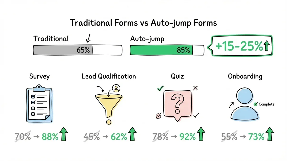
Surveys and feedback forms — When you’re asking 8-15 questions, the conversational format keeps respondents engaged. Each question feels quick, even if the total number of questions is the same. Completion rates for surveys tend to jump 15-25% with auto-jump enabled.
Lead qualification forms — The one-at-a-time format feels less invasive for sensitive questions like budget, company size, or timeline. Respondents are more willing to share information when each question arrives individually rather than being visible all at once.
Quizzes and assessments — The format naturally creates a quiz-like experience. Answer, see the next question, answer again. It’s engaging and keeps people moving forward.
Onboarding flows — Collecting account preferences, profile information, or setup choices works well as a conversation. Each step builds on the previous one, and the respondent feels guided through the process.
When to stick with traditional forms
Some forms work better as a single page or multi-page layout:
- Short forms (1-4 fields) — Contact forms, newsletter signups, simple registrations. The overhead of one-question-at-a-time isn’t worth it.
- Reference-heavy forms — If respondents need to refer back to previous answers (like an expense report or detailed application), they need all fields visible.
- Forms with complex validation — When fields depend on each other and respondents might need to go back and change something, a traditional layout gives more control.
Pairs well with multi-page forms
Auto-jump works within each page of a multi-page form. You get the structure of multi-page (grouped by topic, with progress indicators) combined with the engagement of conversational flow within each page.
A registration form could work like this: Page 1 (personal info) uses auto-jump to walk through name, email, and phone one at a time. Page 2 (preferences) presents options conversationally. Page 3 (confirmation) shows a summary.
This combination gives you the best of both patterns.
Smooth page transitions included
We also shipped animated page transitions for multi-page forms. When respondents move between pages, the transition is smooth and polished rather than a jarring full-page reload.
Small detail, big impact on perceived quality. The form feels intentional and refined, not slapped together.
Try it on your next form
Auto-jump is available on all plans, including free. Open any form in the editor, find the auto-jump toggle in form settings, and enable it.
Build a conversational form — no account required.