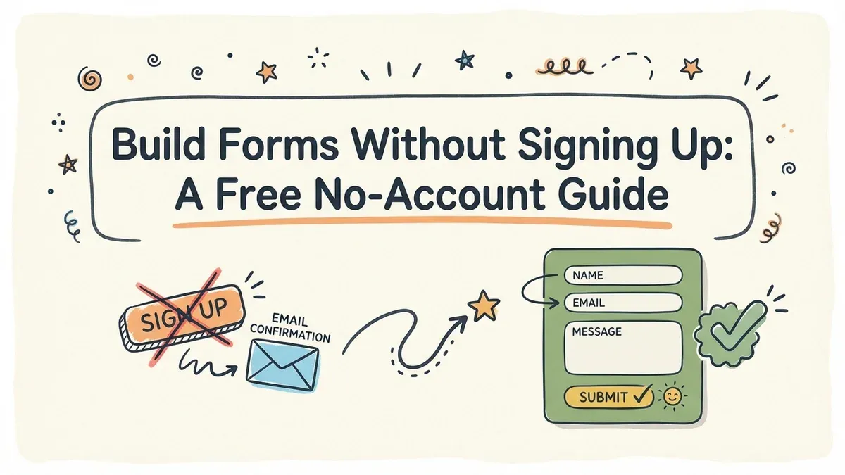
You need a form right now. Not after creating an account, confirming your email, picking a password, and sitting through an onboarding tour. Right now. Maybe it’s a contact form for a client site, a quick feedback survey for a project, or RSVPs for an event this weekend. Whatever the reason, the last thing you want is another login to manage.
A free form builder no sign up required sounds too good to be real, but the option exists, and it’s more capable than you’d expect. Here’s how to go from zero to published form without handing over your email address.
Why no-signup form builders make sense
The traditional flow (register, verify email, set password, create workspace, then start building) adds 5-10 minutes of friction before you even touch a form field. For a one-off project or a quick prototype, that’s wasted time.
Speed is the obvious benefit. You click a link, the editor opens, and you’re dragging fields into place within seconds. No friction, no delays.
Privacy is the less obvious one. Not every project warrants giving a new platform your email address. If you’re testing tools, building something experimental, or creating a form you’ll only use once, guest access lets you stay anonymous.
There’s also a practical advantage for freelancers and agencies. When you’re building forms for different clients, creating a new account for every platform gets messy fast. Guest access keeps things clean.
What to look for in a no-signup form builder
Not every form builder offers guest access, and among those that do, the quality varies wildly. Some give you a stripped-down editor with five field types and zero design options. Others give you the full experience.
Here’s what separates a useful guest editor from a glorified demo:
You should get full component access, meaning every field type the platform offers: text, email, phone, dropdowns, checkboxes, rating scales, date pickers, and more. If the guest editor limits you to basic text fields, it’s not a real builder.
Design control matters too. Your form shouldn’t look like every other form on the internet. Look for custom fonts, color options, background settings, and the ability to add your logo. A form that matches your brand builds trust. A generic-looking one doesn’t.
Real sharing options are non-negotiable. Building a form is only half the job. You need to share it via direct link, embed it on a website, or generate a QR code for print materials. If the guest editor locks sharing behind a signup wall, that defeats the purpose.
And don’t overlook data security. Just because you’re not creating an account doesn’t mean security should take a back seat. Look for HTTPS encryption and clear data handling policies.
| Feature | What a good guest editor offers |
|---|---|
| Field types | 15+ including specialized inputs |
| Design | Custom fonts, colors, backgrounds, logos |
| Sharing | Link, embed, QR code, popup |
| Pages | Multi-page with progress indicators |
| Validation | Required fields, email/phone format checks |
Step 1: Open the guest editor
This is the easy part. Navigate directly to the platform’s guest editor link. Don’t go through the homepage and hunt for a “try without signing up” button buried in the footer.
Bookmark the direct URL if you find a builder you like. You’ll thank yourself the next time you need a form in a hurry.
One thing to check upfront: session limits. Some platforms give you a time window (say, 24 hours) or a form limit in guest mode. Know the constraints before you invest an hour building something complex.
Step 2: Plan before you build
Jumping straight into the editor is tempting. Resist the urge for about two minutes.
Write down what your form needs to collect. Be specific. “Contact info” is vague. “First name, last name, email, phone (optional), message” is actionable. When you know exactly what you’re building, the actual construction takes half the time.
Think about who’s filling this out. A quick feedback form after a workshop can be one page with 3-4 questions. A detailed job application probably needs multiple pages with section breaks. Match your form’s complexity to its purpose.
Decide which fields are required and which are optional. Every required field you add increases the chance someone abandons your form. Be honest about what you truly need versus what would be nice to have.
Step 3: Build with the drag-and-drop editor
Now the fun part. Open the editor and start adding fields.
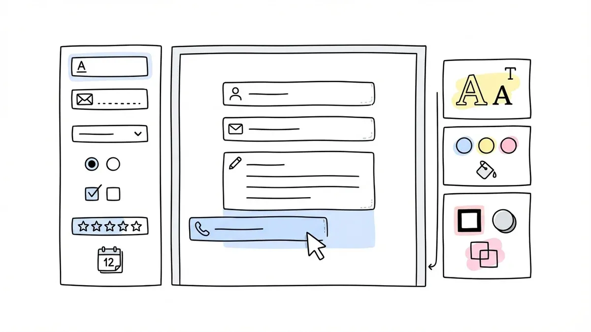
Start with the essentials. For a contact form, that’s name, email, and a message field. For a survey, it might be a mix of rating scales and open-ended questions. Get the core fields in place first, then add secondary ones.
Use the right field type for each question. This matters more than people think. A dropdown menu is faster to complete than a text field when there are predefined options. An email field with built-in validation catches typos that a plain text field won’t. Radio buttons make a five-option choice scannable at a glance.
Group related questions together. Use section headers or page breaks to separate “Contact Info” from “Project Details” or “Feedback.” Grouping gives your form visual structure and makes it easier to complete.
Keep it short. The best-performing forms collect only what’s necessary. If you’re second-guessing whether a field is needed, it probably isn’t.
Step 4: Make it look professional
Design is where most free form builders let you down. They give you a functional form that looks like it was built in 2012. That’s a problem, because how your form looks directly affects whether people trust it enough to submit their information.
Here’s what to focus on:
Fonts matter. A form using your brand’s typeface feels intentional. A form using the default system font feels generic. If your builder offers a large font library (Fomr has 1,700+), take advantage of it.
Match your brand colors. If the form lives on your website or goes out to clients, it should feel like it belongs. Match the background, button colors, and text colors to your existing brand palette.
Check the mobile view. Pull up the preview on your phone. More than half your respondents will fill out the form on a mobile device. If fields are too small, text is unreadable, or buttons are hard to tap, fix it now.
For business forms, add your logo in the header. It builds instant recognition and signals that this isn’t spam.
Step 5: Set up validation and confirmation
Before you share your form, handle the details that separate amateur forms from professional ones.
Mark required fields. Make it obvious which fields must be completed. An asterisk works, but “required” labels are even clearer.
Enable format validation. At minimum, make sure email fields reject malformed addresses and phone fields accept standard formats. This saves you from getting unusable data.
Write a real confirmation message. The default “Thank you for your submission” is fine, but a specific message is better. Tell people what happens next: “We’ll review your submission and respond within 48 hours” sets clear expectations.
Set up notifications so you actually receive submissions. Configure email alerts so responses don’t sit in the platform unseen.
Step 6: Test everything
Skipping testing is the number one cause of embarrassing form problems. It takes five minutes and saves you from sending out a broken form.
Fill out the form yourself. Go through every field, every page, every validation rule. Submit it. Check that the confirmation message appears and the response data looks right.
Test on mobile. Not in a browser simulator, on an actual phone. Tap every button, fill every field, scroll through every page.
Try to break it. Submit with empty required fields. Enter a malformed email. Put letters in a phone number field. Your validation should catch all of these gracefully, with clear error messages.
Test your sharing method too. If you’re sharing via link, click the link in a new browser. If you’re embedding, check the embed on the actual page. If you’re using a QR code, scan it with your phone’s camera.
Step 7: Share and collect responses
Your form is built, designed, and tested. Time to get it in front of people.
Direct links are the most versatile. Copy the URL and drop it into emails, Slack messages, social media posts, or anywhere else. Works everywhere, no setup needed.
Website embeds make the form feel native to your site. Add the embed script to your page’s HTML and the form appears inline. This is ideal for contact forms and registration pages.
QR codes connect physical materials to your digital form. Print one on a flyer, a business card, or a poster at an event. Attendees scan and fill out the form on the spot.
Popup mode shows the form as an overlay triggered by a button click. Good for keeping your page clean while still offering a form when visitors want it.
When guest mode isn’t enough
The no-signup approach works well for most scenarios, but there are situations where creating an account (or upgrading to a paid plan) makes sense:
If you want your form hosted at forms.yourcompany.com instead of the builder’s domain, you’ll need a paid plan with custom domain support. This matters for brand-conscious organizations.
Free forms typically show a small “Powered by [Builder]” badge. If that’s a problem for your use case, upgrading removes it.
When multiple people need to edit the same forms, an account lets you manage access and permissions. Guest mode is a solo experience.
And if you’ll reuse forms over months or years, an account gives you a persistent workspace to organize and update them.
Build your first form right now
You don’t need an account to build a professional form. You don’t need a credit card. You don’t even need an email address.
Fomr’s guest editor gives you access to 30+ components, 1,700+ fonts, full design control, and every sharing option, no signup required. Open it, build your form, share the link, and start collecting responses in minutes.