You spent real money driving traffic to a landing page, and half the people who click “Sign Up” never finish the form. The problem usually isn’t your offer. It’s the form itself.
The gap between a 20% completion rate and a 60% completion rate almost always comes down to form design best practices — small, concrete decisions about layout, field count, and visual hierarchy that either help people or get in their way.
Fewer fields, more completions
Every additional form field reduces your completion rate by roughly 7%. That compounds fast. A 10-field form doesn’t just feel longer than a 5-field form; it actively pushes people away.
Audit your existing forms. For each field, ask: “Will I actually use this data in the next 30 days?” If the answer is no, remove it. You can always collect secondary information later through a follow-up email or a second form step.
For a contact form, you need three fields: name, email, and message. That’s it. A feedback form needs even less. Sometimes a single open-text question gets you better data than a 15-question survey.
Labels that don’t make people think
Ambiguous labels cause abandonment. “Details” as a field label tells users nothing. “Work Email Address” tells them exactly what you want.
Place labels above fields, not beside them. This improves the mobile experience and makes scanning faster. Add placeholder text for format hints (“[email protected]”) but never use placeholder text as the only label. It disappears the moment someone starts typing, and they’re left guessing what the field was for.
Avoid all-caps labels. They’re harder to read and feel like the form is yelling. Stick with sentence case and clear, specific language.
Design for mobile first
Over 60% of forms get completed on phones. If your form looks great on desktop but falls apart on a 375px screen, you’re losing more than half your audience.
Single-column layouts work best on mobile. They’re easier to scan and complete than multi-column arrangements. Make tap targets at least 44px tall, because anything smaller asks people to play a precision game with their thumbs.
Use the right keyboard types. Number pads for phone fields, email keyboards for email fields. These small touches reduce typos and save time. Test on actual phones too, not just by resizing your browser window. Simulators miss things like autocomplete behavior and touch target spacing.
Real-time validation saves frustration
Few things are more annoying than filling out a 12-field form, hitting submit, and getting a vague “Error” message at the top with no indication of what went wrong.
Validate fields as people move to the next one. Show a green checkmark when a field is correct. When something’s wrong, say exactly what’s wrong: “Phone numbers should be 10 digits” beats “Invalid format.” Place the error message directly below the field that needs attention.
Use color and icons together for errors. About 8% of men have some form of color blindness, so red text alone isn’t enough. Pair color with a clear icon and descriptive text.
Use visual hierarchy to guide the eye
Your form has a reading order whether you designed one or not. Good form design uses typography, spacing, and color to make that order obvious.
Make your form title the largest text element. Group related fields together with whitespace between groups. Keep your submit button visually distinct with a contrasting color, sufficient size, and enough padding around it so it doesn’t feel cramped.
Whitespace reduces cognitive load. A form with breathing room feels shorter than a cramped form with the same number of fields. Consistent left alignment helps too. It creates a clean vertical line the eye can follow straight down the page.
Match field types to the data you’re collecting
Using the wrong field type frustrates people and hurts your data quality. A text field that asks for a date will give you “Oct 3,” “10/03/25,” “October 3rd 2025,” and a dozen other formats you’ll have to normalize later.
Here’s a quick reference:
| Data type | Best field | Why |
|---|---|---|
| Open text (names, comments) | Text input | Flexible, familiar |
| One choice from 2-4 options | Radio buttons | All options visible at once |
| One choice from 5+ options | Dropdown | Saves vertical space |
| Multiple choices | Checkboxes | Users can select several |
| Dates | Date picker | Standardized format, no typos |
| Satisfaction level | Rating scale | Quick, visual |
Date pickers prevent formatting chaos. Rating scales collect sentiment faster than open text. Dropdowns keep long option lists from dominating the page. Match the field to how people naturally think about the information.
Write submit buttons that tell people what happens
“Submit” is the default. It’s also vague and slightly ominous. Your button text should describe the outcome, not the action.
“Get My Free Quote” works better than “Submit” for a quote request form. “Send My Message” works better for a contact form. “Download the Guide” works better for a lead magnet. Each one tells the user exactly what clicking this button does for them.
Make buttons large enough to tap easily on mobile. Use a contrasting color that stands out from the form background. Place them where users expect them, usually bottom-center or bottom-right.
Build trust near sensitive fields
People are cautious about sharing personal information, and rightfully so. If your form asks for a phone number, email, or payment details, you need to earn that trust visually.
Add a brief privacy note near email fields: “We won’t share your email with anyone.” Include your company logo and contact information. Use professional, error-free copy. Typos in a form erode confidence fast.
For forms that ask for payment or sensitive data, display security badges and SSL indicators near those fields. Explain what users get in return for registering. “You’ll receive instant access to the workshop materials” answers the unspoken question: “Is this worth it?”
Order fields to reduce hesitation
Start with easy, low-stakes fields. Name and email feel safe. Phone number and company address feel like a commitment. Put the easy stuff first, and people build momentum before they hit the fields that make them pause.
Group related information together. Put optional fields at the end. Make the progression feel natural, the way a conversation flows from “What’s your name?” to “What do you need help with?” rather than jumping straight to “What’s your annual budget?”
Single-column layouts perform better than multi-column for most forms. They create a single, clear path from top to bottom.
Smart defaults and auto-fill
Every keystroke you save the user increases completion probability. Pre-select the most common option in dropdowns when you know it. If 80% of your users are in the US, default the country field to “United States.”
Don’t break browser auto-fill. Use standard HTML field names so browsers can auto-populate name, email, and address fields. This alone can cut completion time by 30% or more. Auto-format phone numbers and dates as users type.
Only pre-fill data you’re confident about. A wrong default is worse than an empty field because users have to notice the error, clear it, and re-enter the correct value.
Test your forms, then test them again
What works for one audience won’t necessarily work for another. A single-page form might outperform a multi-step form for your audience, or the reverse. The only way to know is to test.
Start with high-impact variables:
- Single-page vs. multi-step layout
- Number of required fields
- Submit button text
- Field order (easy fields first vs. most important first)
Test one variable at a time. Run tests long enough to reach statistical significance. Monitor both completion rates and data quality, because a form that converts at 80% but collects garbage data isn’t a win.
Form design best practices for progressive enhancement
Build your form in layers. Start with core functionality: the form loads, accepts input, and submits successfully. Then add enhancements.
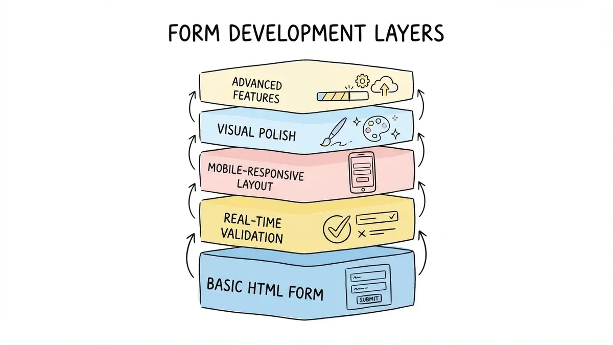
Layer 1: Basic HTML form that works without JavaScript. Layer 2: Real-time validation and clear inline error messages. Layer 3: Mobile-responsive layout with proper touch targets. Layer 4: Visual polish — animations, transitions, micro-interactions. Layer 5: Advanced features like progress bars for multi-page forms.
Each layer improves the experience, but the form works without any of them. This approach protects you from situations where JavaScript fails to load or a user’s browser doesn’t support a particular feature.
Put these practices to work
You don’t need to implement all 12 tips at once. Start with the three that have the biggest impact: cut unnecessary fields, fix your mobile layout, and add inline validation. Those three changes alone can lift completion rates by 20-30%.
Then iterate. Review your form analytics, identify where people drop off, and test specific improvements. Form design isn’t a one-time project. It’s an ongoing process that adapts as your audience and goals change.
Want to try these ideas on a real form? Build one in Fomr’s guest editor — no account needed. You get full design control, 30+ field types, and multi-page support on the free plan.