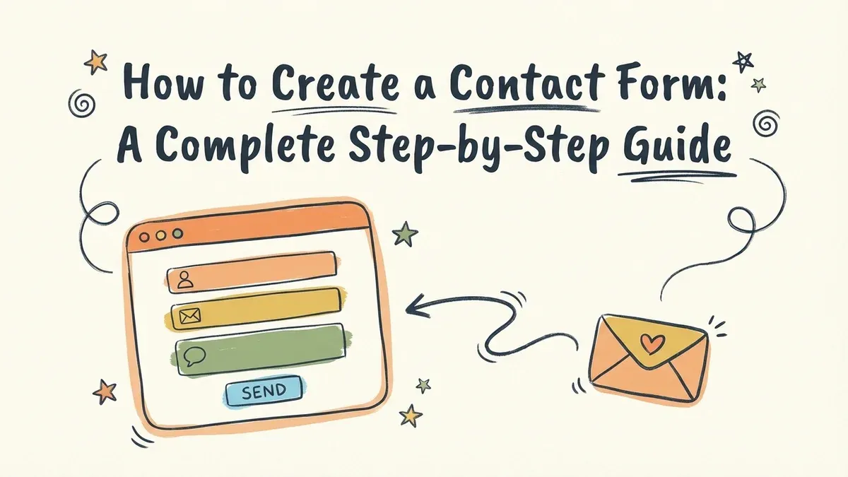
You’ve got a website, but visitors have no way to reach you besides hunting down an email address. A contact form fixes that, and a good one does more than collect messages. It shapes how people perceive your business in the first seconds of interaction.
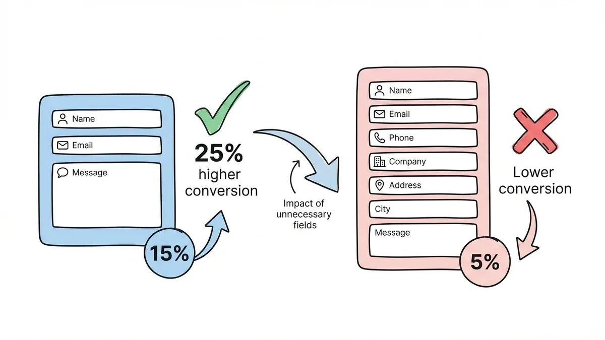
The problem is that most contact forms are either ugly, bloated with unnecessary fields, or both. A 3-field form converts 25% better than a 5-field form, yet businesses keep asking for phone numbers, company names, and mailing addresses nobody wants to provide.
Here’s how to create a contact form that actually earns submissions.
Start with strategy, not a form builder
The biggest mistake is opening a drag-and-drop editor before you’ve answered a few basic questions:
What’s this form for? General inquiries, sales leads, support requests, and partnership opportunities all need different fields and different routing. A contact form trying to do everything does nothing well.
What do you actually need to collect? Every field you add costs you conversions. If you’re a freelance designer, you need a name, email, and project description. That’s it. You don’t need their phone number, company size, or blood type.
Where do submissions go? If you don’t have a plan for responding, the form is pointless. Decide who reads submissions, what your target response time is, and whether you need email notifications or a shared inbox before you build anything.
Pick the right fields (and cut the rest)
Your contact form needs three fields to function. Everything beyond that should justify its existence.
The essentials
- Name — a single field, not separate first/last
- Email address — always required
- Message — a large text area with room to write
That’s a complete contact form. Seriously.
Fields that earn their spot (sometimes)
Add these only if they serve a specific workflow:
- A phone number field, but only if you actually call people back
- A subject or topic dropdown, useful if different team members handle different inquiries
- Company name if you’re B2B (unnecessary for everyone else)
- “How did you hear about us?” is valuable for marketing attribution, but it makes the form feel longer
A dropdown that routes messages to the right person can save hours of manual sorting each week. A phone number field you never use just costs you submissions.
Design the form for phones first
Over 60% of web traffic is mobile, which means most people encountering your contact form are using their thumbs on a small screen.
Make tap targets generous. Fields and buttons should be large enough that you don’t accidentally tap the wrong one. If your submit button is smaller than a fingertip, it’s too small.
Stick to a single-column layout. Side-by-side fields look fine on desktop but become cramped on phones. Stack everything vertically.
Preview on an actual phone. Browser dev tools approximate the experience, but they miss things like keyboard overlap, scroll behavior, and how your form looks in bright sunlight. Test on a real device before you publish.
The visual design matters more than most people think. A form that matches your brand (consistent fonts, colors, spacing) signals professionalism. A default-styled form with mismatched fonts signals “I threw this together in five minutes.”
Write copy that encourages submissions
The words on your form do real work. Every label, placeholder, and button nudges visitors toward or away from hitting submit.
Form titles
“Contact Us” works, but it’s forgettable. Try something that sets expectations:
- “Send Us a Message” — clear and direct
- “How Can We Help?” — inviting, service-oriented
- “Get in Touch” — warm but professional
Field labels
Be specific. “Your Name” is friendlier than “Name.” “Email Address” is clearer than “Email.” “Tell us about your project” is more inviting than “Comments.”
The submit button
“Submit” is the most boring word in form design. “Send Message” tells people exactly what happens when they click. “Get Your Free Quote” works for sales forms. Match the button text to the action.
Confirmation copy
Add a brief line above the form: “We’ll get back to you within 24 hours.” Setting a response time expectation reduces the anxiety of submitting into a void.
Set up notifications so nothing gets lost
A form without notifications is a suggestion box with no bottom. Submissions pile up unseen, and potential customers think you’re ignoring them.
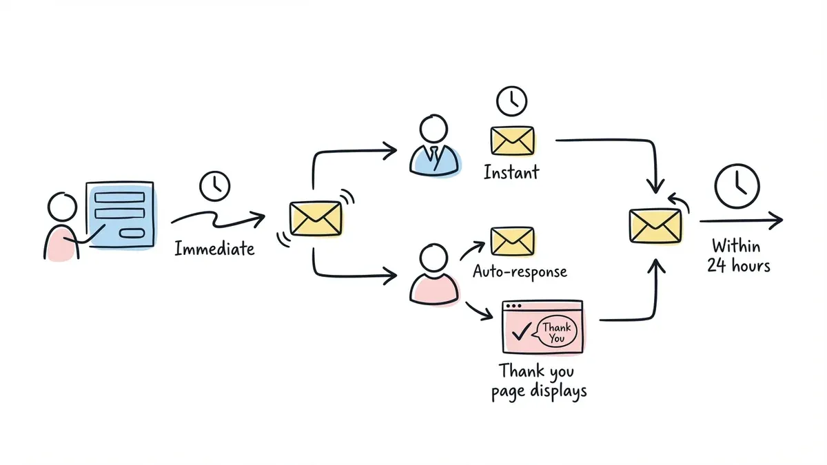
Email notifications should fire immediately when someone submits. Include all the form data in a readable format so you can respond without logging into a dashboard.
Auto-response emails confirm the submission went through. Keep these short: acknowledge the message, set a response timeline, and provide an alternative contact method for urgent matters.
A thank-you page after submission is better than a generic “Thanks!” message. Use it to link to helpful resources, set expectations, or suggest they follow you on social media while they wait.
Publish and share your form
Once your contact form is built, you need to get it in front of people. Most form builders give you several options:
A direct link works for sharing on social media, in email signatures, or on business cards via a QR code. It’s the simplest option and requires zero technical setup.
An embedded form lives directly on your website page. This is the most common approach for a dedicated “Contact” page. Most builders provide an embed code you paste into your site.
A popup form appears based on user behavior (time on page, scroll depth, or exit intent). Use popups sparingly. They can boost conversions, but aggressive popups annoy visitors and hurt trust.
After publishing, test the entire flow yourself. Submit a real message, check that notifications arrive, verify the auto-response works, and confirm the thank-you page displays correctly. Then do it again on your phone.
Optimize based on real data
Your contact form isn’t finished when it goes live. It’s finished when it’s converting well, and that takes iteration.
Track these numbers
- Submission rate — what percentage of people who see the form actually submit it
- Bounce rate — how many visitors leave the page without interacting
- Response time — how quickly you reply (under 1 hour is ideal, under 24 hours is acceptable)
Changes that typically improve performance
Removing one field almost always increases submissions. If your conversion rate is low, audit your fields and cut the weakest one.
Moving the form above the fold puts it where visitors see it without scrolling. Not every layout supports this, but when it works, it works well.
Adding trust signals like a privacy statement (“We won’t share your email”) or security badge can ease hesitation for cautious visitors.
Testing button text and colors is one of the easiest A/B tests you can run. Small changes here sometimes produce surprising results.
Avoid these common mistakes
Too many required fields. If a field is optional, mark it clearly or just remove it. Every required field is a reason to abandon the form.
No mobile testing. Forms that look perfect on a 27-inch monitor can be unusable on a phone. Always test on real devices.
No submission confirmation. If someone fills out your form and sees nothing (no message, no redirect, no email) they’ll assume it’s broken and try again, or give up.
Skipping spam protection. Without honeypot fields, rate limiting, or CAPTCHA, your inbox will fill with bot submissions. Most form builders include basic spam protection, but verify it’s enabled.
Ignoring accessibility. Proper field labels, keyboard navigation support, and sufficient color contrast make your form usable for everyone. Accessibility isn’t optional.
Advanced features worth considering
Once your basic contact form is working, a few upgrades can make it significantly more useful.
Multi-page forms break longer forms into steps, which can improve completion rates by making each step feel manageable. Fomr supports multi-page forms with a visual editor that lets you design each page independently.
Conditional logic shows or hides fields based on previous answers. Want to display a phone number field only when someone selects “Call me back”? That’s conditional logic (coming soon to Fomr).
Custom domains for your form links look more professional than a generic builder URL. If you’re sending form links to clients or partners, this detail matters.
File uploads let people attach documents, screenshots, or project briefs. Especially useful for support forms or creative project inquiries (coming soon to Fomr).
What good contact forms look like by industry
Different businesses need different things from their contact forms.
Service businesses (consultants, agencies, law firms) benefit from a dropdown that categorizes inquiry type and a field asking about project timeline or budget range. Keep it to 5-6 fields max.
E-commerce contact forms should include an order number field for support requests and a dropdown for issue type (returns, shipping, product questions). Speed matters here — customers are often frustrated when they reach out.
SaaS and tech companies can use a contact form to route leads to sales and support tickets to the help desk. A simple “What can we help with?” dropdown that splits into “Sales question” and “Technical support” saves everyone time.
Healthcare providers need to be careful with data collection and ensure compliance with relevant privacy regulations. Keep medical information out of contact forms — use them to schedule appointments or route general inquiries.
Build your contact form
You know the strategy, the field choices, the design principles, and the mistakes to avoid. The only thing left is building it.
Fomr’s guest editor lets you create a contact form without signing up for an account. You get unlimited forms and responses on the free plan, 1,700+ fonts for design control, and 30+ components to build exactly the form you need. If your form needs to look as good as the rest of your site, give it a try.