Getting vendors to complete your registration process shouldn’t feel like pulling teeth. Yet most vendor registration forms are so poorly designed that qualified suppliers give up halfway through — costing you valuable partnerships and leaving procurement teams scrambling to find alternatives.
A well-built vendor registration form does more than collect basic information. It streamlines your vendor onboarding process, ensures compliance from day one, and creates a professional first impression that attracts quality suppliers. The difference between a form that works and one that doesn’t often comes down to structure, clarity, and respecting your vendors’ time.
Here’s how to create a vendor registration form that vendors actually want to complete.
Why vendor registration forms matter for your business
Your vendor registration form is often the first official touchpoint between your company and potential suppliers. A clunky, confusing form signals that working with you might be equally frustrating. A smooth registration process suggests you value efficiency and professionalism — qualities vendors want in their clients.
Beyond first impressions, a thoughtful vendor registration form serves several critical functions. It standardizes the information you collect from all suppliers, making it easier to compare capabilities and pricing. It ensures you capture necessary compliance documentation upfront, reducing legal risks down the line. It creates a structured database of vendor information that your procurement team can reference for future projects.
The key is balancing thoroughness with usability. You need enough information to make informed decisions, but not so much that vendors abandon the process.
Step 1: Plan your vendor registration form structure
Before you start building, map out exactly what information you need and why. Start with your must-have fields — the information you absolutely cannot make vendor decisions without. This typically includes company name, contact details, tax ID, insurance information, and core service areas.
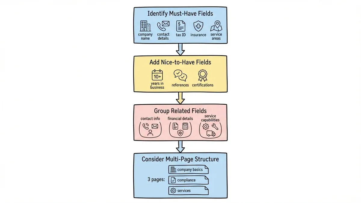
Next, identify your nice-to-have fields. These might include years in business, client references, certifications, or detailed capability descriptions. While useful, these shouldn’t be required if they might prevent qualified vendors from completing the form.
Group related fields together logically. Contact information goes in one section, financial details in another, and service capabilities in a third. This logical flow helps vendors understand what’s coming next and makes the form feel less overwhelming.
Consider using a multi-page approach for longer forms. Breaking a 30-field form into three 10-field pages feels much more manageable than presenting everything at once. Each page should focus on a specific topic — company basics, compliance documentation, and service details work well as natural divisions.
Step 2: Design for clarity and completion
The visual design of your vendor registration form directly impacts completion rates. Clean, professional forms get completed. Cluttered, confusing ones get abandoned.
Use plenty of white space around form fields. Cramped forms feel overwhelming and increase the likelihood of errors. Group related fields visually with subtle borders or background colors, but don’t go overboard with styling that distracts from the content.
Make field labels crystal clear. Instead of “EIN,” use “Employer Identification Number (EIN).” Replace “D&B Number” with “Dun & Bradstreet Number (if applicable).” Your procurement team might know these abbreviations, but vendors filling out forms at 6 PM might not.
Choose appropriate field types for each piece of information. Use dropdown menus for standardized options like business type or service categories. This ensures consistent data and makes analysis easier later. Use text areas for longer responses like company descriptions or capabilities overviews.
Mark required fields clearly with asterisks or other visual markers. Nothing frustrates users more than completing a long form only to discover they missed a required field buried in the middle.
Step 3: Structure your vendor information sections
Company basics section
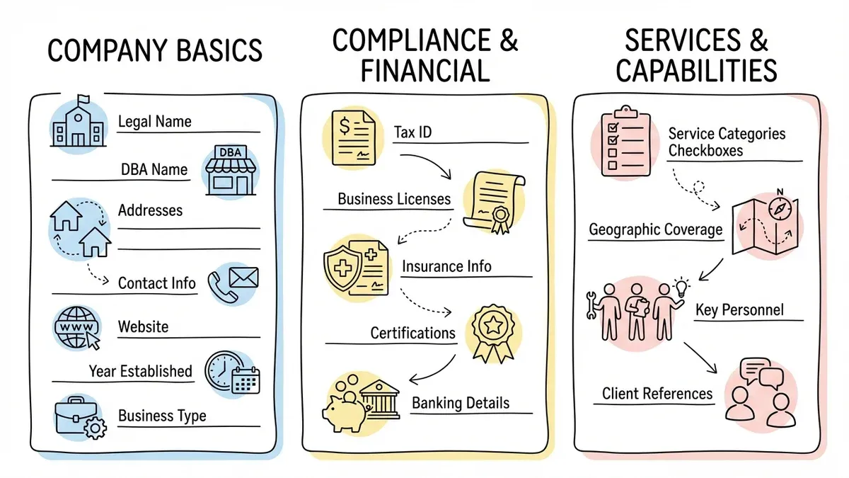
Start with fundamental company information. This section should feel familiar and easy to complete, building momentum for the more detailed sections ahead.
Include fields for legal company name, doing-business-as name (if different), business address, mailing address (if different), primary contact name and title, phone number, and email address. Add fields for company website and year established — these help verify legitimacy and assess experience.
Ask for business type (corporation, LLC, partnership, sole proprietorship) using a dropdown menu. This information affects contracting and payment processes, so capture it early.
Compliance and financial section
This section covers the legal and financial requirements for vendor relationships. While less exciting than capability discussions, it’s often the most critical for procurement teams.
Request tax identification numbers, business licenses, and insurance information. For insurance, specify the types and minimum coverage amounts you require — general liability, professional liability, and workers’ compensation are common requirements.
If your industry has specific certifications or compliance requirements, include those here. Construction companies might need contractor licenses, while IT vendors might need security certifications.
Consider adding fields for banking information if you’ll be making electronic payments. However, mark these as optional initially — many vendors prefer to provide banking details after contract signing for security reasons.
Services and capabilities section
This section helps you understand what each vendor offers and how they might fit your needs. Structure it to make vendor capabilities easy to search and filter later.
Use checkbox lists for service categories rather than open text fields. This ensures consistent categorization and makes it easier to find vendors for specific needs. Include an “other” option with a text field for services that don’t fit your predefined categories.
Ask about geographic coverage areas, especially if location matters for your services. A dropdown list of states or regions works better than free-form text for this information.
Include fields for key personnel, certifications, and notable clients (if vendors are comfortable sharing). This information helps assess vendor quality and fit for your projects.
Step 4: Add smart validation and helpful features
Form validation prevents errors and reduces back-and-forth communication after submission. But implement it thoughtfully — overly aggressive validation frustrates users.
Use real-time validation for fields with specific formats like phone numbers, email addresses, and tax IDs. Show helpful error messages that explain exactly what format you expect. “Please enter a valid phone number” is less helpful than “Please enter phone number as (555) 123-4567.”
Add character counters for text areas with length limits. This helps vendors craft appropriate responses without hitting invisible walls.
Consider adding tooltips or help text for complex fields. A small question mark icon next to “DUNS Number” that explains “This is a unique nine-digit identifier assigned by Dun & Bradstreet” can prevent confusion and incomplete submissions.
Implement auto-save functionality if possible. Long forms take time to complete, and losing progress because of browser crashes or accidental navigation kills completion rates.
Step 5: Test and optimize your vendor registration form
Before launching your vendor registration form, test it thoroughly with real users. Ask colleagues from different departments to complete the form and note where they hesitate or get confused.
Time how long the form takes to complete. If it’s taking more than 15-20 minutes, consider shortening it or breaking it into multiple stages. Remember that vendors might be completing several registration forms for different potential clients — respect their time.
Test the form on different devices and browsers. Many vendors work on mobile devices or older computers, so make sure your form works everywhere.
After launch, monitor completion rates and identify where vendors drop off. If you see high abandonment at a specific section, that’s a sign to simplify or clarify those fields.
Common vendor registration form mistakes to avoid
Asking for too much upfront
The biggest mistake is treating vendor registration like a comprehensive vendor audit. You don’t need every possible piece of information before deciding whether to work with someone. Focus on decision-making criteria and save detailed documentation for after you’ve selected a vendor.
Using internal jargon
Your procurement team might understand terms like “SIC codes” or “NAICS classifications,” but vendors shouldn’t need a dictionary to complete your form. Use plain language and explain technical terms when necessary.
Making everything required
Required fields should truly be required for your decision-making process. Making nice-to-have information mandatory increases abandonment rates and eliminates potentially good vendors who can’t or won’t provide non-essential details.
Ignoring mobile users
Many vendors complete forms on phones or tablets, especially in field service industries. Forms that don’t work well on mobile devices exclude a significant portion of your potential vendor base.
No progress indicators
Long forms without progress indicators feel endless. Vendors don’t know if they’re 20% done or 80% done, making them more likely to abandon the process.
Making your vendor registration form work harder
A good vendor registration form does more than collect information — it starts building the vendor relationship. Include a brief company description or welcome message that explains your vendor program’s benefits. This helps vendors understand why the registration process is worth their time.
Consider adding a field where vendors can describe their unique value proposition or differentiators. This gives them a chance to sell themselves beyond basic capability checkboxes and provides you with richer information for vendor selection.
Include clear next steps at the end of the form. Let vendors know when they’ll hear back, what the evaluation process looks like, and how they can get updates on their status. This transparency builds trust and reduces follow-up emails.
Think about integration with your existing systems. If you use vendor management software or procurement platforms, design your form to export data in compatible formats. This saves time and reduces data entry errors.
Ready to build your vendor registration form?
Creating an effective vendor registration form requires balancing your information needs with vendor experience. The best forms collect essential data efficiently while making vendors feel valued as potential partners.
Start with a clear plan of what information you actually need, structure the form logically, and test thoroughly before launch. Remember that every field you add increases the chance vendors will abandon the process — so make each one count.
Ready to create a vendor registration form that vendors actually want to complete? Try our drag-and-drop form builder — no signup required. You’ll have a professional vendor registration form ready in minutes, complete with validation, mobile optimization, and all the features that turn form-filling from a chore into a smooth first step toward partnership.