You’ve got applicants to screen and a pile of information to collect, but your form is the bottleneck. A clunky, disorganized online application form costs you completions. The Baymard Institute found that poorly designed forms can reduce completion rates by up to 67%. The fix isn’t complicated, but it does require some deliberate thinking about structure, design, and flow.
Here’s how to build an application form that people actually finish.
Start by defining what you actually need
Every unnecessary field on your application form is a tiny exit ramp. Before you open any form builder, sit down and separate the information you need from the information that would be nice to have.
Ask yourself: what data will you actually use to make a decision? If you’re hiring, that’s probably contact details, relevant experience, and a few targeted skill questions. If you’re running event registration, it’s attendee info, dietary needs, and payment.
The rule is simple: if you won’t use the answer, don’t ask the question. A 3-field form converts roughly 25% better than a 5-field form. Every field you cut earns you more completions.
Map out your form structure before building
A great application form tells a story. It moves from easy to hard, from general to specific. Dumping 20 random questions on a single page is the fastest way to tank your completion rate.
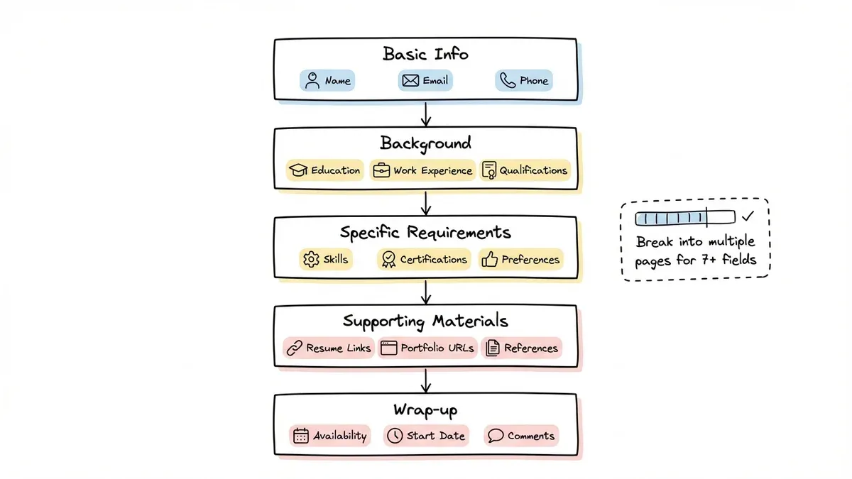
Group your questions into logical sections:
- Basic info — name, email, phone number
- Background — education, work experience, qualifications
- Specific requirements — skills, certifications, relevant preferences
- Supporting materials — resume links, portfolio URLs, references
- Wrap-up — availability, start date, additional comments
For anything longer than 7-8 fields, break your form across multiple pages. Each page should focus on one topic and feel manageable on its own. A progress indicator at the top of each page helps reduce abandonment. People need to know the end is in sight.
Pick an application form builder that doesn’t fight you
The right tool makes this process easy. The wrong one has you wrestling with rigid templates and locked-down design options for an hour.
When evaluating an application form builder, here’s what actually matters:
Your form represents your organization, so you need real design control. You should be able to match your brand colors, pick your fonts, and create something that looks intentional, not like a generic template.
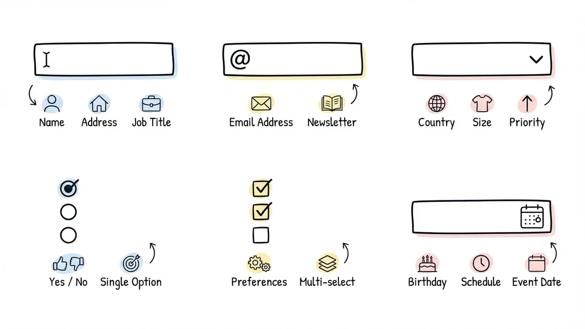
You also need field variety beyond text boxes. Look for dropdowns, date pickers, rating scales, multi-select checkboxes, and phone/email fields with built-in validation.
Multi-page support matters too. Long applications perform better when broken into sections. If a builder only supports single-page forms, keep looking.
And don’t forget mobile. Over 60% of users will hit your form from a phone. If the mobile experience is bad, you’ll lose them.
| Feature | What to look for |
|---|---|
| Field types | 15+ including specialized inputs (email, phone, date) |
| Design options | Custom fonts, colors, backgrounds, logo placement |
| Pages | Multi-page with progress indicators |
| Sharing | Link, embed, QR code, popup |
| Pricing | Unlimited responses on free tier |
Most form builders charge extra for things that should be standard. Pay attention to response limits, team member caps, and branding restrictions before you commit.
Design your form for completion, not just collection
A form that collects the right data but drives people away isn’t doing its job. Design directly impacts whether someone finishes your application or bounces.
Start with a clear header. Your form title should tell people exactly what they’re applying for. Add a one-sentence description and an estimated completion time. “5-minute application” sets expectations and reduces anxiety about a long process.
Order fields intentionally. Lead with easy, low-effort questions like name and email. Save the harder stuff (work history, essay-type responses) for later. By the time people reach the complex fields, they’ve already invested time and are more likely to finish.
Pick the right field type for each question. Don’t use a text box when a dropdown would work. Structured inputs like radio buttons, checkboxes, and dropdowns give you cleaner data and are faster for applicants to complete.
Here’s a quick reference:
- Text fields — names, addresses, open-ended responses
- Email/phone fields — contact info with built-in format validation
- Dropdowns — single selection from a long list (10+ options)
- Radio buttons — single selection from a short list (2-5 options)
- Checkboxes — multiple selections allowed
- Date pickers — dates and deadlines
Keep spacing consistent. Even spacing between fields and sections creates visual rhythm that makes your form easier to scan. Cramped forms feel overwhelming.
Add validation (but don’t overdo it)
Real-time validation catches mistakes before submission, which saves you cleanup time and saves applicants the frustration of a rejected form.
The essentials: required field indicators, email format validation, phone number formatting, and character limits on open-ended fields. These cover most error scenarios without making the form feel like a test.
Where validation gets tricky is when you’re too aggressive. Rejecting a phone number because someone used dashes instead of parentheses isn’t helpful. Be strict on format where it matters (email addresses) and lenient where it doesn’t (phone number formatting).
Conditional logic, where you show or hide questions based on previous answers, is incredibly useful for application forms. For example, only showing “years of experience” if someone indicates they have relevant work history. This isn’t available everywhere yet (Fomr is adding it soon), but if your form builder supports it, use it. It shortens the perceived length of your form for every applicant.
Test before you launch
This step gets skipped constantly, and it shows. A form with broken validation, confusing wording, or a missing confirmation page makes your organization look careless.
Have someone else fill it out. Watch where they hesitate, what confuses them, and how long it takes. Your own familiarity with the form blinds you to friction that’s obvious to a first-time user.
Submit test applications with intentional mistakes. Does your email validation actually catch a typo? Does the required field indicator stop a blank submission? Run through the error paths, not just the happy path.
Check every device. Fill it out on your phone. Fill it out on a tablet. If buttons are too small to tap or text fields are impossible to read on a small screen, fix it before a real applicant hits those problems.
Verify the post-submission experience. Does the confirmation message display correctly? Do notification emails arrive? Can you export the response data cleanly? The form doesn’t end at the submit button.
Share your form the right way
How you distribute your application form matters almost as much as how you build it.
Direct links work for email outreach, social media, and messaging. They’re the simplest option and work everywhere.
Website embeds let you place the form directly on a page your applicants already visit. This keeps them on your site and feels more professional than redirecting to an external URL.
QR codes bridge the gap between physical and digital. Print them on flyers, posters, job board listings, or event materials.
After launch, pay attention to two numbers: your completion rate (what percentage of people who open the form actually submit it) and where people drop off (which page or field causes the most abandonment). These metrics tell you exactly what needs fixing.
Tailor your approach to the application type
The core principles apply across the board, but different application types have different priorities.
Job applications need structured work history fields with date ranges, skills-relevant questions, references, and availability. Keep the essay questions to a minimum. One “tell us about yourself” field is enough.
Event registration should lead with event details (date, location, cost) before asking for attendee information. Include dietary restrictions and accessibility needs. If there’s a fee, make pricing transparent upfront.
Course or program applications typically need academic background, a short personal statement, and prerequisite verification. Don’t ask applicants to re-enter information that’s already on their resume or transcript. It’s tedious and signals that you haven’t thought about their experience.
Keep improving after launch
Your first version won’t be perfect. That’s fine.
Review your completion data after the first 50-100 submissions. Look for patterns: if everyone drops off on page 3, that page is too long or asks something confusing. If your completion rate is below 60%, the form is probably too demanding for what you’re offering.
Consider testing variations. A shorter version of your form might get more completions with only slightly less data. Different question ordering might reduce confusion. Small changes compound over time.
Build your application form today
A well-built application form does two things: it gets you the data you need, and it respects the applicant’s time. Both matter.
Fomr’s visual editor gives you full design control, 30+ field types, multi-page forms, and unlimited responses, all on the free plan. Start building in the guest editor with no account required, and have your application form live in minutes.