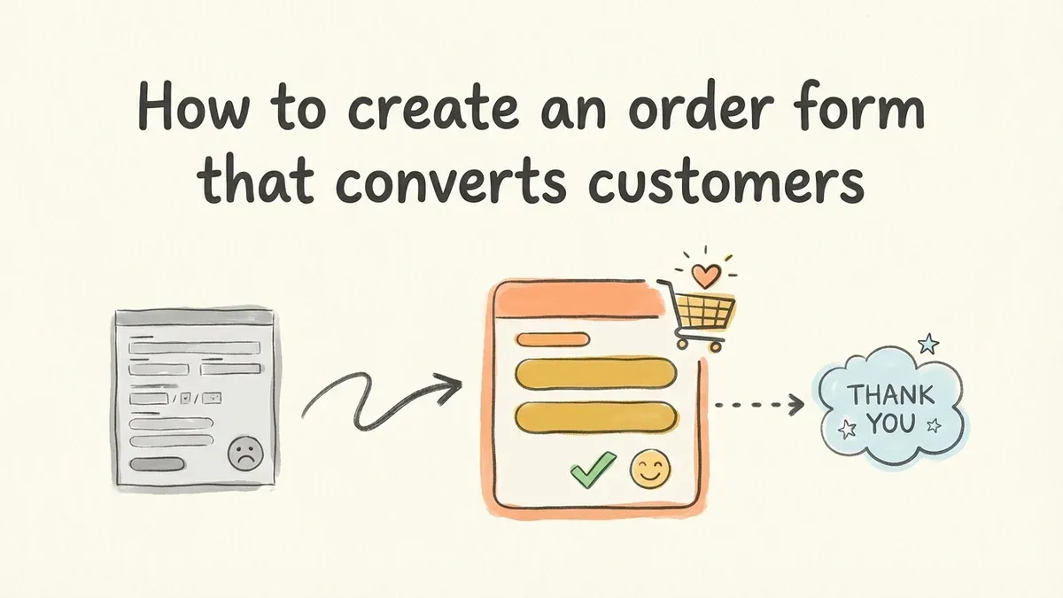
Your website gets traffic, but visitors aren’t buying. The problem might not be your product or pricing — it could be your order form. A poorly designed order form can kill conversions faster than a broken checkout page.
Creating an order form that actually converts requires more than just throwing fields together. You need to understand customer psychology, design principles, and the technical details that make forms work smoothly. We’ll walk through every step, from planning your fields to publishing your form.
What makes an order form different from other forms
Order forms have one job: turn interested visitors into paying customers. Unlike a contact form or survey form, every element of your order form directly impacts your revenue.
The stakes are higher. A confusing contact form might cost you a lead. A confusing order form costs you money. Customers who abandon your order form often don’t come back — they find a competitor with a smoother process.
This means your order form needs to be faster to complete, easier to understand, and more trustworthy than any other form on your site. Every field, label, and button matters.
Step 1: Plan your order form fields
Start with the absolute minimum information you need to fulfill the order. Most businesses collect way too much data upfront, which kills conversions.
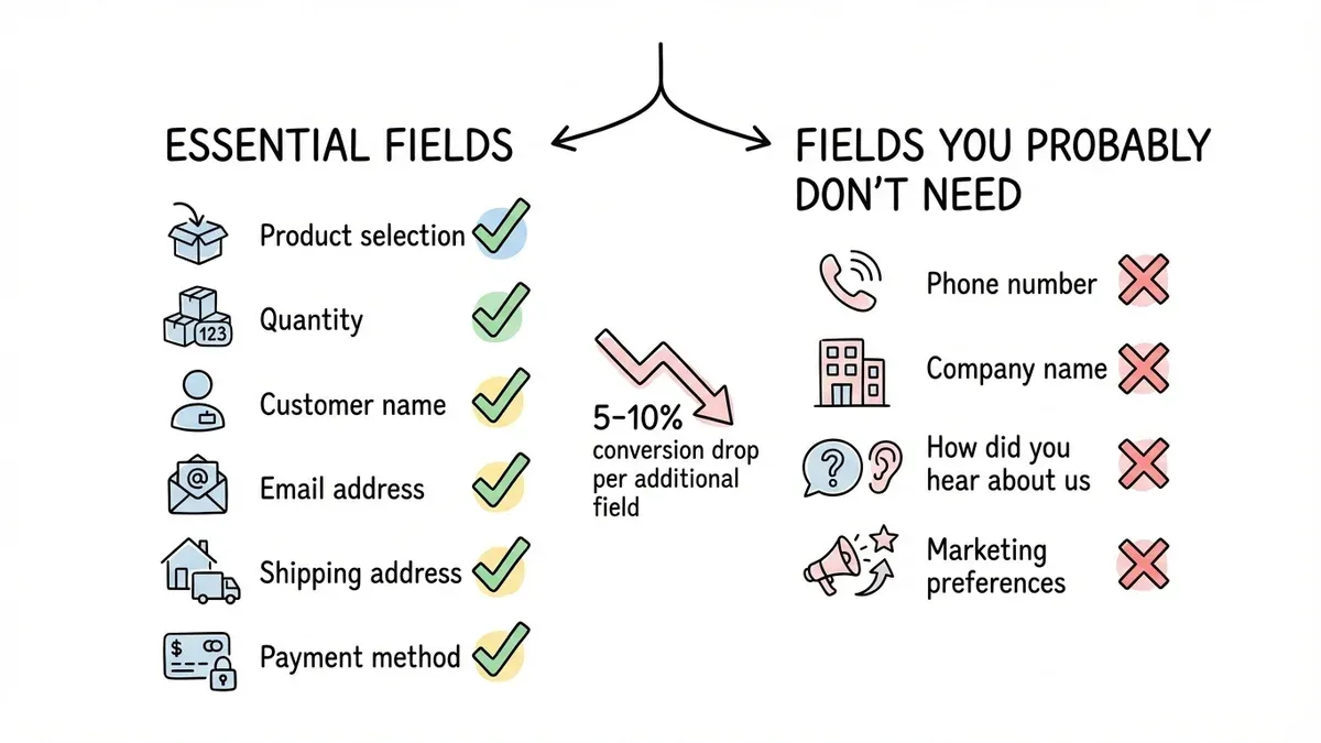
Essential fields for most order forms:
- Product selection (dropdown or radio buttons)
- Quantity
- Customer name
- Email address
- Shipping address
- Payment method
Fields you probably don’t need:
- Phone number (unless you actually call customers)
- Company name (unless B2B)
- How did you hear about us (save it for a follow-up email)
- Marketing preferences (handle this post-purchase)
Each additional field reduces your conversion rate by roughly 5-10%. A form with 15 fields converts about half as well as a form with 8 fields.
Group related fields together. Put all shipping information in one section, payment details in another. This creates a logical flow that feels less overwhelming.
Step 2: Choose the right form builder
You need a form builder that handles order forms specifically, not just basic contact forms. Look for features like conditional logic (coming soon), calculation fields for totals, and secure payment processing.
Key features for order forms:
- Product selection with images
- Quantity calculations
- Tax and shipping calculations
- Payment integration (Stripe, PayPal) (coming soon)
- Mobile-responsive design
- SSL encryption
Free form builders often work fine for simple order forms. If you’re selling one product with no variations, you don’t need enterprise features. But if you have multiple products, sizes, colors, or shipping options, invest in a drag and drop form builder with conditional logic.
We built Fomr specifically for forms that need to look professional without costing a fortune. You get unlimited forms and responses on the free plan, plus design control that most builders charge extra for.
Step 3: Design your product selection section
This is where customers decide what to buy, so make it crystal clear. Use radio buttons for single selections, checkboxes for multiple items, and dropdowns only when you have more than 5 options.
Show product information clearly:
- Product name and brief description
- Price (including any variations)
- High-quality product images
- Availability status
If you sell products with variations (size, color, style), use a logical hierarchy. Let customers pick the main product first, then show relevant options. Don’t overwhelm them with every possible combination upfront.
For quantity fields, use number inputs with plus/minus buttons. Many customers struggle with typing numbers on mobile devices. Make it easy to adjust quantities without typing.
Step 4: Streamline customer information
Collect customer details in a logical order. Name first, then contact information, then shipping details. This matches how people think about providing their information.
Best practices for customer fields:
- Use autofill-friendly field names (“First Name”, not “Name1”)
- Split name into first/last name fields for personalization
- Make email required but phone optional
- Use address validation to prevent shipping errors
For shipping addresses, consider offering a “same as billing” checkbox if you collect both. About 80% of customers use the same address for both, so save them the typing.
Don’t ask for a password during checkout. Let customers create accounts after they complete their purchase. Forcing account creation upfront reduces conversions by 20-30%.
Step 5: Set up calculations and pricing
Your order form should automatically calculate totals, taxes, and shipping costs. Customers expect to see their final price before entering payment information.
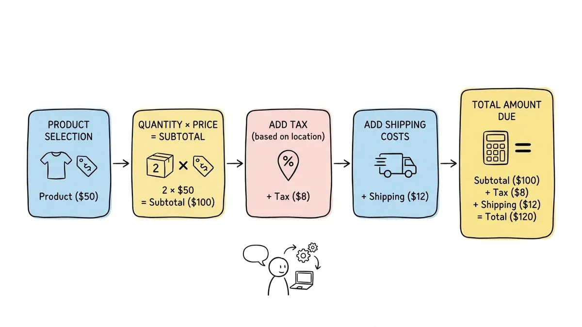
Essential calculations:
- Subtotal (quantity × price for each item)
- Tax (based on shipping location)
- Shipping costs
- Total amount due
If shipping costs vary by location or order size, build this logic into your form. Nothing frustrates customers more than surprise fees at the end of checkout.
For digital products or services, you might not need shipping calculations. But you still need clear pricing that updates based on customer selections.
Step 6: Design the payment section
The payment section needs to feel secure and trustworthy. Use recognizable payment logos (Visa, Mastercard, PayPal) and security badges to build confidence.
Payment section best practices:
- Accept multiple payment methods
- Use inline validation for credit card fields
- Show security badges and SSL certificates
- Keep payment fields visually separate from other sections
If you’re using a drag and drop form builder with payment integration, the security is handled automatically. But make sure customers can see that their information is protected.
For recurring payments or subscriptions, be extremely clear about billing frequency and cancellation policies. Hidden subscription terms are the fastest way to generate chargebacks and angry customers.
Step 7: Add trust signals and social proof
Order forms need more trust signals than other types of forms. Customers are entering payment information, so they need to feel confident about your business.
Effective trust signals:
- Customer testimonials near the order form
- Security badges and certifications
- Money-back guarantee information
- Contact information and business address
- Professional design that matches your brand
Don’t overdo it with trust badges. Two or three recognizable security logos work better than a wall of certificates nobody recognizes.
If you have customer reviews or ratings, show them near your product selection. Social proof works best when it’s relevant to what customers are considering buying.
Step 8: Optimize for mobile devices
More than half of online orders now happen on mobile devices. Your order form must work perfectly on small screens, or you’ll lose sales.
Mobile optimization checklist:
- Large, tappable buttons and form fields
- Minimal typing required
- Fast loading times
- Easy scrolling between sections
- Mobile-friendly payment options (Apple Pay, Google Pay)
Test your order form on actual mobile devices, not just browser developer tools. Touch interactions feel different than mouse clicks, and real mobile networks are slower than your office WiFi.
Consider using a single-column layout on mobile, even if you use multiple columns on desktop. Mobile users scroll naturally but struggle with side-to-side layouts.
Step 9: Test and optimize your order form
Launch with a basic version, then improve based on real customer behavior. Watch where people drop off and fix those friction points first.
Key metrics to track:
- Form abandonment rate
- Time to complete
- Error rates on specific fields
- Conversion rate by traffic source
- Mobile vs desktop performance
A/B test major changes like form length, button colors, or field order. But don’t test everything at once — change one element at a time so you know what actually improved performance.
Common issues that kill conversions include slow loading times, confusing field labels, and unexpected error messages. Fix the obvious problems before optimizing minor details.
Common order form mistakes to avoid
Asking for too much information upfront. Collect what you need to process the order. Everything else can wait for follow-up emails.
Hiding the total cost until the end. Show running totals and fee calculations as customers fill out the form. Surprise costs at checkout cause immediate abandonment.
Making fields too small on mobile. If customers can’t easily tap and type in your fields, they’ll give up. Size your form elements for thumbs, not mouse cursors.
Using confusing field labels. “Billing Name” is clearer than “Name on Card.” Write labels that match how customers think about the information.
Not validating information in real-time. Show format errors immediately, not after customers submit the form. Instant feedback prevents frustration.
Launch your order form and start selling
Creating an effective order form comes down to understanding your customers and removing every possible barrier to purchase. Start with the essential fields, design for mobile, and test with real customers.
The best order form is the one that gets out of your customer’s way. Make it fast, clear, and trustworthy, and you’ll see your conversion rates improve immediately.
Ready to build your order form? Try Fomr’s guest editor — you can create and test a complete order form without even signing up. Start with our order form template and customize it for your business in minutes.