You spent an hour building a form. You shared it everywhere. And then… 4 responses. Maybe 5 if you count the one you submitted yourself to make sure it worked.
Low form response rates are one of the most common frustrations for anyone collecting data online. The fix usually isn’t one big change. It’s a dozen small ones, stacked together, that turn a form people ignore into one they actually finish.
Here are 12 strategies that consistently move the needle.
1. Cut your form down to what actually matters
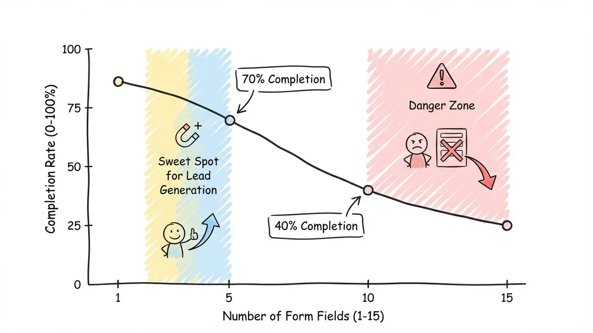
Every field you add costs you completions. Research from the Baymard Institute puts the drop-off at roughly 4-6% per additional field. A 10-field form loses nearly half its potential respondents compared to a 5-field form. That’s a brutal tax for fields nobody reads.
Audit your current forms with one question: “Do I need this information right now, or can I collect it later?” A newsletter signup doesn’t need a phone number. A webinar registration doesn’t need a company address.
For lead generation, aim for 3-5 fields. For detailed surveys or registrations, cap it at 10. If you genuinely need more, break the form into multiple pages so people don’t see a wall of inputs.
2. Order your questions to build momentum
People decide whether to finish your form within the first few seconds. If the opening question asks for something sensitive or complex, they leave.
Start with easy, low-stakes fields like name or email. Save questions about income, detailed preferences, or long text answers for the second half. By then, people feel invested and are more likely to push through.
Here’s a solid order for a feedback form:
- Your name (optional)
- How would you rate your experience? (1-5 stars)
- What did you like most?
- What could we improve?
- Would you recommend us to a friend?
Simple identification first, then an easy rating, then open-ended questions. Each step feels small on its own.
3. Make your form look like you care
This is where most forms fail. The questions might be fine, but the form itself looks like it was built in 2009. Ugly forms signal “we don’t pay attention to details,” and people bounce before typing a single character.
A few design principles that directly affect response rates:
- White space — cramped forms feel overwhelming. Give fields room to breathe.
- Readable fonts. Stick to clean, modern typefaces. Fomr gives you access to 1,700+ Google Fonts if you want something specific.
- Strong contrast: dark text on light backgrounds. Seems obvious, but many forms get this wrong.
- Consistent alignment. Left-aligned labels outperform top-aligned in most tests.
- Clear visual hierarchy with headings and spacing to guide the eye through the form.
When a form looks polished, people trust it more. Trust leads to completions.
4. Write headlines that give people a reason to care
“Contact Us” is not a headline. It’s a label. It tells people nothing about what they get in return for filling out your form.
Your headline should answer one question: “What’s in it for me?”
| Instead of… | Try… |
|---|---|
| Contact Form | Get Your Free Marketing Audit |
| Registration Form | Reserve Your Spot for the Workshop |
| Feedback Form | Help Us Improve Your Experience |
| Email Signup | Download the Complete Guide |
Be specific about what happens after someone submits. “We’ll get back to you” is weak. “You’ll get a personalized report within 24 hours” gives people a reason to follow through.
5. Write field labels that don’t make people think
Confusing labels kill form response rates quietly. People won’t ask you what “Phone” means when there are three phone number types. They’ll just close the tab.
Good labeling is specific and includes context:
- “Mobile phone (for order updates)” with a placeholder like “555-123-4567” beats just “Phone”
- “MM/DD/YYYY” next to a date field prevents formatting guesses
- “We’ll use this to send your receipt” next to an email field explains the why
If you’re asking for sensitive information, explain your reason. People share more when they understand the purpose.
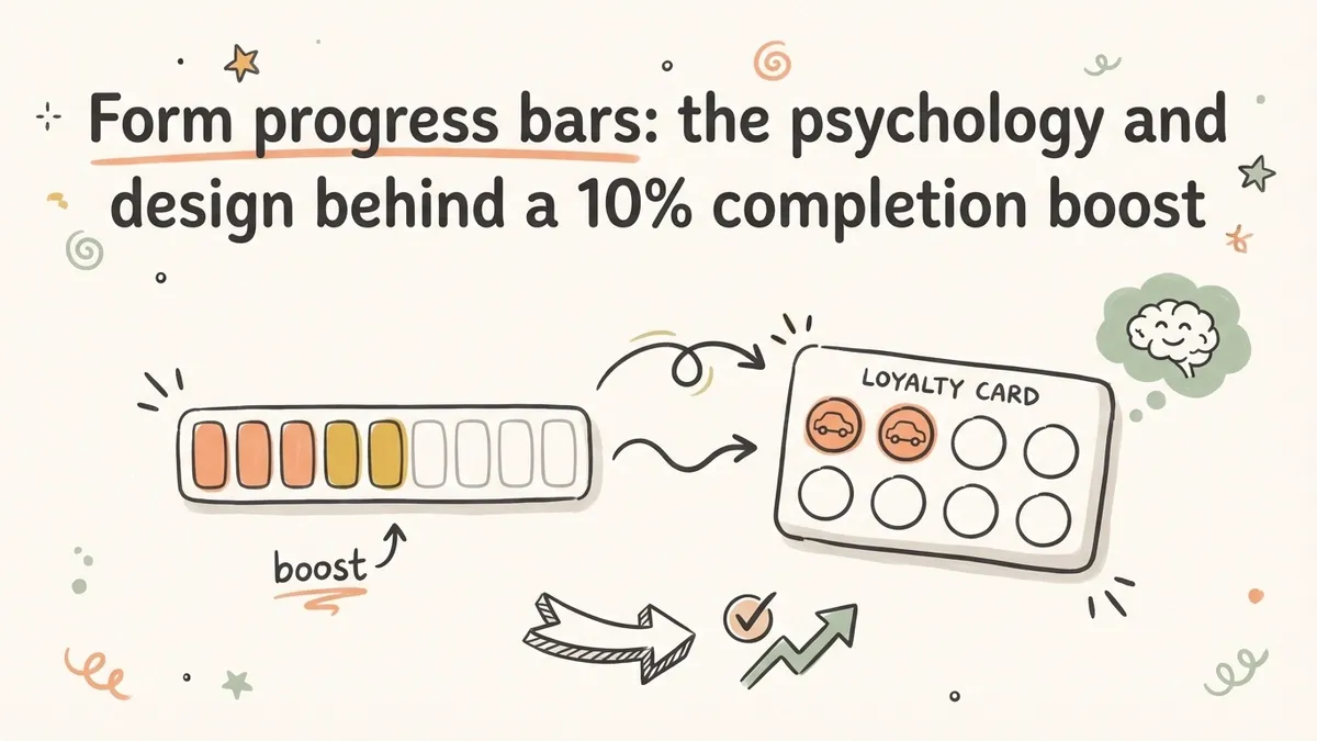
6. Show people how close they are to done
Long forms feel shorter when people can track their progress. A progress bar, step counter, or even just “Step 2 of 4” reduces the anxiety of not knowing how much is left.
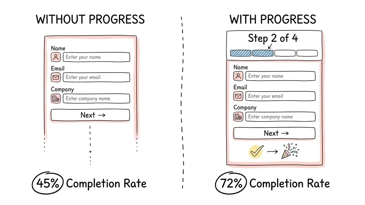
Progress indicators work because they set expectations about time investment up front and create a sense of momentum. “I’m already 60% done, might as well finish” is a real psychological response, and it measurably reduces abandonment on the final steps.
For single-page forms, numbered sections or visual dividers do the same job. For multi-page forms, a progress bar is practically required.
7. Pre-fill what you already know
Every keystroke you eliminate increases your form response rate. If you already know someone’s country from their IP address, pre-select it. If the form asks for today’s date, fill it in automatically.
Good defaults to consider:
- Country based on IP geolocation
- Current date for date fields
- Most common selections at the top of dropdowns
- Previously entered information for returning users
One caution: only pre-select options when you’re confident about the choice. Wrong assumptions feel invasive and create friction instead of removing it.
8. Add trust signals near your form
People hesitate before sharing personal information. Trust signals reduce that hesitation.
What works:
- Social proof near the form: “Join 10,000+ subscribers” or “Used by 500+ companies”
- Security badges and SSL indicators
- A visible privacy policy link
- Company logos of existing customers
- Testimonials placed next to or above the form
For a survey, something like “Your responses are anonymous and encrypted” can meaningfully increase completions. For a contact form, “We typically respond within 4 hours” sets expectations and builds confidence.
9. Replace “Submit” with something better
Generic button text like “Submit” or “Send” doesn’t motivate anyone. Your button is the last thing people see before they decide to click or close.
High-converting button text reinforces the value:
- “Get My Free Quote” instead of “Submit”
- “Download the Guide” instead of “Send”
- “Reserve My Spot” instead of “Register”
- “Join the Community” instead of “Sign Up”
The button should also look clickable. Use a contrasting color, make it large enough to tap on mobile (at least 44px tall), and give it visual weight.
10. Design for phones first
Over 60% of web traffic is mobile. If your form is awkward on a phone, you’re losing the majority of your potential respondents.
A mobile optimization checklist:
- Input fields at least 44px tall (easy to tap)
- Correct keyboard types (number pad for phone, email keyboard for email)
- Single-column layout only, no horizontal scrolling
- Large buttons with generous tap targets
- Minimal required typing (use dropdowns, toggles, and selections where possible)
Test on actual phones, not just browser dev tools. The dev tools approximation misses things like touch target spacing and keyboard behavior.
11. Time your ask to match their mindset
A perfectly designed form shown at the wrong moment still flops. Context and timing matter as much as design.
Effective timing examples:
- Exit-intent popups for newsletter signups, catching people as they’re about to leave
- Post-purchase surveys that capture feedback while the experience is fresh
- Event registration promoted right after the announcement, not three weeks later
- Support feedback asked immediately after closing a ticket
Also consider placement. A contact form on your pricing page targets people with buying intent. The same form on a blog post targets people with informational intent. Match the form’s ask to where the visitor’s head is at.
12. What happens after “Submit” matters too
How to increase your form response rate doesn’t end at submission. Your post-submit experience affects whether people fill out your forms in the future.
Good follow-up looks like this:
- Immediate confirmation with a thank-you page or inline message
- A clear timeline. “We’ll respond within 24 hours” beats silence.
- Fast delivery. If you promised a download or response, don’t make them wait.
- Personalization: reference what they submitted when you follow up
People talk. If submitting your form leads to a good experience, future response rates go up through word of mouth and repeat behavior. Drop the ball, and they’ll think twice next time.
Track what’s working and fix what isn’t
These 12 strategies are a starting point. The real gains come from measuring results and iterating.
Key metrics worth tracking:
| Metric | What it tells you |
|---|---|
| Conversion rate | % of visitors who complete the form |
| Abandonment rate | Where people drop off in multi-step forms |
| Time to complete | Whether the form takes too long |
| Mobile vs. desktop | Device-specific issues |
| Traffic source | Which channels bring engaged visitors |
Test one variable at a time: form length, button text, headline, field order. Small improvements compound faster than you’d expect.
Put these into practice
The common thread across all 12 strategies: reduce friction, build trust, and respect people’s time. Every form is different — a webinar registration has different needs than a detailed customer survey — but these principles apply across the board. And if you’re running a survey, a higher response rate means you reach your target faster: check how many completed responses you actually need with our free sample size calculator.
If you want to try these ideas on a real form, Fomr’s guest editor lets you build one without creating an account. You get full design control, multi-page layouts, and mobile optimization on the free plan, with unlimited forms and responses.