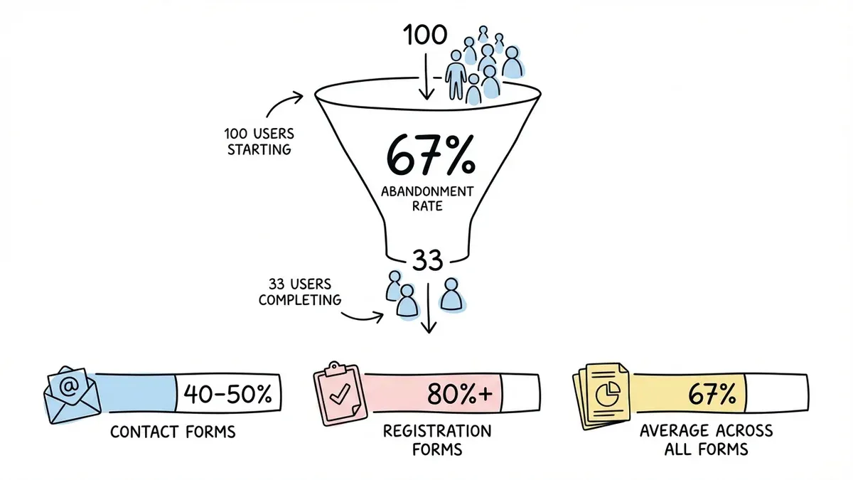
You spend weeks perfecting your lead magnet, crafting the perfect email sequence, and driving traffic to your landing page. Then you check your analytics and see the brutal truth: 67% of people who started your form never finished it.
Form abandonment is the silent conversion killer that’s costing you leads, customers, and revenue every single day. But here’s the thing — most form abandonment happens for predictable reasons that you can fix with the right strategies.
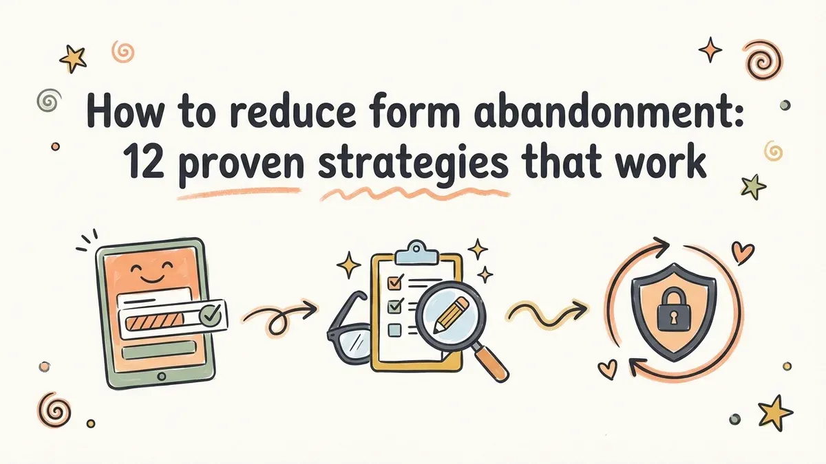
We’ve analyzed thousands of forms and identified the exact tactics that turn abandoners into completers. These aren’t vague “make it better” suggestions — they’re specific, actionable changes you can implement today.
Why form abandonment happens (and why it matters)
The average form abandonment rate sits around 67%, but it varies wildly by industry and form type. Contact forms see abandonment rates of 40-50%, while complex registration forms can hit 80% or higher.
Users abandon forms for three main reasons: friction (too many fields, confusing layout), trust issues (looks unprofessional, unclear privacy), and motivation problems (unclear value proposition, poor timing). The good news? Each of these has a solution.
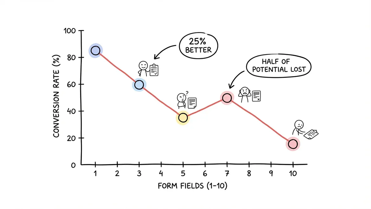
1. Cut your field count ruthlessly
Every field you add increases abandonment exponentially. A 3-field contact form converts 25% better than a 5-field version. A 7-field form? You’ve lost half your potential completions.
Start with the absolute minimum: name, email, and one specific field related to your goal. That’s it. If you need more information, collect it after the initial conversion through follow-up emails or progressive profiling.
For registration forms, resist the urge to collect everything upfront. Airbnb’s signup form asks for just email and password — they gather the rest during the first booking flow when users are more motivated to complete it.
2. Design for mobile-first completion
Over 60% of form submissions happen on mobile devices, but most forms are still designed for desktop. This creates massive friction on smaller screens.
Use single-column layouts exclusively. Stack fields vertically with plenty of spacing between them. Make tap targets at least 44px tall — anything smaller leads to misclicks and frustration.
Test your forms on actual mobile devices, not just browser dev tools. What looks fine in Chrome’s mobile simulator often breaks on real phones with different screen sizes and keyboards.
3. Write labels that actually help users
Generic labels like “Name” and “Comments” force users to guess what you want. Be specific: “Your first name” instead of “Name.” “What’s your biggest marketing challenge?” instead of “Comments.”
Place labels above fields, not inside them. Floating labels that disappear when users type create cognitive load — people forget what they’re supposed to enter halfway through.
For complex fields, add helper text below the label: “Phone number (we’ll only call if there’s an issue with your order).” This reduces anxiety about how you’ll use their information.
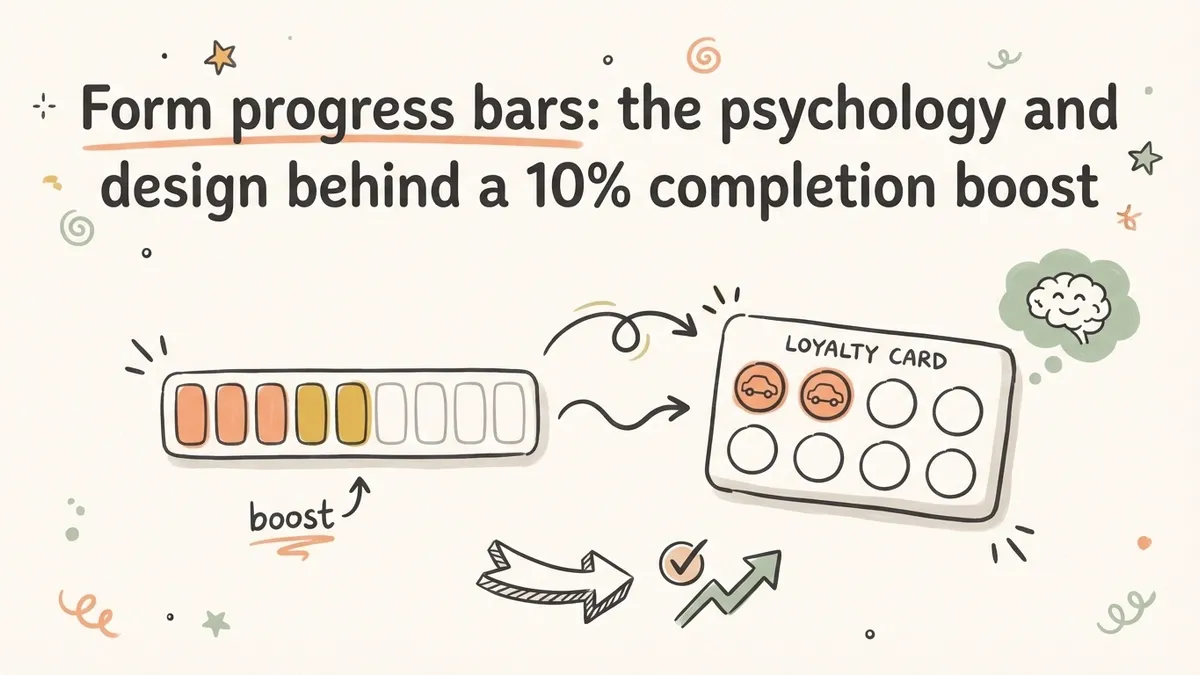
4. Show progress and set expectations upfront
Multi-step forms without progress indicators have abandonment rates 20% higher than forms that show where users are in the process.
Add a progress bar or step counter at the top: “Step 2 of 4” or a visual progress bar. But be honest — if you say “3 steps” and then surprise users with a fourth step, they’ll abandon immediately.
Tell users how long the form will take: “2 minutes to complete” or “Just 4 quick questions.” People are more likely to start something when they know the time commitment upfront.
5. Reduce form abandonment with smart field ordering
Start with easy, non-threatening fields like name and email. Save sensitive information (phone numbers, income, personal details) for later when users are already invested.
Group related fields together logically. Don’t jump from “Company name” to “Phone number” to “Job title” — keep company information together, then move to contact details.
End with the lowest-friction field possible. If your last field is “Comments (optional),” users feel like they’re crossing the finish line. If it’s “Upload your tax documents,” they might bail at the last second.
6. Make error handling actually helpful
Generic error messages like “Please fix the errors below” don’t help anyone. Be specific: “Email address should include an @ symbol” or “Phone number should be 10 digits.”
Show errors inline as users type, not after they hit submit. Real-time validation catches problems early and prevents the frustrating submit-fail-fix-resubmit cycle.
Use colors and icons that are accessible. Red text alone isn’t enough — add an error icon and clear messaging for colorblind users.
7. Build trust with professional design and clear privacy
Forms that look unprofessional trigger immediate abandonment. Use consistent fonts, proper spacing, and a color scheme that matches your brand.
Add a privacy statement right below your form: “We’ll never share your information” or “Unsubscribe anytime.” Link to your full privacy policy for users who want details.
Include security badges if you’re collecting sensitive information. Even a simple “SSL secured” message can increase completion rates for forms that ask for payment details.
8. Use conditional logic to show only relevant fields
Nothing kills motivation like filling out fields that don’t apply to you. Use conditional logic to show or hide fields based on previous answers.
If someone selects “Individual” instead of “Business,” hide company-related fields. If they choose “No” for “Do you have a website?” skip the website URL field entirely.
This creates a personalized experience that feels shorter and more relevant to each user. Conditional logic is coming soon to Fomr — it’s one of our most requested features.
9. Optimize your call-to-action button
“Submit” is the most boring button text possible. Use action-oriented copy that reinforces the value: “Get my free guide,” “Start my trial,” or “Send my message.”
Make the button large enough to tap easily on mobile (minimum 44px height) and use a color that stands out from the rest of your form.
Place the button left-aligned under your fields, not centered. Users’ eyes naturally follow the left edge of the form down to the bottom.
10. Test different form lengths and layouts
A/B test single-page forms against multi-step versions. Sometimes breaking a long form into 3 steps reduces abandonment. Other times, keeping everything on one page works better.
Try different field arrangements: horizontal layouts for short forms, vertical for longer ones. Test optional vs. required fields — sometimes making a field optional increases overall completion more than removing it entirely.
Use a drag and drop form builder to quickly test different layouts. We built Fomr’s editor specifically for this — you can duplicate a form and try a completely different layout in minutes.
11. Recover abandoners with smart follow-up
Not everyone who abandons your form is gone forever. Set up email sequences for partial completions: “Looks like you started our contact form — need help with anything?”
For registration forms, send a gentle reminder after 24 hours with a direct link back to where they left off. Don’t make them start over.
Include the value proposition in your follow-up: remind them why they started the form in the first place and what they’ll get when they complete it.
12. Monitor and fix your biggest drop-off points
Use analytics to identify exactly where people abandon your forms. If 40% of users quit after the email field, there’s probably an issue with that specific field or the one that comes next.
Heat mapping tools like Hotjar show you where users click, scroll, and rage-click. These insights reveal friction points that aren’t obvious from completion rates alone.
Set up conversion funnels in Google Analytics to track each step of multi-page forms. This data tells you which steps need the most attention.
Turn abandoners into completers starting today
Form abandonment doesn’t have to be inevitable. These 12 strategies address the root causes that make users quit: too much friction, unclear expectations, and broken trust.
Start with the quick wins: cut unnecessary fields, improve your button copy, and add a progress indicator. Then work on the bigger changes like mobile optimization and conditional logic.
The best part? You can test most of these improvements in minutes with a modern form builder. Try building a conversion-optimized form without even creating an account — see how design choices impact user experience firsthand.