Most lead generation forms convert at 2-5%. That means for every 100 visitors who see your form, 95 or more leave without filling it out. The usual culprits are predictable: too many fields, vague value propositions, layouts that fall apart on mobile, and submit buttons that say nothing more than “Submit.”
The good news? Small changes to your lead generation form can produce big results. Reducing fields from 11 to 4 can increase conversions by 120%, according to Unbounce. Swapping a generic headline for a specific one can lift completions by 40%. These aren’t theoretical numbers — they’re patterns that show up repeatedly across industries.
Here are 12 practical ways to make your forms convert better, starting with the changes that tend to have the biggest impact.
Lead with a specific value proposition
Your form needs to answer one question instantly: “What do I get for giving you my information?” Most forms fail here because the headline is generic — “Contact Us,” “Get In Touch,” “Sign Up.”
Be concrete about the exchange:
- “Download Our 2025 Marketing Budget Template”
- “Get Your Free Website Audit (Usually $500)”
- “Join 10,000+ Marketers Getting Weekly Growth Tips”
Place this above your form fields, not buried in body copy. The value proposition is the reason someone fills out the form. Make it the most visible element on the page.
Cut your fields to the minimum
Every field you add is a small tax on the visitor’s time. The more you ask for, the fewer people finish.
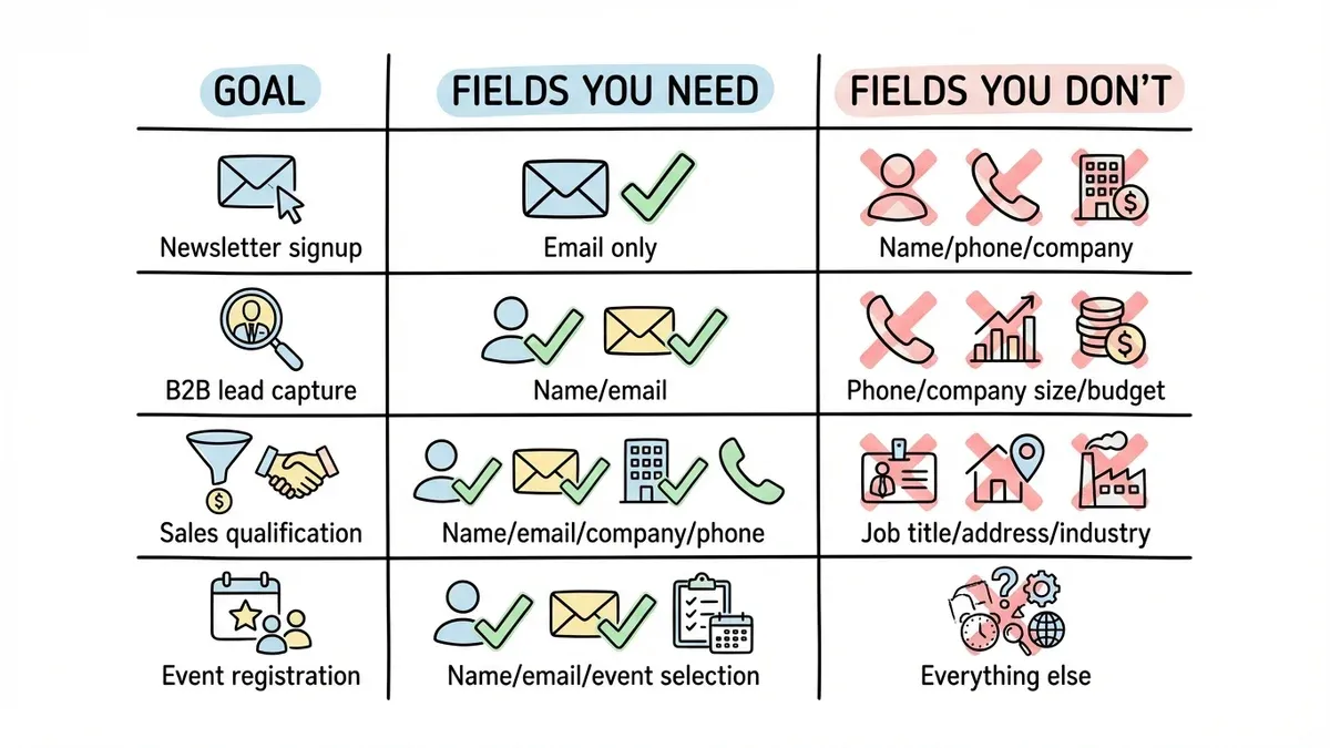
Match your fields to your actual goal:
| Goal | Fields You Need | Fields You Don’t |
|---|---|---|
| Newsletter signup | Email only | Name, phone, company |
| B2B lead capture | Name, email | Phone, company size, budget |
| Sales qualification | Name, email, company, phone | Job title, address, industry |
| Event registration | Name, email, event selection | Everything else |
Resist the urge to ask for everything upfront. You can always collect more information through follow-up emails or progressive profiling. The purpose of a lead generation form is to start a conversation, not conduct a full interview.
If you genuinely need more fields, break the form into multiple pages. A 3-field form converts roughly 25% better than a 5-field form. Multi-page forms with progress indicators help too — each page feels manageable even when the total field count is higher.
Design for phones first
Over 60% of form submissions happen on mobile devices. If your lead generation form doesn’t work well on a phone, you’re losing most of your potential leads before they even start typing.
Mobile-friendly forms need:
- Input fields at least 44px tall (thumb-friendly)
- Single-column layouts, no side-by-side fields on small screens
- Generous spacing between elements
- Tap-sized submit buttons
- Load times under 3 seconds
Test on an actual phone, not just a browser window resized to mobile width. The experience is different: autocomplete behavior, keyboard types, and scroll behavior all change on real devices. Fixing mobile usability issues alone has been shown to improve conversion rates by 50% or more.
Write labels people understand
Jargon in form labels creates hesitation, and hesitation kills completions. “Designation” makes people pause. “Job Title” doesn’t.
Use plain language:
- “Organization” → “Company Name”
- “Designation” → “Job Title”
- “Primary Contact Number” → “Phone Number”
For placeholder text, show examples instead of instructions. “[email protected]” is more helpful than “Enter your email address.” An example instantly communicates format and expectations.
Make your submit button specific
“Submit” is the most wasted word in form design. It tells the visitor nothing about what happens next.
Action-oriented button text converts better:
- “Submit” → “Download My Free Guide”
- “Send” → “Get My Website Audit”
- “Register” → “Save My Spot”
The button should complete the sentence “I want to…” from the visitor’s perspective. “I want to download my free guide” makes sense. “I want to submit” doesn’t.
Color matters too. High-contrast buttons that stand out from the surrounding page consistently outperform low-contrast ones. There’s no universal “best color” — what matters is that the button is visually distinct from everything around it.
Add trust signals near the form
People are cautious about handing over personal information, especially email addresses. Trust signals reduce that friction.
What works well:
- Customer logos or short testimonials
- Subscriber counts (“Join 5,000+ subscribers”)
- Security indicators (SSL badges, privacy compliance)
- A simple privacy statement (“We’ll never share your email”)
Place these near the form, close enough to see while filling it out, but not so prominent that they distract from the fields and submit button. Even a one-line privacy reassurance can measurably increase completions.
Validate fields in real time
Few things are more frustrating than filling out a form, hitting submit, and getting a vague error message that forces you to hunt for the problem. Real-time validation prevents this entirely.
Good validation looks like:
- Checking email format as the visitor types
- Showing a green checkmark when a field is valid
- Displaying specific error messages (“Please enter an email address” not just “Error”)
- Highlighting the exact field that needs fixing
- Preserving all other entered data when an error occurs
This isn’t a nice-to-have. Forms with inline validation complete faster and with fewer abandoned submissions. Most modern form builders handle this automatically, so there’s no reason to skip it.
Use real urgency, not fake countdown timers
Urgency motivates action, but fake scarcity backfires. Today’s visitors have seen enough countdown timers that reset when you refresh the page. They don’t trust them, and using them damages your credibility.
Authentic urgency works:
- Real deadlines tied to events or promotions
- Actual capacity limits (“Only 15 spots left in this cohort”)
- Seasonal offers with genuine expiration dates
- Limited offer pricing that ends on a specific, published date
If your offer doesn’t have natural urgency, don’t manufacture it. A strong value proposition is more effective than a fake timer.
Use progressive disclosure for complex forms
Sometimes you legitimately need a lot of information. Progressive disclosure lets you collect it without overwhelming the visitor upfront.
The technique is simple: show more fields only after the visitor completes the initial ones. Start with email only. Once they’ve entered it, reveal name and company. After that, show industry-specific questions.
This works because each step feels small. A visitor who entered their email is psychologically invested and more likely to continue than someone staring at a 12-field form from the start.
Progressive disclosure is especially useful for B2B lead generation, where you need qualification data but can’t afford to scare off prospects with a long form. Fomr’s multi-page forms are built for exactly this pattern — each page can collect a few fields while showing progress toward completion.
Don’t waste the thank you page
Most thank you pages say “Thanks for submitting!” and nothing else. That’s a missed opportunity.
A good thank you page should:
- Confirm the submission clearly
- Deliver the promised resource immediately (download link, access code, etc.)
- Set expectations (“You’ll hear from us within 24 hours”)
- Suggest a logical next step, like related content or a product demo
The person who just filled out your form is at peak engagement with your brand. Don’t waste that moment on a dead-end page.
Test systematically, not randomly
There’s no universal “best” form length, layout, or color scheme. What converts for a SaaS company’s demo request form won’t necessarily work for a nonprofit’s volunteer signup.
High-impact elements to A/B test:
- Number of fields (try 2 vs. 4 vs. 6)
- Single-page vs. multi-step layout
- Headline and value proposition copy
- Button text and color
- Form placement on the page
Test one variable at a time. Run each test for at least two weeks or until you reach statistical significance. Keep a record of what you tested and what happened — patterns emerge over time that are more valuable than any single test result.
Plan your follow-up before you launch
Your lead generation form is the start of a relationship, not the end of a transaction. How you follow up determines whether that lead becomes a customer or goes cold within a week.
Follow-up basics:
- Send a confirmation email within minutes, not hours
- Deliver promised resources immediately
- Set clear expectations for what happens next
- Personalize based on form responses where possible
- Have a nurture sequence ready before the form goes live
The most common mistake? Building the form, launching it, and then scrambling to figure out what to do with the responses. Plan the full sequence first. The form is just the entry point.
Put these into practice
Start with the changes that tend to have the biggest impact: cut your fields to the minimum, write a specific value proposition, and test on mobile. Those alone can meaningfully move your conversion rate. Then work through the rest of the list, testing as you go.
If you need a form builder that makes this easy, Fomr’s guest editor lets you build a lead generation form in minutes with no signup required. The free plan includes unlimited forms, responses, fields, and team members — so you can test as many variations as you want without worrying about hitting a limit.