A multi step form breaks one long form into several shorter pages, guiding users through a series of focused questions instead of overwhelming them with everything at once. Think of it like a conversation — you wouldn’t ask someone their name, email, phone number, job title, company size, and budget all in the same breath.
Multi step forms consistently outperform single-page forms for complex data collection. They reduce form abandonment, increase completion rates, and create a better user experience. But building them wrong can backfire spectacularly.
Here are 12 actionable tips to create multi step forms that actually work.
Start with your easiest questions
Your first step should feel effortless. Ask for basic information like name or email address — things people can answer without thinking. This creates momentum and gets users invested in completing the process.
Avoid starting with complex questions like “What’s your annual marketing budget?” or multi-select lists with 20 options. Save those for later steps when users are already committed.
Good first step: Name and email address Bad first step: Company size, industry, and detailed requirements
Keep each step to 3-5 fields maximum
The whole point of a multi step form is to avoid overwhelming users. If you cram 8 fields onto one step, you’ve defeated the purpose. Each page should feel quick and manageable.
For most use cases, 2-3 fields per step works best. You can push to 4-5 fields if they’re all simple (like checkboxes or dropdowns), but never go higher.
This rule forces you to think critically about what information you actually need versus what would be “nice to have.”
Show clear progress throughout the form
Users need to know how much work is left. A progress bar or step indicator prevents the anxiety of not knowing if they’re halfway done or just getting started.
Display progress as steps completed rather than percentage. “Step 2 of 4” feels more concrete than “50% complete.” It also helps users understand the structure of your form.
Some form builders hide progress indicators to prevent abandonment, but this usually backfires. Transparency builds trust, and users appreciate knowing what they’re signing up for.
Use logical grouping for your multi step form
Each step should have a clear theme or purpose. Group related questions together so each page feels cohesive. Don’t scatter similar questions across multiple steps just to balance the field count.
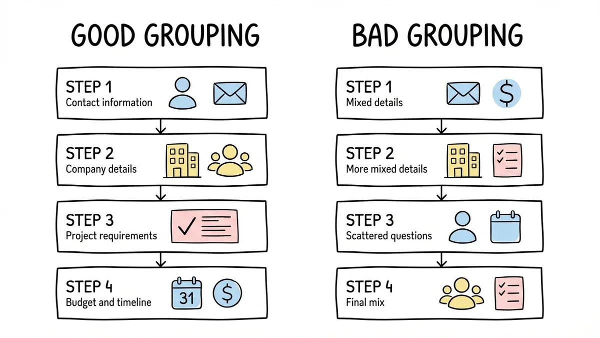
Good grouping examples:
- Step 1: Contact information
- Step 2: Company details
- Step 3: Project requirements
- Step 4: Budget and timeline
Bad grouping: Mixing contact info, budget questions, and project details on the same step, or splitting contact information across multiple pages for no reason.
Make your back button actually work
Users will want to review and edit their previous answers. If your back button doesn’t work properly or loses their data, they’ll abandon the form entirely.
Test this thoroughly. Click back from every step and make sure all previously entered data is preserved. Users should be able to navigate freely between completed steps without losing information.
This seems obvious, but you’d be surprised how many forms break when users try to go back and change something.
Write step titles that explain the purpose
Generic step titles like “Step 2” or “Personal Information” don’t help users understand why you’re asking these questions. Write descriptive titles that connect to the user’s goal.
Generic: “Contact Information” Better: “How can we reach you with updates?”
Generic: “Company Details”
Better: “Tell us about your business”
Good titles reduce friction by helping users understand the relevance of each section.
Save progress automatically
Don’t make users lose their work if they accidentally close the browser or their session times out. Auto-save functionality is crucial for longer multi step forms.
This is especially important for registration forms, job applications, and detailed surveys where users might need to gather information from other sources partway through.
At Fomr, our forms automatically save progress as users type, so they never lose their work even if something goes wrong.
Optimize your multi step form for mobile
More than half of form submissions happen on mobile devices. Your multi step form needs to work perfectly on small screens.
Keep mobile-specific considerations in mind:
- Single-column layouts work better than multi-column
- Larger touch targets for buttons and form fields
- Minimize typing with dropdowns and checkboxes where appropriate
- Test the experience on actual phones, not just browser dev tools
A form that works well on desktop but breaks on mobile will lose you half your potential submissions.
End with a clear summary page
Before users submit, show them a summary of what they’ve entered. This serves two purposes: it lets them review for accuracy, and it reinforces the value of what they’re about to receive.
The summary doesn’t need to include every single field — focus on the key information that matters most. For a contact form, show name, email, and their main request. For a registration form, show the event details and any special requirements they mentioned.
Use smart conditional logic
Not every user needs to answer every question. Use conditional logic to show or hide steps based on previous answers. This keeps your form relevant and prevents users from wasting time on irrelevant questions.
For example, if someone selects “Individual” for company type, don’t ask about team size or enterprise features. If they’re looking for a basic contact form, skip the advanced customization questions.
This feature is coming soon to Fomr, but many form builders already support it.
Test your abandonment points
Track where users drop off in your multi step form. If 40% of users abandon at step 3, that step probably has a problem. Maybe it’s too long, asks sensitive questions too early, or isn’t clearly connected to the user’s goal.
Common abandonment triggers:
- Asking for sensitive information (like income) before building trust
- Steps that feel irrelevant to the user’s needs
- Technical problems like slow loading or broken functionality
- Unclear instructions or confusing question wording
Choose the right form builder for multi step forms
Not all form builders handle multi step forms well. You need a platform that makes it easy to create, edit, and manage complex forms without technical expertise.
Look for these features:
- Drag and drop form builder for easy step creation
- Visual preview so you can see how each step looks
- Mobile-responsive design that works on all devices
- Reliable data saving and progress tracking
- Clean, professional templates that don’t look generic
We built Fomr specifically for creators who want beautiful, functional forms without the complexity. Our drag-and-drop editor makes it simple to create multi step forms that look professional and work flawlessly across devices.
When to use multi step forms vs single-page forms
Multi step forms aren’t always the right choice. Use them when:
- You need to collect more than 6-8 pieces of information
- Some questions depend on answers to previous questions
- You’re asking for sensitive or complex information
- The form serves multiple purposes (like registration + preferences + payment)
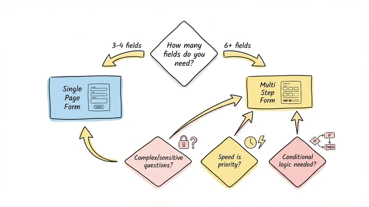
Stick with single-page forms for:
- Simple contact forms with 3-4 fields
- Newsletter signups
- Quick feedback surveys
- Any form where speed is more important than completeness
Ready to build your first multi step form?
Multi step forms can dramatically improve your conversion rates when built correctly. The key is balancing comprehensive data collection with a smooth user experience.
Start with simple questions, keep each step focused, and always test on real devices. Most importantly, choose a form builder that makes the process straightforward rather than fighting with complicated tools.
Try building a multi step form with Fomr — no account required. Our drag-and-drop editor and instant preview make it easy to create professional forms that work beautifully on any device.