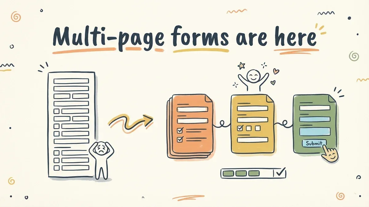
Long forms kill completion rates. A 15-field form on a single page feels like a wall of questions. The same 15 fields split across 3 pages feels manageable. Each page is a small commitment, not a big one.
Today we’re launching multi-page forms in Fomr.
How it works
The editor now supports adding multiple pages to any form. Each page is a self-contained step with its own set of fields. Respondents see a progress indicator and navigate with next/previous buttons.

You can drag and drop pages to reorder them, add new pages anywhere in the flow, and preview the entire multi-page experience directly in the editor. What you see in preview is what respondents see.
Welcome pages
First impressions matter. A welcome page lets you set context before the first question — explain what the form is about, how long it takes, and what happens after submission.
No fields on this page. Just a title, description, and a “Start” button. It reduces the cognitive load of seeing form fields immediately and gives people a moment to decide if they want to proceed.
For surveys and longer forms, this is especially effective. “This takes about 3 minutes and your feedback directly shapes our product roadmap” is more compelling than dropping someone straight into question one.
Thank-you pages
After submission, respondents used to see a generic confirmation message. Now you can design a custom thank-you page with:
- A personalized message
- Links to related resources
- Social media sharing prompts
- Next steps or follow-up instructions
The thank-you page is your last touchpoint with the respondent. Use it. A well-crafted thank-you page can drive traffic to other pages, encourage social sharing, or simply leave a positive final impression.
When to use multi-page forms
Not every form needs multiple pages. A 3-field contact form works fine on a single page. But here’s where multi-page forms make a real difference:

Registration forms — Split personal info, preferences, and account details across separate pages. Each step feels light.
Surveys with 10+ questions — Group related questions together. “About your experience” on one page, “About our product” on another. Respondents can see progress and know they’re close to the end.
Application forms — Break the application into sections: personal info, qualifications, essay questions. Applicants can focus on one section at a time.
Multi-step processes — Onboarding flows, quote requests, booking forms. Each page represents a logical step in the process.
The completion rate impact
We’ve seen forms that switched from single-page to multi-page layouts increase completion rates by 20-40%. The biggest improvements come from forms that were originally 8+ fields on a single page.
The psychology is simple: each completed page gives the respondent a small win. They’ve invested time and don’t want to abandon their progress. It’s the same principle that makes progress bars effective — visible progress motivates continued effort.
Build your first multi-page form
Multi-page forms are available on all plans, including free. Open any form in the editor, add a new page from the sidebar, and start breaking your form into focused steps.
Try the editor — no account required.