
Most people build a form, share the link, and check back a week later to count submissions. If the number looks decent, they move on. If it looks bad, they shrug and blame the audience.
That’s like running a store and only counting how many people walked out with a bag. You’d never know that 200 people entered, 140 picked something up, and 120 put it back down before reaching the register. The interesting story isn’t in the final number. It’s in everything that happened before it.
Form analytics gives you that story. It tells you where people get stuck, which questions make them quit, how long they spend deciding whether your form is worth their time, and whether your mobile experience is quietly bleeding completions. Once you start paying attention to these metrics, you’ll wonder how you ever optimized forms without them.
Why submission counts aren’t enough
A form that gets 50 submissions per week sounds fine until you learn that 400 people started it. That’s an 87.5% abandonment rate, which means your form is actively repelling the majority of people who try to use it.
Submission counts tell you the end result. Form analytics tells you why. And the “why” is where all the actionable improvements live.
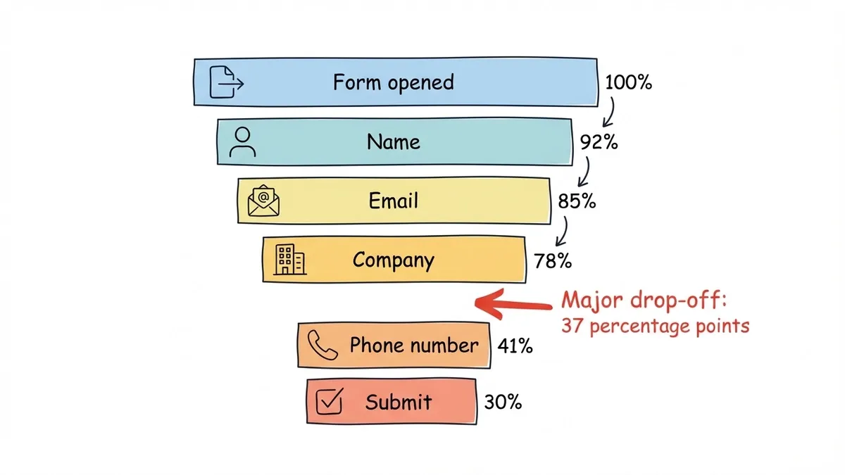
Here’s a real scenario. You’re running a lead generation form with five fields: name, email, company, phone number, and “How did you hear about us?” Your submission tracking shows 30 completions per week. Not terrible, but not great. Without analytics, you might redesign the whole form or change the headline on your landing page.
With form analytics, you’d see that 78% of people who start the form make it past the first three fields, but drop-off spikes at the phone number field. The fix isn’t a redesign. It’s making one field optional. That kind of precision saves you from wasting time on changes that don’t matter.
The five form metrics that actually matter
Not every number in your analytics dashboard deserves your attention. These five give you the clearest picture of form performance and the most direct path to improvement.
Completion rate
This is the percentage of people who start your form and actually submit it. It’s the single most important form performance metric because it captures the entire experience in one number.
How to calculate it: Submissions divided by unique form views (or unique starts, depending on your tool), multiplied by 100.
Benchmarks to aim for:
- Simple contact forms: 40-60%
- Lead generation forms (3-5 fields): 30-50%
- Multi-page surveys: 20-35%
- Complex application forms: 10-25%
If your completion rate falls below these ranges, something specific is pushing people away. The metrics below will help you figure out what.
One thing worth noting: completion rate varies a lot by traffic source. Visitors from a targeted email campaign will complete forms at much higher rates than cold traffic from a social media ad. Segment your analytics by source before drawing conclusions — tagging the links you share with our free UTM builder makes those sources show up cleanly.
Abandonment rate and drop-off points
Abandonment rate is the inverse of completion rate (if 40% complete, 60% abandon), but the real value is in knowing where people abandon. A form analytics tool that shows per-field or per-page drop-off rates is worth ten times more than one that only shows the aggregate number.
Common drop-off patterns and what they mean:
- Heavy drop-off on the first field. Your form loads but people don’t even start. The problem is usually above the form: a weak value proposition, a confusing page layout, or the form looks too long at first glance.
- Drop-off at a specific field. That field is either too personal (phone number, income), too confusing (unclear label), or too much effort (long text when a dropdown would work). We wrote a full guide on how to reduce form abandonment that covers fixes for each of these patterns.
- Gradual decline across all fields. The form is just too long. Cut fields or split it into multiple pages. Multi-step forms consistently outperform single-page forms for anything over five fields.
- Drop-off on the last page. People made it through the whole form but didn’t hit submit. This usually points to a trust issue (no privacy statement, unclear what happens next) or a broken submit button on certain devices.
Time to complete
This measures how long it takes someone to go from opening your form to submitting it. It’s a proxy for friction. Long completion times don’t always mean something is wrong, but sudden spikes on specific fields usually do.
What’s normal:
- A 3-field contact form should take under 60 seconds
- A 10-field registration form: 2-4 minutes
- A detailed survey with 20+ questions: 5-10 minutes
If your 5-field form takes an average of 4 minutes to complete, people are struggling somewhere. Look at per-field time data to find the bottleneck. It’s often a question that’s ambiguous (“Rate your satisfaction with our service” when you offer twelve different services) or a field that requires information people don’t have handy (policy numbers, account IDs, dates they need to look up).
Time data also helps you set accurate expectations. If your form takes 8 minutes on average, say “This takes about 8 minutes” at the top. People are more likely to commit when they know what they’re signing up for. Lying about it (“Quick 2-minute survey!” that takes 15 minutes) destroys trust and tanks your completion rate.
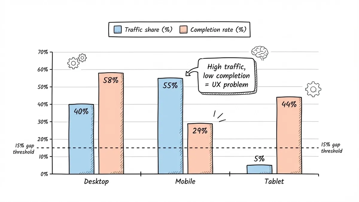
Device and browser breakdown
This one is easy to overlook and expensive to ignore. If 55% of your form traffic comes from mobile devices but your completion rate on mobile is half of what it is on desktop, you have a mobile UX problem that’s costing you roughly a quarter of all potential submissions.
Check these splits regularly:
- Desktop vs. mobile vs. tablet completion rates. A gap of more than 10-15 percentage points between desktop and mobile means your form needs mobile optimization work.
- Browser-specific issues. A form that works perfectly in Chrome but breaks in Safari will silently lose you 20-30% of mobile users (since Safari dominates on iPhones). Test across browsers, not just the one you use.
- Screen size distribution. If a chunk of your traffic comes from smaller screens (under 375px wide), make sure your form doesn’t require horizontal scrolling or have tap targets that are too close together.
When you build forms with Fomr, the responsive behavior is handled automatically. But even with a responsive form builder, you should still check your analytics to confirm that mobile users aren’t struggling with specific field types or page layouts.
Field-level interaction data
This is the most granular metric and often the most revealing. Field-level analytics show you which fields people interact with, how long they spend on each one, and which ones they skip or leave blank.
Patterns to watch for:
- Fields with high “started but not completed” rates. The person clicked into the field, maybe typed something, then deleted it and moved on or left entirely. This usually means the question is confusing or feels too invasive.
- Fields that take disproportionately long. If one dropdown takes 30 seconds while others take 3, the options are probably too numerous or poorly organized.
- Optional fields that nobody fills out. If an optional field has a 5% fill rate, it’s just adding visual clutter. Remove it.
- Fields with high error rates. Validation errors that fire repeatedly on the same field point to unclear formatting requirements or overly strict validation rules.
How to set up form tracking
You have a few options for collecting form analytics data, ranging from free and basic to paid and comprehensive.
Google Analytics event tracking
If you’re already running GA4, you can track form interactions as events. Set up events for form views, field focus, field completion, and form submission. This gives you a decent picture of the funnel without adding another tool.
The downside: it requires manual setup. You’ll need to add event triggers for each form interaction, either through Google Tag Manager or by firing gtag() calls in your code. For embedded forms, this can get complicated depending on how the form loads on the page.
Dedicated form analytics tools
Tools like Hotjar, Zuko, and Formisimo are built specifically for form tracking. They record field-level interactions automatically, generate drop-off funnels, and show you time-per-field data without any custom event setup.
The trade-off is cost. Most dedicated form analytics tools charge $50-300/month depending on traffic volume. For high-value forms (lead gen, checkout, applications), the ROI usually justifies it. For a simple contact form, Google Analytics events are probably enough.
Built-in form builder analytics
Some form builders include basic analytics in their dashboard. This is the easiest option since there’s nothing to configure. You get submission counts, completion rates, and sometimes device breakdowns without touching any code.
The depth varies a lot between platforms. Some only show total submissions. Others give you per-field drop-off data and time metrics. When evaluating a form builder, check what analytics come built in before committing. It’s one of those features that doesn’t seem important until you need it.
Session recording tools
Tools like Hotjar, FullStory, and Microsoft Clarity let you watch recordings of real users filling out your forms. This is qualitative rather than quantitative data, but watching 20-30 recordings of people who abandoned your form will reveal patterns no metric can capture: someone hovering over a confusing label, scrolling up and down looking for instructions, or rage-clicking a button that doesn’t respond on mobile.
Turning form data into actual improvements
Collecting data is the easy part. The hard part is knowing what to do with it. Here’s a framework for turning form analytics into changes that move your completion rate.
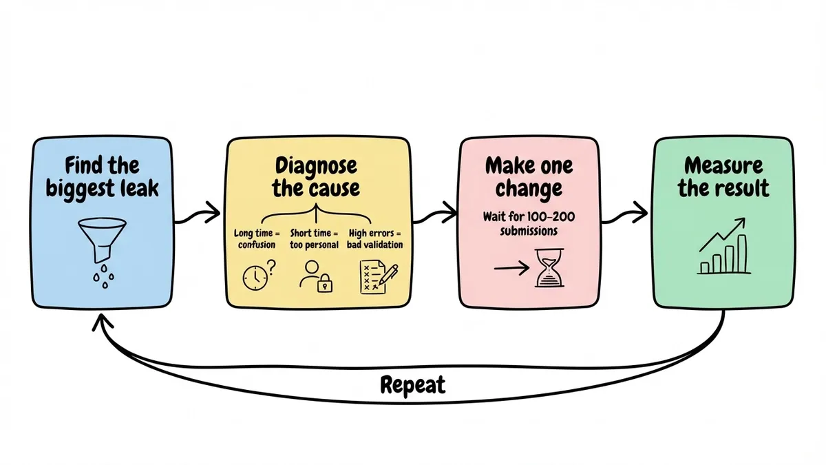
Step 1: Find the biggest leak
Look at your drop-off funnel and find the single step or field where you lose the most people. Don’t try to fix everything at once. Focus on the biggest leak first because that’s where you’ll get the most return for the least effort.
Step 2: Diagnose the cause
A drop-off at a specific field could mean several things. Use the context clues:
- High drop-off + long time on field = confusion (rewrite the label or add helper text)
- High drop-off + very short time on field = the person saw it and immediately decided to leave (the field is too personal or the form suddenly looks longer than expected)
- High drop-off + high error rate = validation is too strict or formatting requirements are unclear
Step 3: Make one change and measure
Change one thing at a time. If you rewrite a label, remove a field, and add a progress bar all at once, you won’t know which change made the difference. Give each change at least 100-200 submissions before evaluating the impact.
Step 4: Repeat
Once you’ve fixed the biggest leak, move to the next one. A form that went from 25% to 35% completion rate after fixing one field might jump to 45% after fixing the next bottleneck. These gains compound.
For more specific tactics on improving completion rates, our guides on boosting form response rates and form design best practices cover the implementation side in detail.
Common form analytics mistakes
A few pitfalls that trip people up when they start paying attention to form data.
Optimizing for completion rate at the expense of lead quality. If you cut your form from 8 fields to 3 and your completion rate doubles but your sales team says the leads are garbage, you’ve optimized the wrong metric. Sometimes a longer form that filters out unqualified leads is exactly what you want. Track downstream conversion (did the lead become a customer?) alongside form completion.
Ignoring sample size. A form that got 12 submissions last week doesn’t have enough data to draw conclusions from. You need at least a few hundred submissions before field-level drop-off percentages become reliable. For low-traffic forms, collect data over a longer period before making changes.
Treating all traffic sources the same. Someone who clicked a targeted email link and someone who stumbled onto your form from a random Google search have very different intent levels. Segment your form analytics by traffic source. A 20% completion rate from cold social traffic might actually be excellent, while a 40% rate from warm email traffic might be underperforming.
Never re-checking after changes. You fixed the phone number field drop-off, great. But did the change create a new problem downstream? Maybe people who now breeze past that field are getting stuck on the next one because the momentum shift changed their behavior. Always check the full funnel after making changes, not just the field you modified.
What to track first
If you’re starting from zero, don’t try to instrument everything at once. Here’s a practical starting order:
- Overall completion rate. Get this number for every form you run. It’s the baseline that tells you whether a form needs attention.
- Per-page or per-field drop-off. Once you know a form is underperforming, this tells you where to focus.
- Device breakdown. Check if mobile users are having a worse experience. If they are, that’s often the fastest fix available.
- Time to complete. Use this to set expectations and find fields that cause hesitation.
- Field-level error rates. The last piece of the puzzle, useful for fine-tuning validation and labels.
You don’t need expensive tools to start. Google Analytics handles the first three reasonably well. As your forms become more critical to your business, invest in deeper form tracking that gives you field-level data.
Build forms worth analyzing
Form analytics only matters if you’re building forms that get enough traffic to generate meaningful data. That means forms that look professional, load fast, and work well on every device.
If you’re looking for a form builder that handles the design and responsiveness side so you can focus on optimization, Fomr gives you a drag-and-drop editor with full design control, multi-page layouts, and responsive behavior out of the box. The free plan includes unlimited forms and responses, so you can build, test, and iterate without worrying about hitting a paywall.
Start with one high-traffic form. Set up basic analytics. Find the biggest drop-off point. Fix it. Measure the result. That single loop, repeated a few times, will do more for your conversion rates than any redesign ever could.
Try building your first form and see where the data takes you.