A 5% improvement in form conversion rate doesn’t sound like much. But if 10,000 people see your form each month, that’s 500 extra submissions per month. Six thousand per year. For a B2B company where each lead is worth $200, that’s $1.2 million in pipeline from a change that might take an afternoon to implement.
Most businesses obsess over landing page headlines, hero images, and button colors. They’ll spend weeks A/B testing a CTA above the fold. Then they slap a default form at the bottom and call it done. The form itself gets almost no optimization attention, even though it’s the exact point where intent turns into action.
Form conversion optimization is the practice of systematically improving your forms so more people who start them actually finish. It borrows from conversion rate optimization (CRO) but applies those principles to the specific context of form interactions. And it works. The tactics in this guide have produced measurable lifts in real-world tests, not just theory.
CRO principles that apply directly to forms
Conversion rate optimization has a few core ideas that translate perfectly to form design. If you’ve done any landing page CRO, these will feel familiar. The difference is in how you apply them.
Reduce friction at every step
Friction is anything that slows someone down or makes them think twice. In forms, that means unnecessary fields, confusing labels, unclear instructions, and layouts that require effort to parse.
The Baymard Institute found that the average checkout form contains 14.88 form elements, but only 7-8 are actually needed. Each extra field doesn’t just add a few seconds of work. It adds a decision point where someone can think “is this worth it?” and leave.
Audit your forms with this question: if removing this field would cost you nothing in the next 30 days, remove it.
Match effort to perceived value
People will fill out a 20-field application for a $50,000 grant. They won’t fill out a 20-field form for a PDF ebook. The effort someone is willing to invest has to match what they believe they’ll get in return.
Your form’s length should scale with the value of what’s on the other side. A newsletter signup? One field (email). A free consultation request? Three to four fields. A detailed quote? Maybe eight to ten, but broken across multiple pages with progress indicators.
If you’re asking for more than the perceived value justifies, either shorten the form or increase the perceived value of the offer.
Create a clear path forward
Every form should have an obvious visual flow from top to bottom. When someone lands on your form, they should immediately understand: how many fields there are, what information they need, and how long it will take.
Progress bars on multi-step forms help here. Multi-step forms with progress indicators can improve completion rates by 10-15% compared to showing all fields on a single page, because each step feels manageable even when the total field count is high.
A/B testing form elements that actually move the needle
Not all form changes are worth testing. Some have a reliable track record of producing lifts. Start with these before you get into micro-optimizations.
Field count
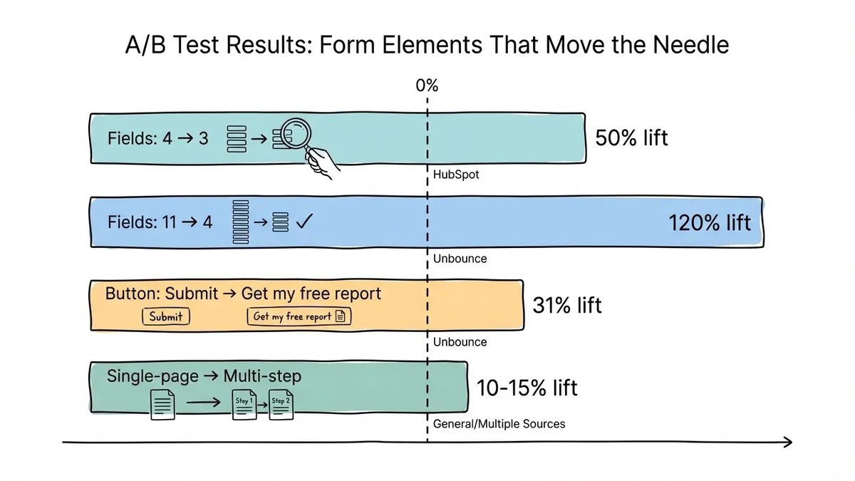
This is the highest-impact variable in almost every form test. HubSpot’s research across thousands of forms found that reducing fields from four to three increased conversions by 50%. Unbounce reported a 120% lift when going from 11 fields to 4.
Run a simple A/B test: your current form against a version with one or two fewer fields. If you’re worried about data quality, track whether the shorter form produces leads that are just as qualified. In most cases, it does. Before declaring a winner, run both variants through our free statistical significance calculator — with small samples, an impressive-looking gap is often just noise.
Submit button copy
“Submit” is the most common button label and one of the weakest. It tells people what they’re doing mechanically but says nothing about what they’re getting.
Test specific, value-oriented button text:
- “Get my free report” outperformed “Submit” by 31% in a test by Unbounce
- “Start my free trial” beats “Sign up” because it emphasizes what the user receives
- “Send my request” feels more personal than “Submit form”
First-person phrasing (“Get my…”) tends to outperform second-person (“Get your…”) by a small but consistent margin. It’s worth testing with your specific audience.
Single-page vs. multi-page layout
For forms with more than five fields, splitting them across pages almost always wins. The psychological principle at work is the “foot-in-the-door” technique: once someone completes the first easy step, they’re more likely to continue.
Test a single-page version against a multi-page version where the first page has just two or three low-friction fields (name and email). Measure both completion rate and submission quality.
Field order
Put the easiest, least personal fields first. Name and email before phone number. General questions before specific ones. This builds momentum. By the time someone reaches the more sensitive or effortful fields, they’ve already invested time and are less likely to abandon.
If you want to know which specific fields cause the most drop-off in your forms, tracking per-field analytics will show you exactly where people quit.
Psychological triggers that increase form submissions
People don’t fill out forms based on pure logic. Emotional and psychological factors play a huge role in whether someone completes a form or closes the tab. Here are the triggers that consistently improve form conversion rates.
Social proof near the form
Placing a testimonial, customer count, or trust badge next to your form reduces the perceived risk of submitting personal information. A study by Nielsen Norman Group found that trust signals placed within visual proximity of a form increased completion rates by up to 12%.
Effective social proof for forms:
- “Join 15,000+ marketers who get our weekly newsletter” (specific number)
- A short testimonial from a recognizable company or person
- Trust badges (SOC 2, SSL, GDPR) if you’re collecting sensitive data
- Star ratings or review counts if applicable
The key is specificity. “Trusted by thousands” is weak. “Used by 8,400 companies including Shopify and Notion” is strong. Real numbers beat vague claims every time.
Reciprocity
Give something before you ask for something. If your form is gated behind a lead magnet, show a preview of the content before the form appears. Let people see the first page of the ebook or a summary of the key findings.
When someone receives value first, they feel a natural pull to give something back. It’s the difference between “give me your email to see this” and “here’s a taste, want the full thing?”
Urgency and scarcity (used honestly)
Real urgency works. Fake urgency backfires. If your webinar has limited seats, saying “12 spots remaining” next to the registration form will increase signups. If your free ebook is available forever, pretending it’s scarce will erode trust.
Honest urgency examples that work well with forms:
- Event registration with actual capacity limits
- Limited offer pricing with a real deadline
- Limited beta access with a genuine waitlist
Don’t manufacture urgency where none exists. People can tell, and it damages your credibility for future interactions.
Commitment and consistency
Once someone starts filling out a form, they’ve made a small commitment. The principle of consistency says they’ll want to follow through. This is why multi-step forms work so well, and why showing a progress bar (“Step 2 of 3”) increases completion rates.
You can amplify this by starting with a micro-commitment before the form itself. A quiz, a calculator, or a simple yes/no question gets people to engage before they encounter any form fields. By the time they reach the actual form, they’ve already said yes once.
Copy optimization for forms
The words on and around your form matter more than most people realize. Small copy changes can produce surprisingly large conversion lifts.
Headlines that state the value exchange
Your form headline should answer: “What do I get for filling this out?” Compare these:
- Weak: “Contact Us”
- Better: “Get a free 30-minute consultation”
- Weak: “Subscribe”
- Better: “Get weekly growth tactics (read by 12,000 marketers)”
The headline is doing the heaviest persuasion work on the page. It should be the most specific, benefit-focused piece of copy near your form.
Field labels that reduce cognitive load
Ambiguous labels cause hesitation, and hesitation causes abandonment. “Details” as a field label forces people to guess what you want. “Describe your project in 2-3 sentences” tells them exactly what to write and roughly how much.
For sensitive fields, add context that reduces anxiety. “Phone number (we’ll only text appointment confirmations)” converts better than a bare “Phone” label because it answers the unspoken question: “Are they going to call me with sales pitches?”
We wrote a detailed guide on reducing form abandonment that covers label optimization and other friction-reduction tactics.
Microcopy that builds confidence
The small text around your form fields, buttons, and privacy notices can quietly boost or kill conversions. Effective microcopy examples:
- Below the email field: “No spam. Unsubscribe anytime.”
- Near the submit button: “Takes less than 60 seconds”
- Below the form: “Your data is encrypted and never shared with third parties”
Each of these addresses a specific objection someone might have at the moment they’re deciding whether to complete the form. The best microcopy anticipates hesitation and resolves it in a few words.
Layout optimization for higher conversions
How your form is arranged on the page affects completion rates as much as what’s in it.
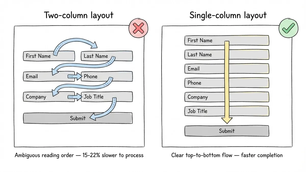
Single-column layouts win on almost every device
Two-column form layouts look efficient on desktop but create confusion about reading order. Eye-tracking studies from the Baymard Institute show that users process single-column forms 15-22% faster than multi-column ones because there’s no ambiguity about which field comes next.
The only exception: very short, related fields like “First name” and “Last name” can sit side by side without causing confusion. Everything else should stack vertically.
White space is functional, not decorative
Cramped forms feel overwhelming. Generous spacing between fields gives each element room to breathe and makes the form feel shorter than it actually is.
A good rule of thumb: vertical spacing between fields should be at least 1.5x the height of the field itself. Between sections (groups of related fields), use 2-3x. This creates natural visual grouping without needing explicit dividers.
Put the form where people expect it
For landing pages, the form should be visible without scrolling on desktop. On longer pages, repeat the form or add a sticky CTA that scrolls with the user.
For embedded forms on content pages, place them at the point of highest motivation: right after a key insight, after a product demo section, or after a case study result. In Fomr, you can embed forms anywhere on your site using a lightweight JavaScript widget, which makes it easy to test different placements without rebuilding pages.
Mobile form optimization
Over 60% of web traffic is mobile, but mobile form completion rates are consistently 10-20% lower than desktop. Closing that gap is one of the fastest ways to improve your overall form conversion rate.
Thumb-friendly tap targets
Apple’s Human Interface Guidelines recommend a minimum tap target of 44x44 points. Google’s Material Design spec says 48x48dp. If your form fields and buttons are smaller than that, mobile users will misclick, get frustrated, and leave. This applies to radio buttons, checkboxes, and dropdown triggers too.
Input types and autocomplete
Using the correct HTML input type triggers the right mobile keyboard. type="email" shows the @ symbol. type="tel" shows the number pad. Enable autocomplete attributes where appropriate too. Most mobile browsers can auto-fill name, email, phone, and address fields if the form is properly marked up. That turns a 30-second typing exercise into a two-tap completion.
Test on real devices
Browser dev tools simulate screen size but miss real-world issues: keyboard overlap hiding fields, autocomplete differences between iOS and Android, and touch target spacing that feels fine with a mouse cursor but terrible with a thumb. Test on at least one iPhone and one Android device before publishing.
Putting it all together: a form optimization checklist
You don’t need to implement everything at once. Start with the changes most likely to produce results for your specific situation.
High-impact changes (do these first):
- Remove any field you won’t use in the next 30 days
- Rewrite your submit button to state the value (“Get my free guide”)
- Add one piece of social proof within visual range of the form
- Test single-page vs. multi-page if you have more than five fields
Medium-impact changes:
- Rewrite field labels to be specific and unambiguous
- Add microcopy that addresses the top objection for each sensitive field
- Ensure all fields use correct input types for mobile keyboards
- Add a progress bar to multi-step forms
Ongoing optimization:
- Track per-field drop-off rates to find your biggest friction points
- Run one A/B test per month on a single form element
- Review mobile completion rates separately from desktop
- Check form performance by traffic source (organic vs. paid vs. email)
If you want to dig deeper into design-specific improvements, our guide on form design tips to boost completion rates covers visual hierarchy, typography, and layout patterns in more detail.
Start optimizing your forms today
Form conversion optimization isn’t a one-time project. It’s an ongoing practice of measuring, testing, and refining. But the first round of improvements usually produces the biggest gains, because most forms have never been optimized at all.
Pick one tactic from this guide and apply it to your highest-traffic form this week. Measure the result. Then pick another. Small, consistent improvements compound into significant conversion gains over time.
If you need a form builder that gives you the design flexibility to actually implement these optimizations, Fomr lets you customize every visual detail (fonts, colors, backgrounds, layouts) and test different form structures without writing code. You can try it right now without creating an account and see how your forms could look with proper optimization applied.