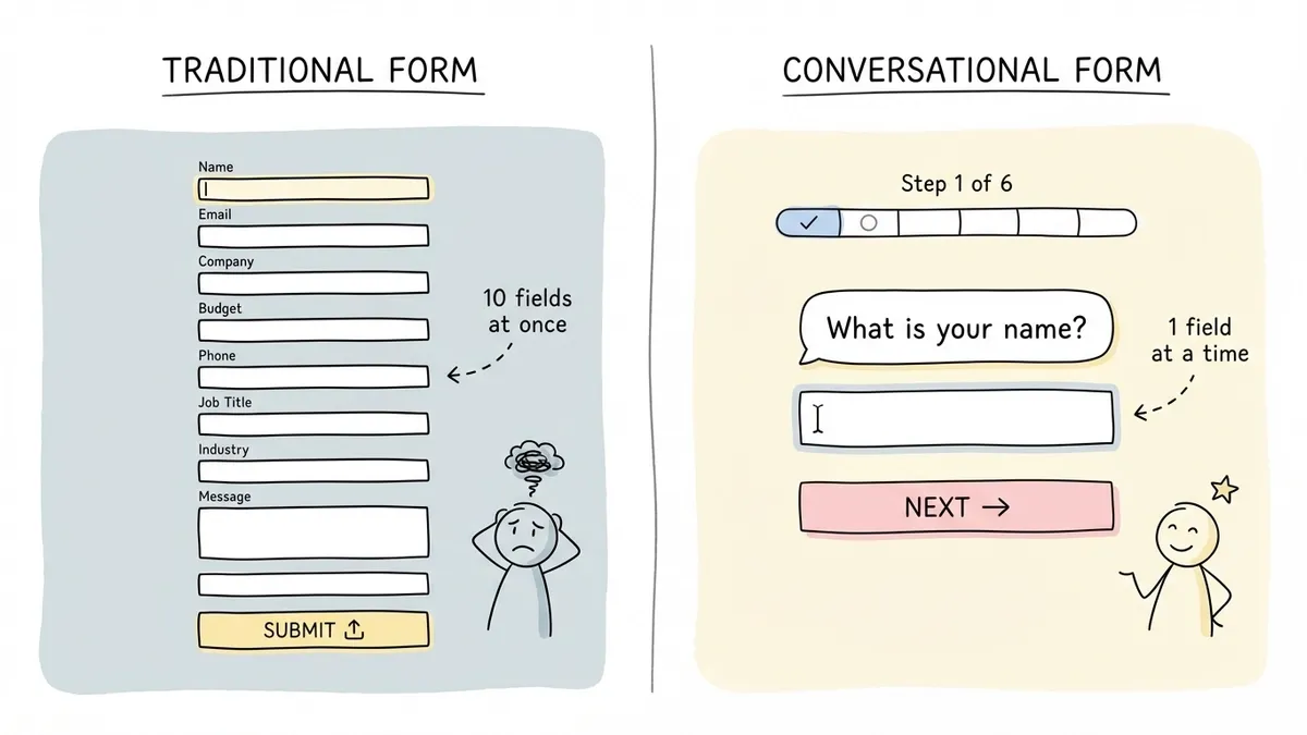
Think about the last time you filled out a government form online. Thirty fields on a single page. Tiny labels. A submit button at the bottom that felt like it was mocking you. Now think about the last time someone asked you a question in a conversation. They asked one thing, you answered, they asked the next thing. No scrolling. No overwhelm.
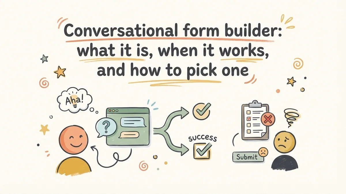
That’s the core idea behind a conversational form builder: instead of presenting every field at once, you show one question at a time. The respondent answers, and the form advances. It feels less like paperwork and more like a dialogue.
Typeform popularized this pattern around 2012, and it spread fast. Today, dozens of form tools offer some version of it. But here’s what most “conversational forms are amazing!” articles won’t tell you: this format is not universally better. It’s a design choice with real trade-offs, and picking the wrong format for your use case can actually hurt your completion rates.
Let’s break down when conversational forms genuinely outperform traditional ones, when they don’t, and what to look for in a builder.
What conversational forms actually are
A conversational form presents questions sequentially, one at a time, with transitions between them. The respondent sees a single question, answers it, and the next question appears. Some implementations auto-advance after selection (pick an option and the form moves on), while others require clicking a “Next” button or pressing Enter.
The term gets used loosely. Some people mean a literal chatbot interface with speech bubbles. Others mean any form that shows one question per screen. For this article, we’re talking about the second type: a structured form with defined fields, presented in a sequential, focused way. Not a chatbot. Not AI-generated follow-up questions. Just a regular form with a different presentation layer.
This distinction matters because the two approaches have very different strengths. Chatbot-style forms can handle open-ended conversations but are harder to build, harder to analyze, and prone to going off-script. Sequential one-question-at-a-time forms keep the structure of a traditional form while borrowing the pacing of a conversation.
How the UX actually differs
The psychological difference between seeing 12 fields on a page and seeing one field at a time is bigger than it sounds.
When someone lands on a long traditional form, their brain does a quick cost-benefit calculation: “Is what I’m getting worth filling all this out?” If the answer is no, or even maybe, they leave. The Baymard Institute has documented this pattern extensively in checkout research. Perceived effort drives abandonment more than actual effort.
Conversational forms short-circuit that calculation. The respondent sees one easy question. They answer it. Now they’ve invested something, and the sunk cost effect kicks in. Each answered question makes the next one feel smaller. By the time they hit a harder question (budget, phone number, detailed requirements), they’re already five answers deep and much less likely to bail.
There’s a focus benefit too. With one question on screen, there’s nothing else competing for attention. No scanning ahead to see what’s coming. No anxiety about how much is left. Just this one thing, right now.
The numbers
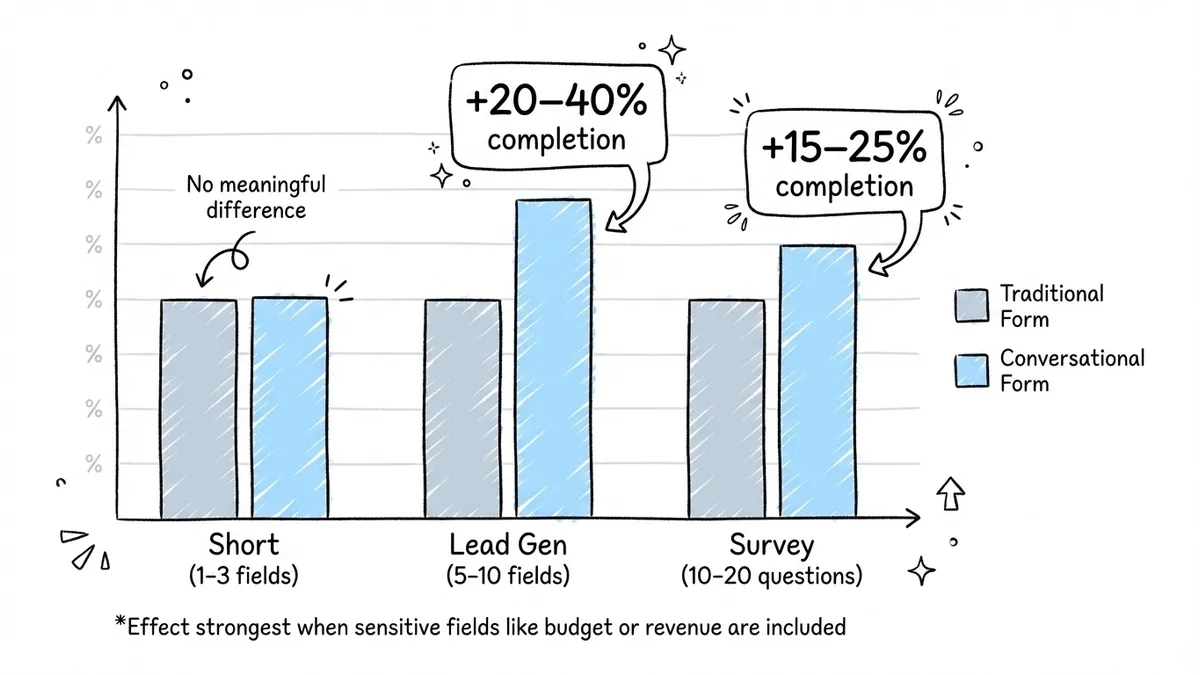
Conversion rate comparisons between traditional and conversational forms vary wildly depending on the study, the form type, and the audience. That said, some patterns are consistent enough to be useful:
- Lead generation forms (5-10 fields): Conversational layouts tend to see 20-40% higher completion rates compared to single-page equivalents. The effect is strongest when the form asks for sensitive information like budget or revenue.
- Surveys (10-20 questions): Completion rate improvements of 15-25% are common. The one-at-a-time pacing makes long surveys feel shorter.
- Short forms (1-3 fields): No meaningful difference, and sometimes the conversational format performs worse because it adds unnecessary clicks.
These aren’t guarantees. Your specific audience, your form’s context, and the quality of your questions all matter more than the format alone. But the trend is clear: for forms with more than a handful of fields, conversational layouts reduce perceived effort and improve completion.
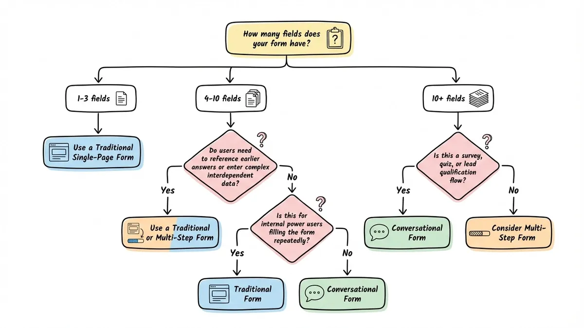
When conversational forms are the right call
Not every form benefits from the one-question-at-a-time treatment. Here’s where it genuinely helps:
Surveys and feedback collection. If you’re asking 8+ questions, the conversational format keeps people engaged. Each question feels quick, even when the total count is high. This is probably the single best use case for the format.
Lead qualification. Asking someone their budget, company size, or timeline feels invasive on a traditional form where all the questions are visible at once. In a conversational flow, each question arrives in context, and people are more willing to answer honestly.
Quizzes and assessments. The sequential format naturally creates a quiz-like rhythm. Answer, advance, answer, advance. It’s engaging in a way that a wall of radio buttons isn’t.
Onboarding and signup flows. Collecting preferences, profile details, or account setup information works well as a guided sequence. Each step builds on the last, and the respondent feels like they’re making progress rather than filling out a form.
Event registrations with many attendee details. When you need names, dietary preferences, session choices, and contact info for multiple people, breaking it into a conversation prevents the form from looking like a spreadsheet.
For more on structuring longer forms, our guide on multi-step forms covers the principles of grouping and pacing that apply here too.
When conversational forms are the wrong call
Here’s where I’d push back on the “conversational forms are always better” narrative. There are real scenarios where this format hurts more than it helps.
Short contact forms. A name, email, and message field don’t need the conversational treatment. Three fields on a page is already fast. Adding transitions and one-at-a-time pacing just slows things down and makes a simple action feel like a process.
Forms where people need to reference previous answers. Expense reports, detailed applications, order forms with multiple line items. If someone needs to scroll back and check what they entered three screens ago, the conversational format creates friction that a traditional layout avoids.
Data-heavy internal forms. If your team fills out the same 20-field form dozens of times a day, they don’t want animations and transitions. They want to tab through fields as fast as possible. Speed trumps engagement for power users.
Forms with complex interdependencies. When field B depends on field A and field C depends on both, and the user might need to revise their answers after seeing later questions, a traditional layout where everything is visible gives more control.
The honest answer is that form format should match the context. A conversational form builder is a tool, not a universal upgrade. The form UX best practices that matter most (clear labels, smart validation, appropriate field sizing) apply regardless of which format you choose.
Design principles for conversational form UX
If you’ve decided the conversational format fits your use case, here’s how to do it well. These principles separate forms that feel natural from ones that feel gimmicky.
One concept per screen
This sounds obvious, but it’s easy to get wrong. “One question at a time” doesn’t mean “one field at a time.” If you’re asking for a first name and last name, those belong on the same screen. They’re one concept: your name. Splitting them into two separate screens feels tedious.
Group by concept, not by field count. Address fields (street, city, state, zip) can share a screen. But don’t mix “What’s your email?” with “How did you hear about us?” on the same screen just because they’re both short.
Make transitions feel intentional
The animation between questions matters more than you’d think. Too fast and it feels jarring. Too slow and it feels sluggish. A 300-400ms slide or fade transition hits the sweet spot for most people.
Auto-advance (moving to the next question automatically after a selection) works great for multiple choice, ratings, and yes/no questions. For text inputs, let the respondent press Enter or click a button. Auto-advancing on text fields would be chaotic.
Show progress without creating anxiety
A progress bar or step counter helps people understand where they are. But be careful with how you display it. Showing “Question 3 of 47” on a long survey can backfire. Consider showing progress as a percentage or a simple bar that fills up, without the exact count.
For shorter forms (under 10 questions), showing the count is fine. For longer ones, the bar alone is less intimidating.
Write questions like a human would ask them
Traditional form labels are terse: “Email address.” “Phone number.” “Company size.” In a conversational form, you have room to be more natural. “What’s the best email to reach you?” or “How large is your team?” feels more like a conversation and less like a database schema.
Don’t overdo it, though. “Hey there! We’d absolutely love to know your super awesome email address!” is worse than “Email address.” Be natural, not performative.
Keep the back button accessible
People will want to change their answers. Make it easy to go back. A visible back arrow or “Previous” link should be on every screen. And when they go back, their previous answer should still be there. Losing entered data is the fastest way to get someone to abandon your form entirely.
What to look for in a conversational form builder
If you’re evaluating tools, here’s what actually matters:
Auto-advance behavior. Can the form automatically move to the next question after a selection? This is the core of the conversational experience. Without it, you just have a multi-step form with one field per step. In Fomr, this is called auto-jump, and it works across all question types, with smooth animated transitions between questions.
Transition quality. Cheap implementations just hide one div and show another. Good ones animate the transition smoothly. This sounds cosmetic, but it’s the difference between a form that feels polished and one that feels like a slideshow.
Design flexibility. Many conversational form tools lock you into a specific look. If you need your form to match your brand (custom fonts, colors, backgrounds), check whether the builder gives you that control or forces you into their template.
Fallback for short forms. Can you use the same tool for both conversational and traditional layouts? You probably don’t want one tool for your 15-question survey and a different one for your 3-field contact form.
Embedding options. Most conversational forms need to live on your website, not on a separate page. Look for embed options that work cleanly: inline embeds, popups, or fullscreen takeovers. A form that only works as a standalone link limits where you can use it.
Pricing that doesn’t punish growth. Some builders charge per response, which means your costs scale with your success. Others charge flat rates or offer generous free tiers. If you’re collecting hundreds or thousands of responses, per-response pricing adds up fast.
Building your first conversational form
The fastest way to see if this format works for your use case is to try it. Take an existing form that has a mediocre completion rate and rebuild it as a conversational flow. Keep the same questions, just change the presentation.
Here’s a practical approach:
- Pick a form with 6+ fields and a completion rate you’re not happy with.
- Group the fields by concept (not one field per screen, but one topic per screen).
- Rewrite the labels as natural questions where it makes sense.
- Enable auto-advance for selection-based questions.
- Run both versions for a week or two and compare completion rates.
If you want to test this without committing to a new tool, Fomr’s guest editor lets you build a form with auto-jump enabled without creating an account. Build it, share the link, and see how it performs against your current form.
For more on improving completion rates regardless of format, our form conversion optimization guide covers the broader set of tactics that apply to any form layout.
The format is a tool, not a philosophy
Conversational forms work well for specific use cases. They’re not a magic fix for every form, and they’re not inherently superior to traditional layouts. The best form builders give you both options and let you choose based on what your respondents actually need.
Pick the format that matches your form’s length, complexity, and audience. Test it. Measure it. And don’t let anyone tell you that one approach is always right.