Last week I filled out a conference registration form that asked me about my dietary restrictions, T-shirt size, and hotel preferences. I was attending virtually. None of those questions applied to me, but the form had no way of knowing that because every attendee saw the exact same 23 fields regardless of how they answered the first question.
I almost closed the tab. Plenty of people would have.
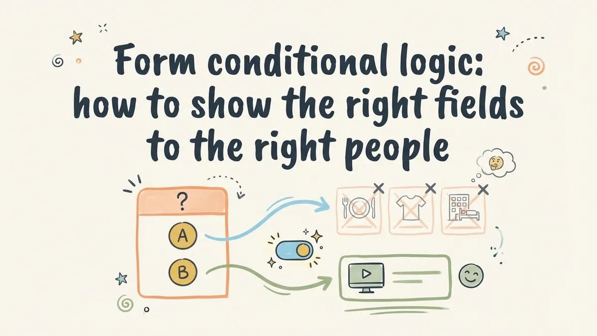
This is the problem that form conditional logic solves. Instead of dumping every possible question on every respondent, you show or hide fields based on what someone has already told you. The form adapts. Irrelevant questions disappear. The experience feels shorter, smarter, and more respectful of the person’s time.
What conditional logic actually means
Conditional logic (sometimes called skip logic, branching logic, or show/hide rules) is a set of rules that control which fields or pages a user sees based on their previous answers. The concept is simple: if a user picks option A, show them fields related to A. If they pick option B, skip ahead to something else.

Here’s a concrete example. Say you’re building a lead generation form for a marketing agency. One of your first questions is “What type of business are you?” with two options: B2B and B2C. A B2B company cares about lead volume, sales cycle length, and CRM integrations. A B2C company cares about ad spend, customer acquisition cost, and e-commerce platforms. Asking both groups every question wastes everyone’s time and muddies your data.
With conditional form fields, you ask the business type question once, and the rest of the form reshapes itself around the answer. B2B respondents see B2B-relevant fields. B2C respondents see B2C-relevant fields. Both groups finish faster, and you get cleaner data on the other end.
That’s the whole idea. No magic, just relevance.
Why it matters more than most people think
The average form abandonment rate hovers around 67%. That number gets worse as forms get longer. Every irrelevant field you show someone is a small nudge toward the back button.
Conditional logic attacks this problem directly. When you hide fields that don’t apply, you’re effectively shortening the form for each individual user without losing any of the data you need. A 20-field form might only show 8 fields to any given person. The form is still comprehensive on the backend, but it feels focused on the frontend.
There’s a psychological component too. When a form responds to your answers in real time, it feels like a conversation rather than a bureaucratic checklist. You answered “I’m attending in person,” and suddenly the form asks about your meal preference. That makes sense. It feels intentional. People are more likely to keep going when the questions feel relevant to them specifically.
If you’re already thinking about how to reduce form abandonment, conditional logic is one of the highest-impact changes you can make. It’s not a cosmetic tweak. It’s a structural improvement to how your form works.
Common patterns that work well
Not every form needs conditional logic. A three-field contact form is fine as-is. But once you’re collecting more than basic information, these patterns come up again and again.
Qualifying questions that route people
This is the most common use case. You ask a broad question early in the form, and the answer determines which path the user takes.
Examples:
- “Are you a new or returning customer?” New customers see onboarding questions. Returning customers skip straight to their request.
- “What department is this request for?” IT requests show technical fields. HR requests show employee-related fields.
- “How many employees does your company have?” Enterprise prospects get routed to a sales call booking. Small teams get sent to a self-serve signup.
The qualifying question acts as a fork in the road. Everything downstream depends on it.
Showing detail fields only when relevant
Sometimes you don’t need to branch the entire form. You just need to show one or two extra fields when a specific answer triggers them.
The classic version: a dropdown with an “Other” option that reveals a text field. But there are better examples. An event registration form that shows dietary restriction options only if someone selects “Yes, I’ll attend the dinner.” A job application that shows a portfolio URL field only if the applicant selects a creative role. A feedback form that shows a follow-up text box only if someone rates their experience below 3 out of 5.
These small conditional fields keep the form clean for most users while still collecting the detail you need from specific respondents.
Multi-page forms with dynamic routing
When you combine conditional logic with multi-step forms, things get interesting. Instead of just showing or hiding individual fields, you can skip entire pages.

Picture a loan application. Page one asks what type of loan you need: personal, auto, or mortgage. Based on that answer, the form jumps to a page tailored to that loan type. Personal loan applicants see income and employment questions. Mortgage applicants see property and down payment questions. Auto loan applicants see vehicle information fields.
Each user sees three or four pages instead of ten. The form collects everything it needs without forcing anyone through sections that have nothing to do with them.
Calculated follow-ups
This pattern is less obvious but really useful. You use a previous answer to change the content or options in a later question.
If someone says they manage a team of 50+, your next question about communication tools might include enterprise options like Slack Enterprise Grid or Microsoft Teams. If they manage a team of 5, you show simpler options. The question is the same, but the choices adapt.
This works well for product recommendation forms, assessment quizzes, and any situation where the right options depend on context the user has already provided.
Practical tips for building conditional forms
Knowing the patterns is one thing. Building them well is another. Here are the things I’ve seen trip people up most often.
Start with a flowchart, not a form builder
Before you open any tool, sketch out the logic on paper or in a simple diagram. Write down every question, every possible answer, and where each answer should lead. This takes ten minutes and saves hours of rework.
I’ve watched people try to build conditional logic on the fly, adding rules one at a time as they think of them. It always turns into a mess. Conflicting rules, dead-end paths, questions that reference fields the user never saw. Map it out first.
Keep your conditions simple
The temptation is to build elaborate logic chains: “If field A equals X AND field B equals Y OR field C is not empty, then show field D.” That kind of complexity is hard to test, hard to debug, and easy to break when you edit the form later.
Stick to single-condition rules whenever possible. If you find yourself needing three or four conditions to determine whether a field should appear, that’s a sign your form structure needs rethinking. Maybe you need an extra qualifying question earlier in the flow, or maybe you should split the form into separate forms entirely.
Test every path
This is the step people skip, and it’s the one that matters most. If your form has conditional logic, you need to fill it out multiple times, choosing different options each time, to make sure every path works correctly.
Check for:
- Dead ends where the user gets stuck with no fields to fill out and no way to submit
- Required fields that are hidden but still blocking submission
- Logic loops where two conditions contradict each other
- Pages that show up empty because all their fields are conditionally hidden
Automated testing is great if you have it, but even manual testing catches most problems. Just go through every branch at least once.
Don’t hide too aggressively
There’s a balance between showing irrelevant fields and hiding so much that the form feels unpredictable. If a user goes back to change an earlier answer and half the form rearranges itself, that’s disorienting.
Be transparent about what’s happening. Progress indicators help. So does keeping the overall structure stable even when individual fields change. If your form has five pages, it should always have roughly five pages, even if the content on those pages shifts based on answers.
Think about the data on the other end
Conditional logic means different respondents fill out different fields. That’s the whole point, but it creates complexity in your data. Some responses will have values for fields that others left blank (because they never saw those fields).
Plan for this when you set up your spreadsheet, dashboard, or CRM integration. You’ll want to filter and segment by the qualifying questions so you’re comparing apples to apples. Don’t average across fields that only half your respondents answered.
Real-world examples worth studying
Abstract advice only goes so far. Here are specific form types where conditional logic makes a measurable difference.
Event registration forms. Ask “Will you attend in person or virtually?” first. In-person attendees see travel, accommodation, and meal preference fields. Virtual attendees see timezone and platform preference fields. This alone can cut the perceived form length in half for each group. We’ve written about building these in our guide to creating event registration forms.
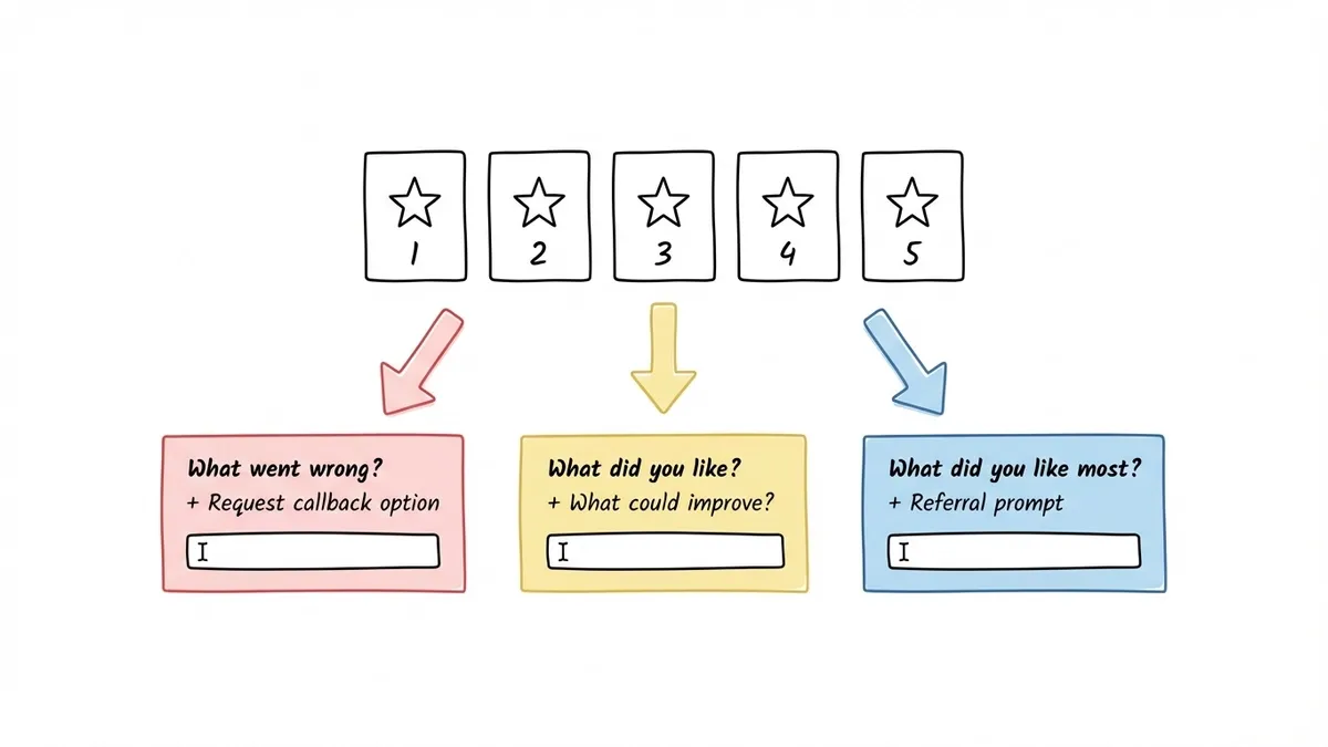
Customer feedback forms. Start with a satisfaction rating. If someone rates you 4 or 5 stars, show a short “What did you like most?” text box and a referral prompt. If they rate you 1 or 2 stars, show a “What went wrong?” text box and an option to request a callback. The 3-star crowd gets a balanced set of both. This approach gets you more actionable feedback because the follow-up questions match the sentiment.
Lead qualification forms. Ask about company size or budget range early. High-value leads get routed to a longer form that collects detailed requirements and books a sales call. Smaller leads get a shorter form and an automated email sequence. This is one of the most effective patterns for lead generation forms that convert because it respects both the prospect’s time and your sales team’s bandwidth.
Employee onboarding forms. Ask about the department and role first. Engineering hires see questions about equipment preferences and development environment. Marketing hires see questions about tool access and brand guidelines. Everyone sees the standard HR and payroll fields, but the role-specific sections only appear for the right people.
Where form builders stand on conditional logic
Most modern form builders support some version of conditional logic, but the implementations vary a lot. Some give you a visual rule builder where you click through conditions. Others require you to write expressions or use a formula syntax. A few only support basic show/hide on individual fields without page-level branching.
When evaluating a form builder for dynamic form fields, check whether it supports:
- Field-level conditions (show/hide individual fields)
- Page-level conditions (skip entire pages)
- Multiple conditions per rule (AND/OR logic)
- Conditions based on different field types (not just dropdowns)
At Fomr, we’re building conditional logic as one of our next major features. It’s not available yet, but it’s at the top of our roadmap because we know how much it matters for the kinds of forms our users build. In the meantime, Fomr’s multi-page forms and auto-jump mode already help you create focused, conversational experiences that keep completion rates high. You can structure your pages so each one covers a specific topic, which gets you partway to the branching experience even without formal logic rules.
If you want to see how multi-page forms feel in practice, you can try the editor without signing up and build a quick prototype in a few minutes.
The bottom line
Form conditional logic isn’t a nice-to-have feature for complex forms. It’s the difference between a form that respects the respondent’s time and one that treats every person like they’re the same. The forms that perform best are the ones that feel like they were built specifically for the person filling them out.
Start by identifying the one question in your form where answers diverge. That’s your branching point. Build from there, keep the rules simple, and test every path before you publish. Your completion rates will reflect the effort.
If you’re building forms that need to collect different information from different people, give Fomr a try. Even without conditional logic today, the multi-page editor and design flexibility make it straightforward to create forms that feel personal and focused.