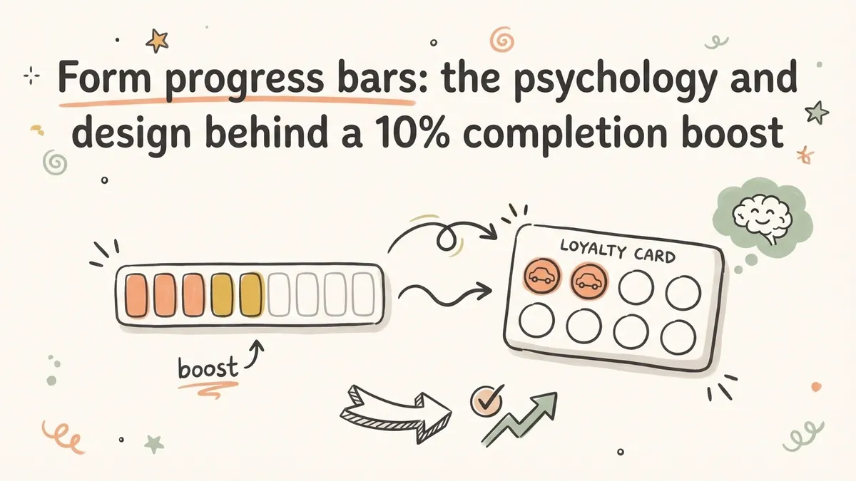
A car wash loyalty card with two free stamps already filled in gets redeemed 34% more often than a blank card with fewer total stamps needed. The math is the same. The effort is the same. But the card that looks like you’ve already started wins by a landslide.
That finding, from a 2006 study by Joseph Nunes and Xavier Dreze at the University of Southern California, has direct implications for anyone building online forms. A form progress bar does the same thing as those pre-stamped loyalty cards: it tells people they’ve already begun, and finishing is closer than they think. The result is a measurable bump in completion rates, typically between 10% and 15% for multi-page forms.
That’s not a small number. If your form gets 1,000 visitors a month and you’re converting 40% of them, a 10% improvement means 40 extra completions every month. No copy changes. No redesign. Just a bar at the top of the page.
Here’s what the research says about why progress indicators work, which type to use, and how to design them so they actually help rather than backfire.
Why progress bars work: two psychological effects
The effectiveness of form progress indicators isn’t just intuitive. It’s grounded in two specific, well-studied psychological phenomena.
The goal gradient effect
In 1934, behaviorist Clark Hull observed that rats in a maze ran faster as they got closer to the food at the end. The closer the goal, the harder they worked. Ran Kivetz, Oleg Urminsky, and Yuhuang Zheng replicated this with humans in a 2006 paper published in the Journal of Marketing Research. They tracked customers on a coffee loyalty program and found that purchase frequency accelerated as people approached their free coffee. The gap between the 8th and 9th purchase was shorter than the gap between the 2nd and 3rd.
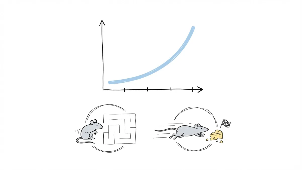
Applied to forms, this means respondents speed up as they approach the end. A progress bar makes the approaching finish line visible. Without one, users have no sense of proximity to the goal, so the acceleration never kicks in. They’re running a maze with no idea how long it is.
This is especially relevant for multi-step forms, where the page transitions create natural “checkpoints” that a progress bar can mark. Each completed step is a small win that pulls the respondent forward.
The endowed progress effect
This is the car wash study mentioned above. Nunes and Dreze gave customers one of two loyalty cards: a blank 8-stamp card, or a 10-stamp card with 2 stamps already filled in. Both required 8 more purchases to earn the reward. The 10-stamp group completed the card at a 34% higher rate.
The explanation: people are more motivated to finish something they perceive as already in progress than to start something from scratch. A form progress bar that shows “Step 1 of 4 complete” after the first page triggers this effect. The respondent feels invested. They’ve made progress. Quitting now means losing that progress.
This is one reason why reducing form abandonment often comes down to small perception shifts rather than dramatic redesigns. The form itself doesn’t change. The respondent’s sense of momentum does.
Types of form progress indicators
Not all progress indicators are the same, and the right choice depends on your form’s structure and length.
Horizontal progress bar
The classic. A filled bar that grows from left to right as the user advances through pages. It’s immediately understood by virtually everyone because it mirrors loading bars, download progress, and dozens of other UI patterns people encounter daily.
Best for: forms with 3-7 pages where you want a clean, minimal indicator that doesn’t take up much vertical space. The bar communicates proportion (how much is done vs. how much remains) at a glance.
Limitation: it doesn’t tell users what’s on each step. A bar at 50% says “you’re halfway” but not “the next section asks about your budget.” For some forms, that ambiguity is fine. For others, it creates anxiety.
Step indicator (numbered steps)
A row of numbered circles or labels connected by a line, with the current step highlighted. You’ve seen this on checkout flows: “Shipping > Payment > Review.” Each step has a name, so users know what’s coming.
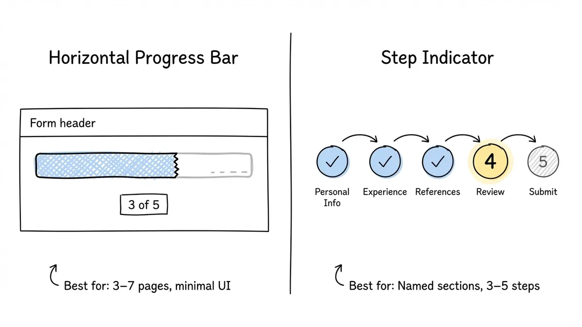
Best for: forms where the sections have distinct, meaningful categories. Job applications (“Personal Info > Experience > References”), event registrations (“Details > Preferences > Payment”), or any form where knowing the upcoming sections reduces anxiety.
Limitation: step indicators get crowded fast. Beyond 5-6 steps, the labels start truncating or wrapping on mobile screens. If your form has 10 steps, a step indicator becomes visual clutter rather than a helpful guide.
Percentage counter
A simple text display: “60% complete” or “3 of 5 sections done.” No visual bar, just a number.
Best for: situations where screen real estate is tight, like mobile-first forms or one-question-at-a-time layouts where you want minimal chrome around each question. A small percentage in the corner stays out of the way while still communicating progress.
Limitation: percentages can feel discouraging on long forms. Seeing “12% complete” after spending two minutes on a form is deflating. If your form has many steps, a percentage counter can work against you by making the remaining effort feel enormous.
Hybrid approaches
Many effective forms combine two indicators. A progress bar for the visual proportion plus a “Step 2 of 5” label for the concrete count. This covers both the “how much is left?” question (bar) and the “how many more pages?” question (label). It’s a bit more visual weight, but the clarity is worth it for complex forms.
When to use a form progress bar (and when to skip it)
Progress bars aren’t universally helpful. Here’s when they earn their place and when they can actually hurt.
Use a progress bar when:
- Your form has 3 or more pages. Single-page forms don’t need one, and two-page forms barely benefit.
- The form takes more than 60 seconds to complete. Short forms don’t generate enough anxiety about remaining effort to justify a progress indicator.
- You’re collecting sensitive or complex information. Progress bars reduce the “how much more of this?” anxiety that causes people to bail on detailed forms like job applications, insurance quotes, or medical intake forms.
Skip the progress bar when:
- Your form is a single page with a few fields. Adding a progress bar to a 3-field contact form looks silly and adds unnecessary visual noise.
- You’re using a conversational, one-question-per-page format with only 3-4 questions. The transitions themselves communicate progress, and a bar can feel heavy-handed.
- The form length is genuinely unpredictable (like a branching survey where different answers lead to different numbers of follow-up questions). A progress bar that jumps backward or stalls confuses people. If you can’t show accurate progress, don’t show any.
Design best practices for form progress bars
Getting the indicator type right is half the battle. The other half is designing it so it actually helps rather than distracts.
Put it at the top, and keep it visible
The progress bar should be the first thing users see on each page, anchored to the top of the form. If it scrolls out of view on longer pages, users lose their sense of position. A sticky progress bar that stays visible as the user scrolls is ideal for forms with longer individual steps.
Make the progress feel real
The bar should advance by a meaningful amount with each step. If you have a 10-step form and the bar barely moves after the first three steps, users feel like they’re making no progress. This is where the goal gradient effect works against you: if the goal looks far away, motivation drops.
One practical trick: front-load your shorter, easier steps. If the first two steps have 2 fields each and the third has 6, the progress bar jumps quickly at the start (building momentum) and then slows down when the user is already invested. This isn’t manipulation. It’s just smart sequencing that aligns with how motivation actually works.
Use color intentionally
The filled portion of the bar should use a color that contrasts clearly with the unfilled portion. Your brand’s primary color for the filled section and a light gray for the unfilled section is the standard pattern, and it works because it’s instantly readable.
Avoid using red or orange for the unfilled portion. Those colors signal errors or warnings, and they create a subtle sense of urgency that feels stressful rather than motivating. Green for the filled portion can work, but only if green isn’t also your error-state color (which would be unusual, but worth checking).
Don’t let the bar lie
If your form has conditional logic that adds or removes pages based on user answers, the progress bar needs to reflect the actual remaining steps, not the maximum possible steps. A bar that jumps from 40% to 80% because a conditional branch was skipped feels broken. A bar that goes backward because a new section was triggered feels worse.
The honest approach: recalculate the total steps dynamically and update the bar accordingly. If that’s technically difficult, show a step counter (“Step 3 of 5”) instead of a proportional bar, and update the total as the path becomes clear.
Keep it simple on mobile
On screens under 400px wide, a full step indicator with labels will almost certainly break. Labels truncate, circles overlap, and the whole thing becomes unreadable. For mobile, default to a simple progress bar or a compact “2/5” counter. Save the detailed step labels for desktop.
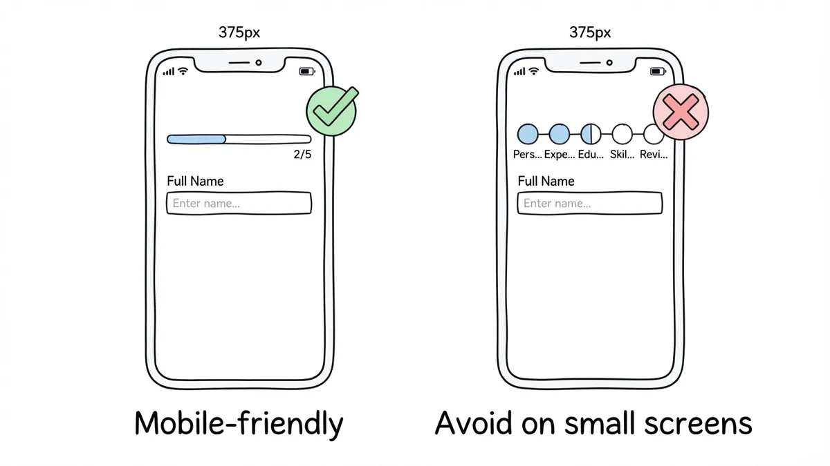
Test your progress indicator on actual phones. What looks fine in a browser resize often wraps awkwardly on a real 375px-wide screen.
Animate transitions smoothly
When the user advances to the next step, the progress bar should animate forward rather than jumping instantly. A smooth 200-300ms transition gives a satisfying sense of advancement. It’s a tiny detail, but it reinforces the feeling of making progress, which is the whole point.
Don’t overdo the animation, though. Bouncing, pulsing, or color-shifting progress bars are distracting. A simple ease-in-out fill is all you need.
How progress bars fit into broader form UX
A progress bar doesn’t fix a bad form. If your form asks for too much information, uses confusing labels, or has broken validation, a progress indicator just shows people exactly how much suffering remains. The bar is one piece of a larger form UX strategy.
That said, it’s one of the highest-impact, lowest-effort improvements you can make. It requires no copy changes, no field restructuring, and no design overhaul. You add a bar, and completions go up.
If you’re building multi-page forms in Fomr, progress bars are built in. When you split a form into multiple pages, respondents automatically see a progress indicator showing where they are and how many steps remain. You don’t need to configure it separately or write any custom code. The bar updates as respondents move through each page, and it adapts to the actual number of pages in your form.
For forms using Fomr’s auto-jump mode (where each question advances automatically after the respondent answers), the progress indicator adjusts to show per-question progress rather than per-page progress. This keeps the feedback loop tight, which matters for the goal gradient effect. Every answered question visibly moves the bar forward.
Quick checklist before you ship
Before publishing a form with a progress indicator, run through these:
- Does the bar accurately reflect the number of remaining steps? Test every conditional path if your form has branching.
- Is the bar visible without scrolling on both desktop and mobile?
- Does the bar advance by a noticeable amount with each step? If the increment is too small to see, users won’t feel the progress.
- Can users navigate backward without the bar breaking or showing incorrect progress?
- Does the indicator work on a 375px-wide screen without overlapping or truncating?
- Is the color contrast between filled and unfilled portions accessible? Check against WCAG AA standards (4.5:1 ratio for text, 3:1 for graphical elements).
If any of those fail, fix them before launch. A broken progress bar is worse than no progress bar, because it actively confuses people about where they are.
Start with the simplest version
If you’re not sure which type of progress indicator to use, start with a basic horizontal bar and a “Step X of Y” label. That combination covers the two questions every respondent has (“how much is done?” and “how many more pages?”) without adding visual complexity.
You can always upgrade to a full step indicator with named sections later if user feedback or analytics suggest people want more detail about what’s coming next. But the simple version works for the vast majority of forms, and it takes about 30 seconds to set up in most form builders.
Try it on your next multi-page form. Build one in Fomr’s guest editor if you want to see how a built-in progress bar looks and feels without creating an account. Split your form into a few pages, preview it, and watch the bar do its thing. It’s a small addition that earns its place.