
In 2008, Luke Wroblewski published eye-tracking data showing that top-aligned labels let users complete forms nearly twice as fast as left-aligned ones. That was almost two decades ago. The finding has been replicated, cited in hundreds of UX articles, and baked into every major design system. And yet, a surprising number of forms on the web still use left-aligned labels with awkward gutters between the label and the field.
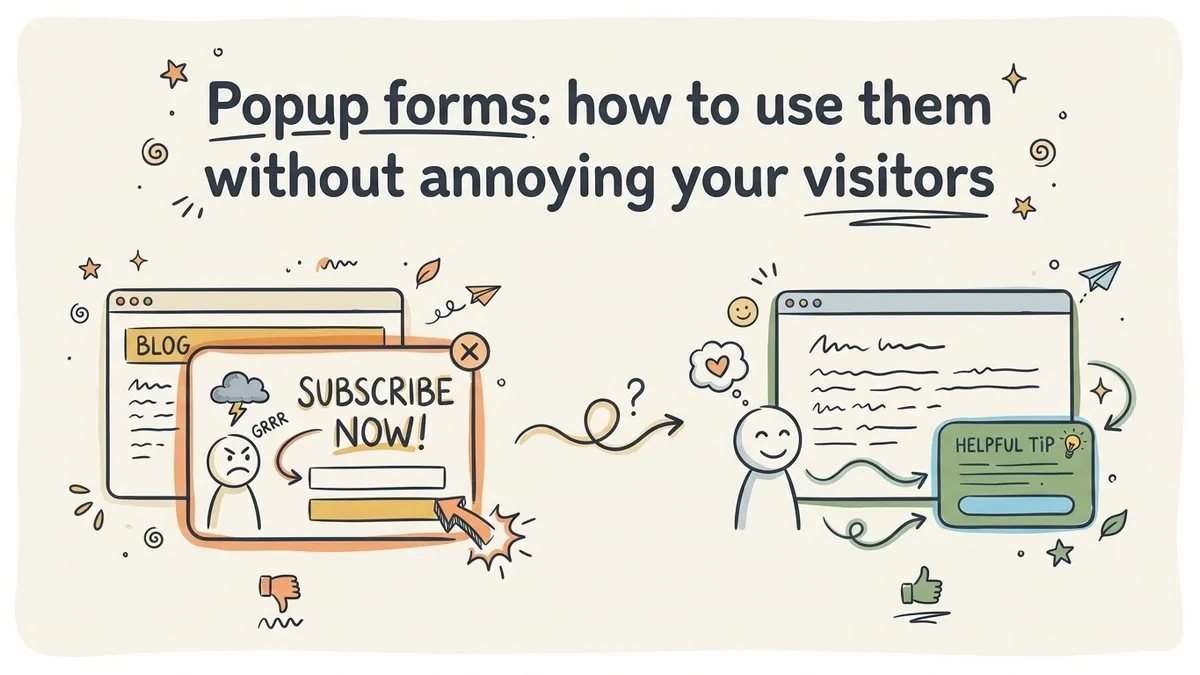
That’s the frustrating thing about form UX best practices. The research exists. It’s not ambiguous. But the gap between what we know and what actually gets built is enormous, because most form builders default to patterns that look fine in a mockup but fall apart when real people try to use them.
This post collects the findings that matter most, from sources like the Nielsen Norman Group, the Baymard Institute, and Wroblewski’s own work. Not theory. Not opinion dressed up as data. Actual tested, measured results you can apply to your next form.
Label placement matters more than you think
Wroblewski’s eye-tracking study compared three label positions: top-aligned (above the field), right-aligned, and left-aligned. Top-aligned labels produced the fastest completion times because users could process the label and the field in a single eye fixation. Left-aligned labels forced a zigzag reading pattern that slowed people down.
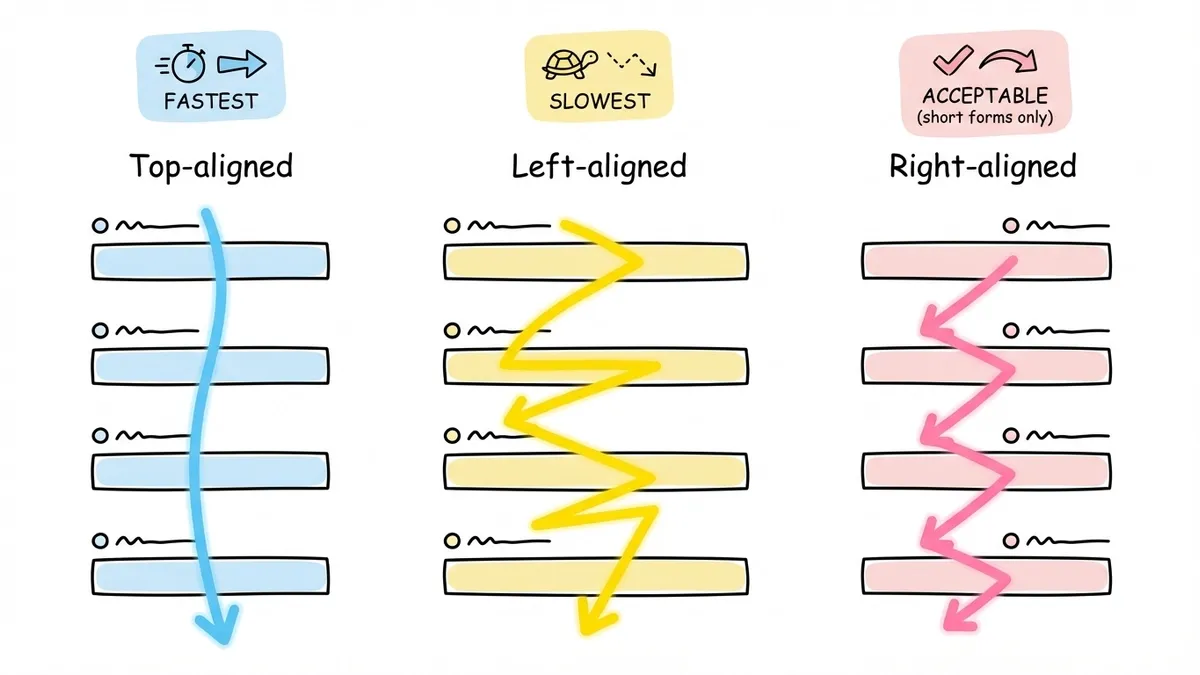
The Nielsen Norman Group confirmed this in their own testing and added a nuance: left-aligned labels work acceptably when the form is short (three to four fields) and the labels are all roughly the same length. Once you get past that, the inconsistent gutter between labels and fields creates visual noise.
For most forms, top-aligned labels are the safest choice. They scale well on mobile, they work with fields of any width, and they don’t break when a label runs long. If you’re building forms in Fomr, this is the default layout, which saves you from having to think about it.
One exception: very dense data-entry forms where vertical space is at a premium (think admin dashboards with dozens of fields). In those cases, right-aligned labels can work, but only if you’re willing to accept slower completion times in exchange for a more compact layout.
Input sizing should hint at expected length
This one is subtle but effective. When a field’s width roughly matches the expected input length, users process it faster. A zip code field that’s the same width as an address field sends a confusing signal. Is it asking for a zip code or something longer?
The Baymard Institute found that mismatched field sizes cause a measurable hesitation. Users pause, re-read the label, and sometimes type extra characters before deleting them. It’s a small friction, but it compounds across a form with many fields.
Good sizing rules of thumb:
- Zip/postal codes: narrow (5-10 characters wide)
- Phone numbers: medium (about 15 characters)
- Email addresses: wide (30-40 characters)
- Full names: wide
- State/province: narrow or use a dropdown
You don’t need pixel-perfect sizing. Just make sure the field width gives a reasonable visual hint. A phone number field that stretches the full width of the form is a missed opportunity to communicate “this is a short answer.”
The placeholder text trap
Placeholder text inside form fields looks clean in screenshots. It’s also a usability problem that has been documented repeatedly.
The core issue: placeholder text disappears when the user starts typing. If someone gets distracted mid-form and comes back, they can’t remember what a half-filled field was asking for. The Nielsen Norman Group tested this and found that placeholder-only labels (no visible label, just placeholder text) increased errors and completion time across every demographic they studied. Older users were hit hardest.
There’s a secondary problem too. Placeholder text is typically styled in light gray, which fails WCAG contrast requirements. You can darken it, but then users mistake it for pre-filled data and skip the field entirely.
Use placeholders for format hints only: “e.g., [email protected]” or “MM/DD/YYYY.” Never as a replacement for a real label. If your form looks cleaner without labels, the design needs rethinking, not the labels.
Validation timing: when you tell people matters as much as what you tell them
There are three common validation strategies, and they produce very different user experiences.
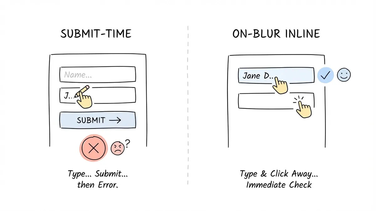
Submit-time validation waits until the user clicks the button, then dumps all errors at once. It’s the worst option. Users have to scroll back through the form, find each problem, fix it, and re-submit. If the error messages are vague (“Please correct the highlighted fields”), the experience is genuinely hostile.
Real-time validation checks each field as the user types. This sounds ideal but has a catch: if you validate too aggressively, you show errors before the user has finished typing. Flagging an email as “invalid” while someone is still typing the domain is annoying. It creates a sense of being scolded.
On-blur validation (checking when the user leaves a field) hits the sweet spot for most forms. The user has finished their input, so the feedback is timely without being premature. Luke Wroblewski tested this approach and found it reduced errors by 22% compared to submit-time validation, with no increase in completion time.
The ideal setup combines on-blur validation for most fields with real-time positive feedback. Show a subtle checkmark when a field passes validation. Hold error messages until the user moves to the next field. And when you do show an error, put it directly below the field that needs attention, not in a banner at the top of the page.
Error messages that actually help people fix the problem
“Invalid input” is the error message equivalent of a shrug. It tells the user something is wrong without giving them any way to fix it.
Good error messages have three qualities: they say what went wrong, they say why, and they suggest what to do. “Phone number must be 10 digits. You entered 9.” is a complete error message. “Invalid phone number” is not.
A few patterns from the Baymard Institute’s checkout usability research:
- State the requirement, not just the violation. “Password must be at least 8 characters” beats “Password too short.”
- Use the user’s actual input in the message when possible. “Did you mean gmail.com?” for a typo in an email domain is genuinely helpful.
- Don’t blame the user. “Please enter a valid email” implies they did something wrong. “This doesn’t look like an email address. Check for typos?” is the same message without the accusation.
Color alone isn’t enough for error states. About 8% of men have some form of color vision deficiency, so a field that only turns red will be invisible to a meaningful chunk of your users. Pair color with an icon and descriptive text. We covered this in more detail in our post on form design tips to boost completion rates.
Required vs. optional: mark the minority
There’s a long-running debate about whether to mark required fields with an asterisk or mark optional fields with “(optional).” The research points to a simple rule: mark whichever group is smaller.
If most fields are required, mark the few optional ones. If most are optional, mark the required ones. This reduces visual clutter because you’re adding indicators to fewer fields.
The asterisk convention () is widely understood, but it’s not universal. The Baymard Institute found that some users, particularly older ones, don’t associate the asterisk with “required.” If you use asterisks, include a brief note at the top of the form: ” Required field.” It takes five words and eliminates confusion.
A better approach for most forms: just remove optional fields. If a field is optional, ask yourself whether you really need it. Every optional field still adds cognitive load. The user has to read it, decide whether to fill it in, and move on. That decision costs mental energy even when the answer is “skip it.” If you’re collecting information you might not use, you’re taxing your users for nothing.
Tab order and keyboard navigation
This is the form UX best practice that gets ignored most often, probably because it’s invisible to anyone using a mouse. But keyboard users, screen reader users, and power users who tab through forms quickly will notice immediately when tab order is broken.
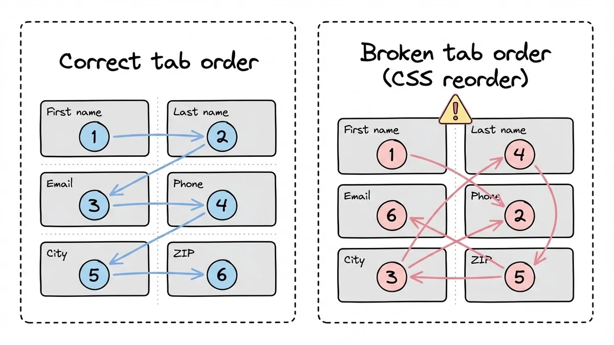
Tab order should follow the visual reading order of the form: left to right, top to bottom. When it doesn’t, because fields were rearranged visually with CSS but not in the DOM, users end up jumping to unexpected places. It’s disorienting.
Test your forms by putting your mouse away and completing the entire form with just a keyboard. Tab through every field. Make sure focus states are visible (a clear outline or highlight on the active field). Check that pressing Enter submits the form. If any of these feel wrong, your keyboard users are having a bad time.
This is especially important for multi-step forms, where tab order needs to work correctly within each page and the transition between pages shouldn’t trap keyboard focus.
Button copy: say what happens next
“Submit” is the most common form button label. It’s also one of the least effective. It describes the mechanical action (submitting data) without telling the user what they get.
Research from Unbounce found that specific, value-oriented button text outperformed generic labels by 30% or more. “Get my free quote” beats “Submit.” “Send my message” beats “Submit.” “Create my account” beats “Sign up.”
First-person phrasing tends to edge out second-person in A/B tests. “Get my report” slightly outperforms “Get your report.” The difference is small but consistent enough to be worth adopting as a default.
Two more button details that matter:
- Make the primary action button visually dominant. If you have both “Submit” and “Cancel” buttons, the submit button should be larger, more colorful, or more prominent. Users shouldn’t have to think about which button to click.
- Don’t disable the submit button until all fields are valid. This is a common pattern that backfires. Users click the grayed-out button, nothing happens, and they don’t know why. It’s better to let them click and then show specific error messages.
We wrote more about how button copy and form layout affect conversions in our form conversion optimization guide.
Progress indication for longer forms
Any form longer than five or six fields benefits from some kind of progress signal. The user needs to know how much is left. Without that signal, longer forms feel like they might go on forever, and that uncertainty drives abandonment.
The most common approaches:
- Step indicators (“Step 2 of 4”) are simple and effective. They set clear expectations.
- Progress bars give a visual sense of completion percentage. They work well but can backfire if the bar moves unevenly (a page with two fields followed by a page with ten fields makes the bar feel dishonest).
- Section headers on single-page forms (“Personal Info,” “Shipping Address,” “Payment”) act as implicit progress markers. Users can scan ahead and see how much remains.
The key is honesty. If you say “3 steps” and then add a surprise fourth step, users feel tricked. If your progress bar jumps from 50% to 80% on one click, it undermines trust. Match the progress indicator to the actual effort remaining.
For forms that genuinely need many fields, splitting them across pages with a clear progress indicator reduces abandonment significantly. The psychological principle is simple: each completed step creates a small sense of accomplishment that motivates the user to continue.
Putting it all together
Form usability isn’t one big decision. It’s dozens of small ones, and the research gives us clear answers for most of them. Top-aligned labels. Sized inputs. On-blur validation. Specific error messages. Honest progress indicators. Button copy that tells people what they’ll get.
The hard part isn’t knowing what to do. It’s actually doing it, because most form builders make these details tedious to control. That’s one of the reasons we built Fomr the way we did: the editor gives you direct control over layout, typography, field sizing, and multi-page structure so you can apply these practices without fighting your tools. You can try it without creating an account if you want to see how it works.
But regardless of what tool you use, the principles here are universal. Pick one or two practices from this list that your current forms don’t follow, fix them, and measure the difference. The research says it’ll be worth your time. In our experience, it always is.