Every missed booking is money left on the table. A potential client visits your site, decides they want to schedule a consultation, a class, or a room, and then hits a form that asks for 14 fields, loads slowly on mobile, or just looks like it was built in 2009. They close the tab. You never know they existed.
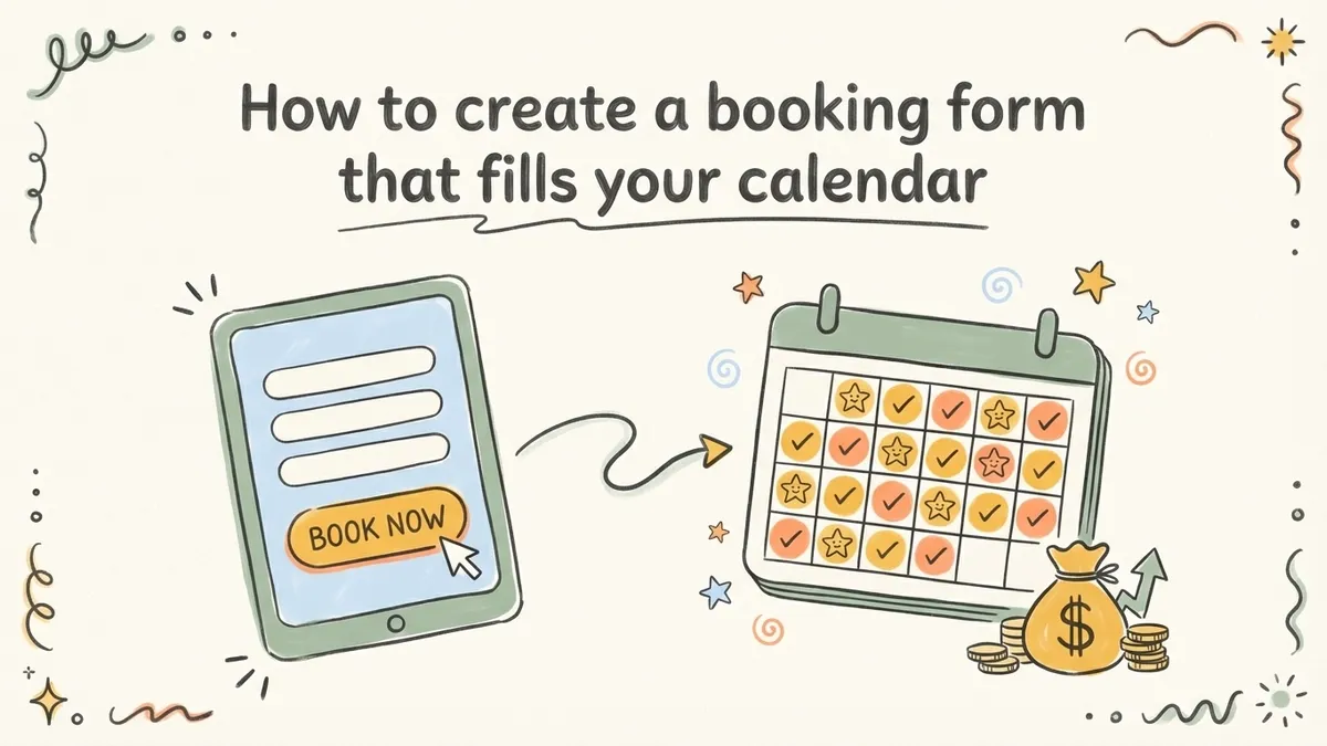
A good online booking form does one thing well: it turns intent into a confirmed appointment with as little friction as possible. The difference between a booking form that converts at 15% and one that converts at 50% usually comes down to a handful of design and structure decisions. Here’s how to build one that actually fills your calendar.
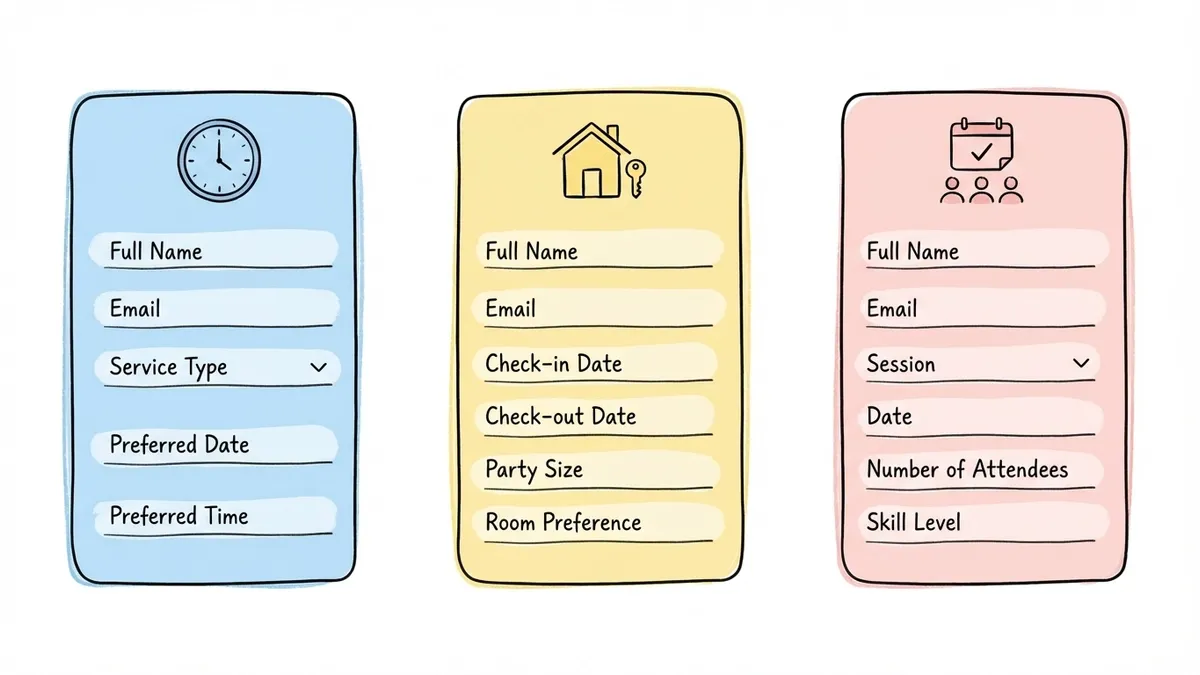
Figure out what type of booking you’re handling
Not all booking forms work the same way. A hair salon appointment, a hotel reservation, and a consulting call have very different requirements, and trying to use one generic template for all three leads to a clunky experience.
Before you build anything, get clear on your booking type:
- Appointment booking forms are for one-on-one services: consultations, coaching sessions, medical visits, salon appointments. The key fields are date, time, service type, and contact info.
- Reservation forms handle shared resources: hotel rooms, restaurant tables, equipment rentals, venue spaces. These need date ranges, party size, and sometimes room or resource preferences.
- Class or event booking forms let people sign up for group sessions: fitness classes, workshops, tours. They need the session name, date, number of attendees, and sometimes skill level.
Each type has different “must-have” fields. A restaurant reservation form that asks for your mailing address is wasting everyone’s time. A consulting booking form that doesn’t ask what the call is about leaves the consultant unprepared. Match the form to the actual booking scenario.
Choose the right fields (and cut the rest)
This is where most booking forms go wrong. The person building the form thinks “while we have them here, let’s also ask about…” and suddenly a 4-field form becomes a 12-field form.
The data is clear on this. Each additional field reduces completion rates by roughly 7%, according to research from HubSpot’s form optimization studies. For a booking form, that means the difference between 5 fields and 10 fields could cut your bookings nearly in half.
Here’s what belongs on most appointment booking forms:
- Full name (one field, not separate first/last)
- Email address for confirmation
- Phone number if you need to reach them about changes
- Service or appointment type as a dropdown or radio buttons
- Preferred date and time using a date picker
That’s five fields. For most service businesses, that’s enough to confirm a booking and follow up.
Fields that can wait until after the booking is confirmed: how they heard about you, detailed medical history, billing address, marketing preferences. Collect those in a follow-up email or during the actual appointment. Your booking form’s job is to get the appointment on the calendar, not to run an intake survey.
For reservation forms, swap service type for party size and add a date range if stays are involved. For class bookings, add a session selector and number of attendees. The principle stays the same: collect what you need to confirm the booking, nothing more.
Pick a form builder that won’t box you in
You could code a booking form from scratch, but unless you need deep calendar integration with custom availability logic, a form builder gets you there faster and with fewer headaches.
What matters for a booking form builder:
Design flexibility. Your booking form is often the first real interaction someone has with your business. If it looks generic or clashes with your brand, it undermines trust before the appointment even happens. You want control over fonts, colors, backgrounds, and layout, not just a choice between three preset themes.
Multi-page support. Booking forms benefit from being split across pages. Page one collects contact info, page two handles scheduling details, page three covers any special requests. This progressive approach feels lighter than a single long page, and it works especially well on mobile. If you want to dig into why this works, our post on what multi-step forms are and why they work covers the psychology behind it.
Mobile responsiveness. A huge portion of bookings happen on phones, often right after someone searches “hair salon near me” or “yoga class this weekend.” If your form doesn’t work well on a small screen, those impulse bookings evaporate.
Sharing options. You’ll want to embed the form on your website, share it as a direct link, maybe generate a QR code for printed materials in your physical location. The more ways people can reach your form, the more bookings you’ll get.
Fomr handles all of this on the free plan with no limits on forms or responses. The drag-and-drop editor gives you access to 1,700+ fonts and full color control, so your booking form can match your brand exactly. Calendar integrations with tools like Google Calendar, Outlook Calendar, Cal.com, and Calendly are coming soon. If you need real-time slot blocking today, pair the form with a scheduling tool for now.
Structure the form for fast completion
The order of your fields matters more than you’d think. People have a mental model of how booking works: who am I, what do I want, when do I want it. Your form should follow that same flow.
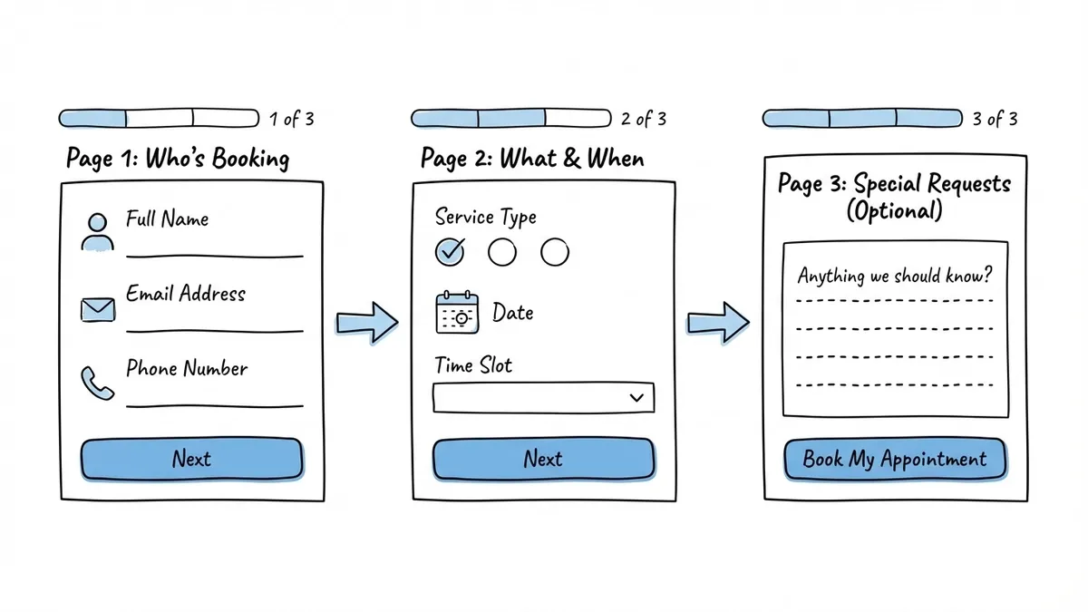
Page one: who’s booking
Start with name, email, and phone number. These are familiar fields that people can fill out on autopilot. Starting with easy questions builds momentum. If the first thing someone sees is a complex date-and-time selector, they’re more likely to hesitate.
Page two: what and when
Service type comes first (dropdown or radio buttons), then date and time selection. If you offer multiple locations, add a location selector before the date field so people aren’t picking times for the wrong branch.
For date and time, use proper date picker fields instead of free-text inputs. A text field that says “Preferred date” will give you “next Tuesday,” “March 3rd,” “3/3,” and “sometime next week.” A date picker gives you clean, consistent data every time.
Page three (optional): special requests
If your business benefits from knowing details in advance, like “I’m allergic to latex” for a medical appointment or “We’re celebrating a birthday” for a restaurant reservation, add an optional text area on a final page. Keep it clearly labeled as optional. Most people will skip it, and that’s fine.
This three-page structure works well because each page has only 2-3 fields. It feels quick even though you’re collecting 5-7 pieces of information total. For tips on making this structure convert even better, check out our guide on form design tips to boost completion rates.
Design the form to build trust
People are handing you their contact information and committing their time. The form needs to feel professional and trustworthy, or they’ll bail.
Match your brand
Your booking form should look like it belongs on your website. Same fonts, same color palette, same logo. A form that looks like it was built by a different company creates a subtle disconnect that makes people uneasy. This is especially true for service businesses where trust is the product: therapists, financial advisors, medical practices.
Write a clear title
“Booking Form” is functional but forgettable. “Book Your Free 30-Minute Consultation” tells people exactly what they’re getting and sets expectations about time commitment. Be specific about what they’re booking and what it costs (or that it’s free).
Use smart button text
“Submit” is vague. “Book My Appointment” or “Reserve My Spot” tells people what clicking the button actually does. This small change consistently improves conversion rates across UX research on form buttons.

Add a brief trust signal
A single line below the submit button goes a long way. “We’ll send a confirmation email within 5 minutes” or “Your information is kept private and never shared” addresses the two biggest concerns people have: did it work, and is my data safe?
Set up confirmation and follow-up
The booking form experience doesn’t end at the submit button. What happens next determines whether people actually show up.
Your confirmation page should include:
- A clear statement that the booking was received
- The date, time, and service they selected (reflected back to them)
- What happens next: “You’ll receive a confirmation email shortly” or “We’ll call to confirm within 24 hours”
- A way to contact you if they need to change or cancel
Then set up a confirmation email. This is your chance to reduce no-shows. Include the appointment details, your address or meeting link, any preparation instructions (“Please arrive 10 minutes early” or “Have your insurance card ready”), and a cancellation/reschedule link.
A reminder 24 hours before the appointment cuts no-show rates significantly. Research from the healthcare industry shows that appointment reminders reduce no-shows by 29% on average. Even a simple email or SMS reminder makes a real difference.
Mistakes that quietly kill your booking rate
I’ve seen these patterns repeatedly across booking forms for salons, clinics, consultancies, and studios. They’re easy to fix once you spot them.
Asking for the same information twice. If you ask for a name at the top and then “Name for the reservation” further down, people notice. It feels careless, and it adds unnecessary friction.
No mobile optimization. Test your booking form on an actual phone. Not a browser resize, an actual phone. Tap targets that are too small, dropdowns that don’t scroll properly, and date pickers that overlap other elements are common problems that only show up on real devices.
Vague time slots. “Morning” and “Afternoon” as time options force you to follow up with every single person to nail down an actual time. Use specific slots: “10:00 AM,” “10:30 AM,” “11:00 AM.” Yes, this means more options in your dropdown, but it eliminates a round of back-and-forth communication.
No confirmation page. If someone submits a booking form and sees a blank page or a generic “Thank you,” they’ll wonder if it actually went through. Some will submit again, creating duplicate bookings. Others will just leave and book with a competitor who gave them a clear confirmation.
Requiring account creation. Unless you’re running a membership-based business, don’t make people create an account to book an appointment. It’s an unnecessary barrier. Collect their email, send them a confirmation, and let them create an account later if they want to.
Share your booking form everywhere
A booking form that lives only on your website’s contact page is underperforming. Put it where people are already thinking about booking.
Embed it on your services page. Don’t make people navigate from your services page to a separate booking page. Embed the form right below your service descriptions, where the intent is highest. Our guide on how to embed a form on any website walks through the technical setup.
Share the direct link on social media. When you post about availability or a new service, include the booking form link directly. Every extra click between “I want this” and “I booked it” loses people.
Print a QR code for your physical location. If you have a storefront, put a QR code at the front desk, on business cards, or on flyers. People can scan and book their next appointment before they even leave.
Add it to your email signature. If you’re a consultant or freelancer, a “Book a call” link in your email signature turns every email you send into a booking opportunity.
Build your booking form now
Here’s the short version: keep your booking form to 5-7 fields, split it across 2-3 pages, use proper date pickers, match your brand, and write a confirmation page that tells people exactly what happens next. Then put the form everywhere your potential clients already are.
You don’t need to overthink this. Start with the essentials, launch it, and refine based on what you learn from actual submissions.
If you want to create a booking form without writing code, Fomr’s guest editor lets you build one right now with no account required. Drag in your fields, customize the design, split it across pages, and share it via link, embed, or QR code. The free plan has no limits on forms or responses, so you can experiment until it’s right.