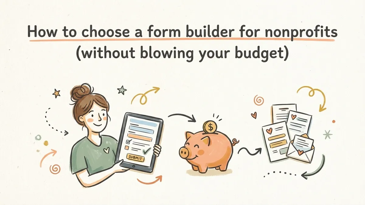
Nonprofits run on forms. Volunteer signups, event registrations, donation pledges, grant applications, membership renewals, feedback surveys. If your organization interacts with people (and it does), you’re collecting information from them constantly.
The problem is that most form builders are priced for businesses with marketing budgets. A $50/month plan might be reasonable for a SaaS company generating leads, but for a food bank staffed by three paid employees and forty volunteers, that’s money pulled directly from the mission. And the free tiers that do exist tend to cap you at 100 responses per month, which is useless when your annual gala registration form alone might pull in 300 submissions over a weekend.
So here’s what to actually look for in a form builder for nonprofits, which forms you’ll need, and how to get them built without spending money you don’t have.
The forms every nonprofit needs
Before evaluating tools, it helps to map out what you’re actually building. Most nonprofits cycle through the same handful of form types year after year. Some are seasonal. Some run continuously. Almost all of them are more urgent than you’d expect when the deadline hits.
Volunteer signup forms
This is the big one. Volunteer recruitment is constant for most organizations, and the signup form is where interested people either commit or bounce. A good volunteer form collects name, contact info, availability, and role preferences without feeling like a job application. Five to seven fields is the sweet spot. Anything longer and you’ll lose the casual volunteers who just want to help at Saturday’s cleanup event.
Event registration forms
Fundraising dinners, community workshops, awareness walks, board meetings open to the public. Each one needs a registration form, and each one has slightly different requirements. A 5K run needs t-shirt sizes and emergency contacts. A donor appreciation dinner needs dietary restrictions and plus-one counts. A community meeting just needs a name and email.
The key is having a builder flexible enough to handle all of these without starting from scratch every time. We wrote a full guide on building event registration forms if you want the detailed walkthrough.
Donation and pledge forms
This is where things get tricky. Collecting actual payments through a form requires payment processing, which most free form builders don’t include. But donation pledge forms and recurring giving interest forms are perfectly doable. You collect the donor’s information, their intended gift amount, and their preferred giving method, then follow up with a payment link or invoice.
It’s not as slick as an integrated payment form, but it works. And for nonprofits that already use a separate donation processor like PayPal Giving Fund or Donorbox, a pledge form that feeds into your existing workflow is often more practical than trying to consolidate everything into one tool.
Grant and program application forms
These tend to be longer. Grant applications might need narrative responses, budget breakdowns, organizational details, and supporting documentation references. Program applications for scholarships, housing assistance, or mentorship programs have their own complexity.
Multi-page forms help here. Splitting a 15-field application across three or four pages makes it feel manageable instead of overwhelming. Each page should group related questions together: organizational info on page one, project details on page two, budget on page three.
Feedback and survey forms
Post-event surveys, program evaluation forms, community needs assessments, board member feedback. These are easy to deprioritize but genuinely valuable. Funders increasingly want outcome data, and a simple post-program survey is the fastest way to collect it.
Keep these short. Five questions max for post-event feedback. People who just attended your fundraiser are willing to share their thoughts, but not if it takes ten minutes.
What to look for in a nonprofit form builder
Not every feature matters equally when you’re operating on a nonprofit budget with a team that includes volunteers who may not be tech-savvy. Here’s what I’d prioritize.
A free plan that doesn’t punish growth
This is the dealbreaker. Many form builders offer free tiers that look generous until you read the fine print. Caps on responses are the most common trap. If your free plan limits you to 100 responses per month, you’ll hit that wall during your first successful event and face a choice between upgrading mid-campaign or losing data.
Look for unlimited responses on the free tier. Unlimited forms too, because nonprofits tend to accumulate a lot of them over time. You don’t want to delete your spring gala registration form to make room for your summer volunteer drive.
Fomr is one of the few builders that offers unlimited forms, responses, fields, and team members on the free plan. That last part matters for nonprofits specifically, because you probably have multiple people who need to create or manage forms, and paying per seat adds up fast.
We compared the best free form builders in detail if you want to see how different tools stack up on their free tiers.
Branding that matches your organization
Your forms represent your nonprofit. A generic-looking form with default styling and another company’s logo in the corner doesn’t inspire confidence, especially when you’re asking people to donate money or share personal information.
Look for control over colors, fonts, backgrounds, and logo placement. Your volunteer signup form should look like it belongs on your website, not like it was built with a tool you grabbed five minutes ago. This is particularly important for donor-facing forms, where trust and professionalism directly affect whether someone follows through.
Some builders give you a handful of preset themes. Others let you match your exact brand guidelines with custom hex colors, font choices from large libraries, and background images. The difference is noticeable to the people filling out your forms, even if they can’t articulate why one form feels more trustworthy than another.
An editor anyone on your team can use
Nonprofit teams are a mix of paid staff, part-time coordinators, and volunteers. The person building your event registration form might be a marketing director with design experience, or it might be a board member’s college-aged kid who offered to help. Your form builder needs to work for both.
Drag-and-drop editors are the baseline expectation here. But pay attention to how intuitive the editor actually is. Can someone build a functional form in under ten minutes without watching a tutorial? Can they preview it on mobile before publishing? Can they rearrange fields without breaking the layout?
If you want to test an editor before committing to an account, Fomr has a guest editor that lets you build a complete form without signing up. That’s useful for getting a volunteer started on a form without making them create yet another login.
Easy embedding and sharing
Nonprofits distribute forms everywhere. On your website, in email newsletters, on social media, printed on flyers at community events. Your form builder should support all of these distribution methods without making you jump through hoops.
At minimum, you need:
- A shareable link you can paste into emails and social posts
- An embed option for your website (ideally a lightweight widget, not a clunky iframe)
- A popup option for forms triggered by a button click on your site
- QR codes for printed materials, posters, and event signage
That last one is underrated. A QR code on a table tent at your fundraising dinner that links directly to a feedback survey or a recurring donation pledge form gets way more responses than a follow-up email sent three days later.
Mobile-friendly forms by default
According to the Pew Research Center, roughly 97% of Americans own a cellphone of some kind. Your volunteers, donors, and community members are filling out forms on their phones. If your form builder produces forms that are awkward to use on a small screen, you’re losing responses.
This isn’t just about responsive layouts. It’s about input types. A phone number field should trigger the numeric keyboard. A date field should show a date picker, not force someone to type “04/07/2026” on a tiny screen. Good form builders handle these details automatically.
Common mistakes nonprofits make with forms
I’ve seen the same patterns across dozens of nonprofit forms. Here are the ones that cost you the most responses.
Asking for too much too soon
A volunteer interest form doesn’t need a background check authorization, three references, and an essay about why they want to help. That’s onboarding material, not signup material. Collect the minimum to get someone into your pipeline, then gather additional details through follow-up communication.
The same applies to event registration. Name and email get someone registered. Dietary restrictions, accessibility needs, and session preferences can come in a pre-event email a week before.
Ignoring the form’s appearance
A form with default gray styling, tiny text, and a “Powered by [Tool Name]” badge at the bottom doesn’t scream “trustworthy organization.” It screams “we threw this together in five minutes.” That might be true, but your donors and volunteers don’t need to know it.
Spend ten minutes on branding. Match your organization’s colors. Add your logo. Choose a readable font. These small touches make a measurable difference in completion rates. We covered this in depth in our guide on form builders for small businesses, and the same principles apply to nonprofits.
Using one form for everything
I’ve seen nonprofits try to build a single “general inquiry” form that handles volunteer signups, event questions, donation inquiries, and partnership requests through a single dropdown at the top. This creates a bad experience for everyone. The volunteer gets asked about donation amounts. The potential donor sees fields about availability and skills.
Build separate forms for separate purposes. If your form builder offers unlimited forms on the free plan, there’s no reason not to. Each form can be short, focused, and tailored to its audience.
Not closing the loop
Someone fills out your volunteer form. Then what? If the answer is “we’ll get back to them eventually,” you’ve already lost momentum. Set up a thank-you page that confirms their submission and tells them what happens next. “Thanks for signing up! Our volunteer coordinator will email you within 48 hours with available shifts.”
Most form builders let you customize the confirmation page or redirect to a URL after submission. Use it. That post-submission moment is when the person is most engaged with your organization.
Features that sound nice but aren’t essential
Not everything on a feature list matters for nonprofit use cases. A few things you can safely deprioritize:
Advanced conditional logic. Useful for complex applications, but most nonprofit forms are straightforward enough that you don’t need branching paths. If you do need it eventually, you can always switch to a tool that supports it or wait for your current tool to add it.
Payment processing built into the form. Nice to have, but most nonprofits already use a dedicated donation platform. A pledge form that captures intent and feeds into your existing payment workflow is usually good enough.
Hundreds of integrations. If your nonprofit uses Google Sheets to track volunteers, a simple CSV export from your form builder works fine. You don’t need a Zapier connection to fifteen different tools. Keep it simple until your operations genuinely demand automation.
Focus your evaluation on the things that affect every form you build: the editor experience, design control, free plan limits, and sharing options. Everything else is a bonus.
Getting started without spending anything
Here’s what I’d actually do if I were setting up forms for a nonprofit today:
- List every form your organization needs for the next six months. Volunteer signup, event registration, feedback surveys, donation pledges, whatever applies.
- Pick a form builder with a genuinely free plan that won’t cap your responses. Test the editor with your simplest form first, like a contact form or volunteer interest form.
- Set up your brand kit: upload your logo, pick your colors, choose a font that matches your website. Apply it to every form so they all look consistent.
- Build your forms one at a time, starting with whatever’s most urgent. Keep them short. Use multi-page layouts for anything over six or seven fields.
- Share each form through the right channel. Embed on your website, share the link in newsletters, print QR codes for in-person events.
The whole process takes an afternoon for most organizations. And once your brand kit is set up, each new form takes minutes instead of hours.
Pick the tool, then get back to the mission
Choosing a form builder shouldn’t be a month-long evaluation process. Nonprofits have more important things to spend time on. Find a tool that’s free, looks professional, and lets your whole team build forms without a learning curve. Then move on to the work that actually matters.
If you want to test things out without creating an account, Fomr’s guest editor lets you build a form right now and see if it fits your needs. No signup, no credit card, no sales pitch.