
Over 60% of web traffic now comes from mobile devices. Statcounter has tracked this trend since 2017, and the gap keeps widening. But here’s the disconnect: most online forms are still built on desktop screens, previewed on desktop screens, and tested on desktop screens. The person building the form sees a clean two-column layout with generous spacing. The person filling it out on an iPhone SE sees overlapping fields, a submit button they can’t reach without scrolling past three screens of whitespace, and a date picker that requires surgical precision.
The result is predictable. Mobile form completion rates are often 30-50% lower than desktop, depending on the form’s complexity. That’s not a small leak. If your form gets 1,000 visits a month and 600 of those are mobile, you could be losing hundreds of completions to bad mobile UX alone.
A mobile friendly form builder won’t fix every problem automatically. But it eliminates the most common ones by starting with responsive layouts, proper input handling, and touch-friendly defaults. This post covers what actually makes a form work on phones, the mistakes that kill mobile completion rates, and how to evaluate whether your form builder is helping or hurting.
What “mobile friendly” actually means for forms
“Responsive” and “mobile friendly” get used interchangeably, but they’re not the same thing. A responsive form adjusts its layout to fit smaller screens. A mobile friendly form goes further: it’s designed around how people actually use phones.
That means:
- Single-column layout that doesn’t require horizontal scrolling
- Touch targets large enough for thumbs, not mouse cursors
- Input fields that trigger the right keyboard (number pad for phone numbers, @ keyboard for email)
- Autofill support so users don’t retype information their browser already knows
- Fast load times, because mobile connections are often slower and less stable than desktop
Google’s own guidelines for mobile usability flag forms as one of the most common failure points. Their Lighthouse audit checks for tap target sizing, viewport configuration, and font legibility. If your form fails those checks, it’s hurting both user experience and your search rankings.
A form can be technically responsive (it shrinks to fit the screen) while still being terrible on mobile. Two-column layouts that stack awkwardly, dropdowns that open behind the keyboard, submit buttons that sit below the fold on every phone smaller than a Pixel 8 Pro. Responsive is the minimum. Mobile friendly is the goal.
The thumb zone and why it matters
Steven Hoober’s research on how people hold their phones found that about 75% of interactions happen with a single thumb. The “thumb zone” is the arc your thumb can comfortably reach without shifting your grip. On modern phones with 6+ inch screens, that zone is smaller than you’d think relative to the total screen area.
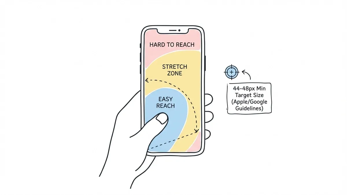
Apple’s Human Interface Guidelines recommend a minimum tap target of 44x44 points. Google’s Material Design guidelines set the bar at 48x48 dp. Both exist because smaller targets lead to mistaps, frustration, and abandonment.
For forms specifically, this means:
- Input fields should be at least 44-48px tall. The default height in many CSS frameworks is 36px or even 32px, which is too small.
- Spacing between fields matters as much as field height. If two fields are 48px tall but only 8px apart, users will still tap the wrong one. Aim for at least 16px of vertical spacing between interactive elements.
- Buttons need to be full-width or close to it on mobile. A narrow “Submit” button centered on a phone screen is a small target surrounded by dead space.
- Checkboxes and radio buttons need generous hit areas. The visible checkbox might be 20px, but the tappable area should extend to at least 44px in every direction.
I’ve seen forms where the radio button labels are tappable but the radio buttons themselves aren’t, or vice versa. On desktop, nobody notices because the mouse cursor is precise. On mobile, it’s the difference between a smooth experience and a form that feels broken.
Input types: the easiest mobile win most people skip
HTML has had specialized input types for over a decade, and they’re still underused. When you set an input’s type correctly, mobile browsers show the appropriate keyboard. When you don’t, users get a full QWERTY keyboard for every field, including ones where they only need to type numbers.
Here’s what to use and when:
type="tel"for phone numbers. Shows a numeric dial pad. Way faster than hunting for digits on a QWERTY layout.type="email"for email addresses. Shows a keyboard with @ and .com shortcuts prominently placed.type="number"orinputmode="numeric"for quantities, zip codes, and other numeric fields. The distinction matters:type="number"adds increment/decrement arrows (annoying for zip codes), whileinputmode="numeric"just shows the number keyboard without the extra UI.type="url"for website URLs. Shows a keyboard with / and .com shortcuts.type="date"for dates. Triggers the native date picker, which is almost always better than a custom one on mobile.
The difference in typing speed is significant. Baymard Institute’s checkout usability research found that using the correct input type for credit card fields reduced entry time by roughly 20% and cut input errors in half. That’s one attribute change per field. No redesign needed.
If your form builder doesn’t set these automatically based on the field type, you’re leaving easy wins on the table. Fomr handles this by default: when you add a phone field, email field, or number field, the correct input type is already set. You don’t have to think about it.
Autofill: let the browser do the work
Mobile users hate typing. Their keyboards are small, autocorrect fights them, and every extra keystroke is a chance to make a typo. Browser autofill exists to solve this, but it only works when forms are set up correctly.
The autocomplete attribute tells browsers which saved data to suggest for each field. Common values include:
autocomplete="name"for full nameautocomplete="email"for email addressautocomplete="tel"for phone numberautocomplete="street-address"for address line 1autocomplete="postal-code"for zip/postal code
When autofill works, a user can complete a 6-field contact form in two taps: one to trigger autofill, one to submit. When it doesn’t work, they’re typing their email address with their thumbs for the 400th time this month.
Google’s research on checkout forms found that autofill reduces form completion time by up to 30%. On mobile, where typing is slower, the savings are even larger.
The catch: autofill breaks when forms use non-standard field names, when fields are nested inside unusual DOM structures, or when JavaScript frameworks re-render inputs in ways that confuse the browser’s autofill detection. A good mobile friendly form builder handles the markup correctly so autofill just works.
Common mobile form mistakes (and how to fix them)
Some mobile form problems are obvious. Others only show up when you actually test on a real phone. Here are the ones I see most often:
Placeholder text as labels
This is the most persistent bad pattern in form design. Placeholder text disappears when the user starts typing, which means they lose context about what the field is asking for. On mobile, where the keyboard covers half the screen and the visible form area shrinks, this is even worse. Users type something, glance up, and can’t remember if the field was asking for their name or their company name.
Use real labels above each field. Always. We covered this in detail in our form UX best practices post, and the research is unambiguous.
Multi-column layouts on small screens
Two or three columns might look balanced on a 1440px monitor. On a 375px phone screen, those columns either squish into unreadable strips or stack vertically with inconsistent spacing. Single-column is the only layout that works reliably on mobile.
Some form builders let you create multi-column layouts but don’t handle the mobile breakpoint well. The columns stack, but the field order gets confusing because it reads left-to-right on desktop but top-to-bottom on mobile. If “First Name” and “Last Name” are side by side on desktop, they should stack in that same order on mobile, not get rearranged.
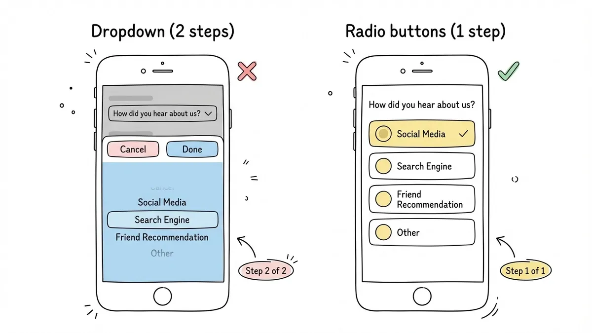
Dropdowns for short lists
On desktop, a dropdown with 3-4 options is fine. On mobile, it triggers a full-screen picker that takes over the viewport, requires a scroll gesture, and then a confirmation tap. For short lists (under 7 items), radio buttons or a button group are faster and less disorienting.
Save dropdowns for long lists like country selectors or state/province pickers, where showing all options at once would be impractical.
Tiny close buttons on modals and popups
If your form appears in a popup or modal, the close button needs to be reachable and tappable. A 16px X in the top-right corner is hard to hit on mobile. Make it at least 44px and consider placing it where thumbs can actually reach it.
No progress indication on long forms
On desktop, users can see most of a form without scrolling. On mobile, even a 5-field form might require scrolling. Without a progress bar or step indicator, users don’t know if they’re 20% done or 80% done. That uncertainty drives abandonment. Multi-step forms with clear progress indicators consistently outperform single-page forms on mobile.
How to test your forms on mobile (properly)
Resizing your browser window is not mobile testing. It catches layout issues, but it misses:
- Keyboard behavior (which keyboard appears, how it interacts with the form)
- Touch target accuracy (you’re still using a mouse cursor)
- Autofill behavior (desktop and mobile autofill work differently)
- Scroll behavior when the keyboard is open (fields can get hidden behind the keyboard)
- Performance on slower connections and less powerful hardware
Real mobile testing means opening the form on an actual phone. At minimum, test on:
- A recent iPhone (Safari on iOS has its own quirks with form inputs, especially date pickers and fixed-position elements)
- A recent Android phone (Chrome on Android handles things differently than Safari)
- A mid-range or older device (not everyone has the latest flagship; test on something with 3-4GB of RAM)
If you can’t test on physical devices, BrowserStack and LambdaTest offer real device testing in the cloud. Chrome DevTools’ device emulation is a decent fallback for layout checks, but it won’t catch keyboard or autofill issues.
One thing that helps: share your form via a direct link or QR code and fill it out yourself on your phone before publishing. You’ll catch problems in 30 seconds that you’d never notice in a desktop preview. Fomr generates shareable links and QR codes for every form, which makes this quick test trivial.
What to look for in a mobile friendly form builder
Not all form builders treat mobile as a first-class concern. Some bolt on responsiveness as an afterthought. Here’s what separates a genuinely mobile friendly form builder from one that just claims to be:
Responsive by default, not by configuration
You shouldn’t have to toggle a “mobile responsive” switch or add custom CSS to make forms work on phones. The form builder should produce mobile-friendly output automatically. Every form, every time.
Correct input types without manual coding
When you add a phone number field, the builder should set type="tel" without you having to dig into field settings or write HTML. Same for email, number, date, and URL fields.
Touch-friendly components
Radio buttons, checkboxes, rating scales, and buttons should all have adequate tap targets out of the box. If you have to increase sizes manually for mobile, the defaults are wrong.
Multi-page/multi-step support
Long forms need to be broken into steps on mobile. A form builder that only supports single-page forms forces you to create one long scrolling page, which is the worst mobile experience for anything beyond 4-5 fields. We wrote about why multi-step forms improve completion rates and the effect is even more pronounced on mobile.
Fast loading
Form builders that inject heavy JavaScript bundles or load multiple third-party scripts slow down the form, especially on mobile connections. The embed script should be lightweight. Images and fonts should be optimized.
Preview on actual mobile dimensions
A desktop-only preview is a red flag. The builder should let you preview how the form looks and behaves at mobile screen sizes before you publish.
A quick mobile form checklist
Before publishing any form, run through this list:
- Single-column layout (no side-by-side fields that might stack poorly)
- All tap targets are at least 44px tall
- Input types match the expected data (tel, email, number, date)
- Labels are visible above fields, not just placeholder text
- Autofill attributes are set on standard fields (name, email, phone, address)
- Short option lists use radio buttons or button groups, not dropdowns
- Progress indicator is visible on multi-step forms
- Form loads in under 3 seconds on a 3G connection
- Tested on at least one real phone (not just a browser resize)
- Submit button is full-width and easy to reach
You don’t need to memorize this. Just test your form on your own phone before publishing. If anything feels awkward, slow, or hard to tap, your users will feel it too.
Build forms that work where people actually use them
The gap between desktop and mobile form experiences is closing, but slowly. Most of the fixes are straightforward: correct input types, adequate tap targets, single-column layouts, autofill support. None of this is cutting-edge. It’s just attention to detail that many form builders still don’t handle well by default.
If you’re looking for a form builder that treats mobile as a default rather than an add-on, try Fomr. Every form is mobile responsive out of the box, with proper input types, touch-friendly components, and a lightweight embed script. You can build one right now without creating an account and test it on your phone in under a minute.