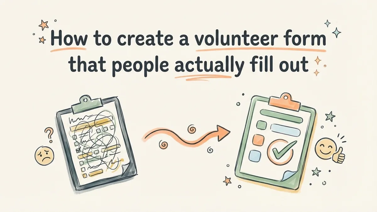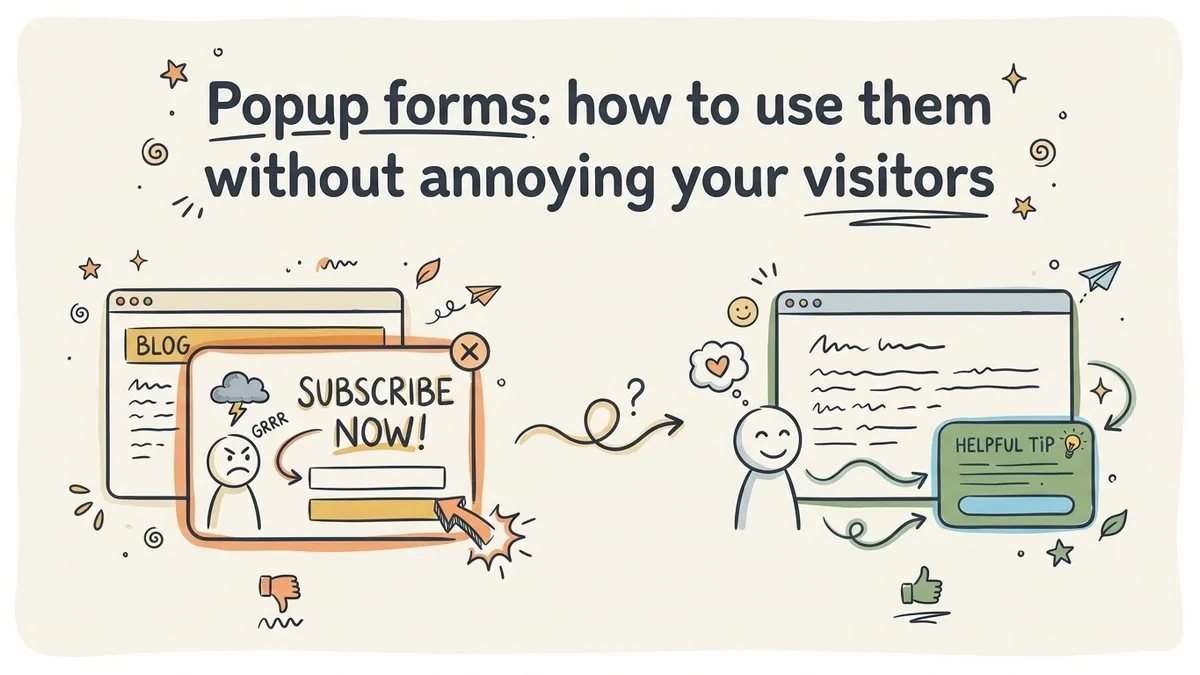
Popup forms have a terrible reputation, and most of them deserve it. You land on a blog post, start reading the first paragraph, and a lightbox slams into your face asking for your email. You haven’t even figured out if the content is worth reading yet. Of course you close it. Everyone does.
But here’s the thing that makes popup forms worth talking about: when they’re done well, they convert 3-10x better than static inline forms. Sumo analyzed nearly two billion popup impressions and found that the top 10% of popups converted at 9.28%, while the average inline form sits around 1-3%. That’s not a marginal difference. That’s a different category of performance.
The gap between a popup form that converts and one that gets instantly closed comes down to three things: timing, targeting, and design. Get those right and you have a lead generation tool that actually works. Get them wrong and you’re just training visitors to look for the X button.
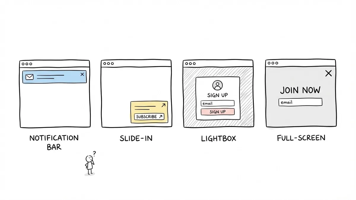
The four types of popup forms (and when each one makes sense)
Not all popup forms are the same. The word “popup” covers at least four distinct patterns, and picking the wrong one for your situation is a fast way to tank your conversion rate.
Lightbox popups
The classic. A form appears in the center of the screen with a darkened overlay behind it. Everything else on the page becomes inaccessible until the visitor interacts with the popup.
Lightbox popups demand attention, which is both their strength and their risk. They work best for high-value offers where you’re confident the visitor has enough context to care: a discount code after someone has browsed three product pages, a content upgrade halfway through a long article, or a webinar registration on a topic the visitor is clearly interested in.
They’re a poor choice for first-time visitors who haven’t engaged with your content yet. If someone arrived 10 seconds ago from a Google search, a lightbox popup is just a wall between them and the information they came for.
Slide-in forms
A smaller form that slides in from the bottom-right or bottom-left corner of the screen. It’s visible but doesn’t block the content. Visitors can keep reading and deal with the form when they’re ready.
Slide-ins are the least aggressive popup type, which makes them a good default for blogs and content-heavy sites. They catch attention without demanding it. Conversion rates are typically lower than lightbox popups (because they’re easier to ignore), but they generate far less annoyance. For sites where repeat visits matter, that trade-off is usually worth it.
Full-screen takeovers
The entire viewport becomes the form. No content visible behind it, no partial overlay. Just the form and a close button.
Full-screen popups are polarizing. They convert well when the offer is genuinely compelling and the timing is right (exit intent on a pricing page, for example). They convert terribly when used as a greeting. I’d reserve these for situations where you have strong evidence the visitor is about to leave and the offer is good enough to justify the interruption.
Notification bars
A thin bar fixed to the top or bottom of the screen, usually with a single line of text and a CTA button. Clicking the button either expands the bar into a form or navigates to a dedicated page.
Notification bars are the gentlest option. They’re always visible but take up minimal space. They work well for site-wide announcements (a sale, a new product launch, a free trial) where you want persistent visibility without disrupting the browsing experience.
Timing is everything (and most popups get it wrong)
Here’s my strongest opinion on this topic: the single biggest reason popup forms fail is that they fire too early. A popup that appears before someone has engaged with your content is an interruption. A popup that appears after someone has demonstrated interest is a relevant offer. Same form, completely different experience.
Scroll-depth triggers
Show the popup after a visitor has scrolled past a certain percentage of the page. For blog posts, 50-60% scroll depth is a reasonable starting point. At that point, the reader has consumed enough content to have an opinion about whether your site is useful.
The advantage of scroll-depth triggers is that they’re a proxy for engagement. Someone who scrolled 60% down a 2,000-word article is genuinely reading. Someone who bounced after 5% was never going to convert anyway.
Time-delay triggers
Show the popup after a visitor has been on the page for a set amount of time. Thirty seconds is a common starting point, but the right number depends on your content. A quick product page might warrant a 15-second delay. A long-form guide might need 45-60 seconds.
Time delays are simpler to implement than scroll triggers, but they’re a weaker signal of engagement. Someone might leave a tab open for two minutes without reading a word. Still, a 30-second delay is infinitely better than showing a popup on page load.
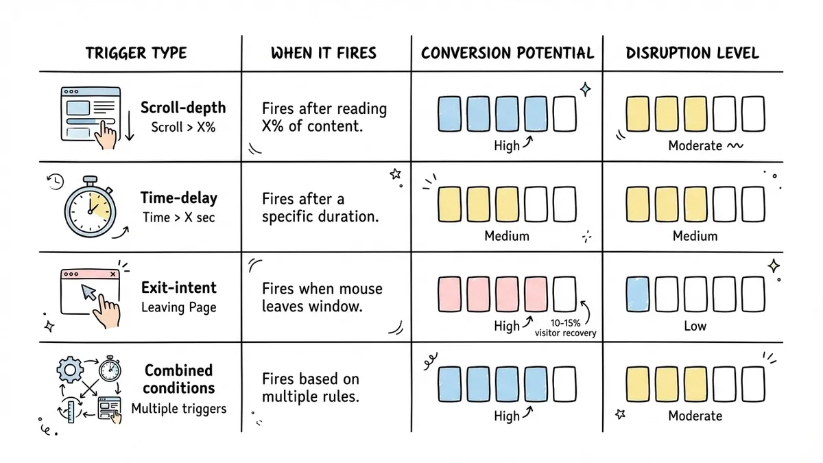
Exit-intent triggers
The popup appears when the visitor’s cursor moves toward the browser’s close button or address bar, suggesting they’re about to leave. On mobile, exit intent is usually approximated by detecting a back-button tap or rapid upward scroll.
Exit-intent popups are the least disruptive option because they only fire when the visitor is already leaving. You’re not interrupting their experience; you’re making a last attempt to capture someone who would otherwise be gone. This is where full-screen takeovers can actually work, because the alternative is losing the visitor entirely.
A Beeketing study found that exit-intent popups recover 10-15% of otherwise-lost visitors. That’s significant, especially on high-traffic pages.
Combining triggers
The best popup strategies layer multiple conditions. For example: show the popup only if the visitor has been on the site for at least 20 seconds AND has scrolled past 40% of the page AND hasn’t seen this popup in the last 7 days. Each condition filters out people who aren’t ready, which means the people who do see the popup are more likely to convert.
Designing popup forms that people actually fill out
Timing gets the popup in front of the right person at the right moment. Design determines whether they engage with it or slam the close button.
Keep the form short
This applies to all forms, but it’s especially critical for popups. A popup form is an interruption by nature, so the effort required to complete it needs to be minimal. One to three fields is the sweet spot. Email only for newsletter signups. Name and email for content downloads. Anything beyond that and you’re asking too much for the context.
If you need more information, collect it after the initial conversion. A two-field popup that converts at 8% is worth more than a six-field popup that converts at 1%. We’ve written more about this in our guide to reducing form abandonment.
Write a headline that states the value
“Subscribe to our newsletter” is not a value proposition. It’s a description of what you want the visitor to do. Compare that with “Get our weekly teardown of landing pages that actually convert” or “Save 15% on your first order.” The second versions tell the visitor what they get, not what you want.
Your popup headline should answer one question: why should I bother? If you can’t articulate a clear reason, the popup shouldn’t exist.
Make the close button obvious
This sounds counterintuitive, but a visible, easy-to-find close button actually improves popup performance. When visitors feel trapped, they panic-click or leave the site entirely. When they can see a clear way out, they feel in control, and some of them choose to stay and engage.
Use a standard X icon in the top-right corner. Make it at least 24x24 pixels. Don’t hide it, delay it, or make it blend into the background. Google has penalized sites for intrusive interstitials that are hard to dismiss, so this isn’t just a UX concern. It’s an SEO one.
Match the popup to your site’s design
A popup that looks like it was designed by a different company than the rest of your site kills trust instantly. Use the same fonts, colors, and visual style as your main site. The popup should feel like a natural part of the experience, not an ad injected by a third party.
This is where having a form builder with real design controls matters. If you can’t match your brand’s typography and color palette, the popup will always feel off.
Use a specific CTA button
“Submit” tells the visitor nothing. “Get the free template,” “Start my trial,” or “Send me the guide” tells them exactly what happens when they click. Specific button copy consistently outperforms generic labels in A/B tests. HubSpot found that personalized CTAs convert 202% better than default ones.
Mobile popup forms need different rules
More than half of web traffic is mobile, and popup forms that work on desktop can be genuinely broken on phones. Google’s interstitial penalty specifically targets mobile popups that cover the main content, so getting this wrong hurts both UX and search rankings.
Size constraints
On mobile, a lightbox popup that covers 90% of the screen is effectively a full-screen takeover. There’s no “background content visible behind the overlay” when the screen is 375 pixels wide. Design your mobile popups to cover no more than 60-70% of the viewport, or switch to a slide-in or notification bar format on small screens.
Touch targets
Buttons and close icons need to be at least 44x44 pixels on mobile. This is Apple’s Human Interface Guideline minimum, and anything smaller leads to frustrated mis-taps. The close button is especially important here. If someone can’t easily dismiss your popup on their phone, they’ll leave your site instead.
Timing adjustments
Mobile visitors tend to make faster decisions about whether a page is useful. They’re also more likely to be interrupted (notifications, switching apps, walking somewhere). Shorten your time delays for mobile. If your desktop popup fires at 30 seconds, try 20 seconds on mobile. Or better yet, use scroll depth instead of time, since it’s a more reliable engagement signal on mobile.
Google’s interstitial guidelines
Since 2017, Google has penalized mobile pages that show intrusive interstitials. The penalty applies to popups that cover the main content immediately after a user arrives from search results. Exceptions include legally required notices (cookie consent, age verification) and small banners that use a “reasonable amount of screen space.”
The safest approach: don’t show any popup to mobile visitors who arrived from organic search until they’ve engaged with the content. A scroll-depth trigger of 30% or more keeps you well within Google’s guidelines.
Setting up a popup form on your site
The technical implementation varies by tool, but the general pattern is the same: you create a form, configure the popup trigger, and add a snippet of code to your site.
With Fomr, the popup embed works through a lightweight JavaScript widget. You add the embed script to your site’s <head> tag once, then attach a data-fomr-type="popup" attribute to any button or element that should trigger the form. The form opens as a centered overlay with a background dim. No iframes, no heavy dependencies.
<script async src="https://fomr.io/widget/embed.js"></script>
<button  data-fomr-id="YOUR_FORM_ID"  data-fomr-type="popup"  data-fomr-popup-overlay="true"  data-fomr-popup-position="center">  Open form</button>
This approach gives you a click-triggered popup, which is the simplest and least intrusive option. The visitor explicitly chooses to open the form. For scroll-based or time-delayed triggers, you’d typically pair the form widget with a small script or a popup tool that handles the trigger logic and then programmatically clicks the button element.
For a deeper walkthrough of all embed options, including inline and fullscreen modes, check our guide on how to embed a form on any website.
Common popup form mistakes to avoid
After seeing hundreds of popup implementations, a few patterns come up repeatedly.
Showing the same popup to returning visitors. If someone closed your popup yesterday, showing it again today is just nagging. Use cookies or local storage to suppress the popup for at least 7-14 days after a dismissal. For visitors who already converted, suppress it permanently.
No frequency cap. Some sites show a popup on every single page. If a visitor browses five pages, they see five popups. This is a fast way to lose repeat visitors. One popup per session is a reasonable maximum.
Ignoring the offer quality. No amount of timing optimization will save a popup with a weak offer. “Sign up for updates” is not compelling. “Get our 50-page guide to [specific topic]” is. The offer does most of the heavy lifting. If your popup isn’t converting, look at the offer before you tweak the timing.
Stacking popups with other interruptions. A cookie consent banner, a chat widget, a notification bar, and a lightbox popup all appearing within the first 30 seconds is chaos. Audit your site for all the things competing for attention and make sure they’re sequenced, not simultaneous.
Skipping A/B tests. Your first popup configuration is almost certainly not optimal. Test one variable at a time: timing, headline, field count, CTA copy, offer. Even small tests can reveal surprising results. We cover testing methodology in more detail in our form conversion optimization guide.
Measuring popup form performance
Track these numbers to know if your popup is working:
- Conversion rate: submissions divided by popup impressions. Below 3% means something needs to change. Above 5% is solid. Above 8% is excellent.
- Dismissal rate: how many people close the popup without interacting. High dismissal rates (above 95%) usually point to bad timing or a weak offer.
- Impact on bounce rate: compare your site’s bounce rate before and after adding the popup. If bounce rate increases significantly, the popup is driving people away.
- Lead quality: are popup leads as engaged as leads from other sources? Check email open rates, trial activation rates, or whatever downstream metric matters to your business.
Don’t optimize for popup conversion rate in isolation. A popup that converts at 10% but increases your bounce rate by 20% is a net negative.
Start with one popup, done well
You don’t need a complex popup strategy with five different triggers and ten audience segments. Start with one popup, on your highest-traffic page, with a genuinely valuable offer, triggered at a reasonable scroll depth. Measure the results for two weeks. Then iterate.
If you want to test a popup form without committing to a dedicated popup tool, Fomr’s free plan includes popup embed mode with unlimited forms and responses. Build the form, grab the embed code, and you can have a working popup on your site in under ten minutes.
The difference between a popup that converts and one that annoys is smaller than you’d think. It’s not about the technology. It’s about respecting your visitor’s attention and earning the right to ask for their information.