
About 1 in 4 adults in the United States has some type of disability. That’s roughly 61 million people, according to the CDC. Some of those disabilities are visible. Many are not. A person with low vision, a repetitive strain injury, a cognitive disability, or a temporary condition like a broken wrist all interact with web forms differently than someone using a mouse and a 27-inch monitor.
When a form isn’t accessible, it doesn’t just create a bad experience. It creates a locked door. Someone who can’t tab through your fields, can’t read your error messages, or can’t distinguish your labels from your background color simply cannot complete your form. That’s a lost customer, a lost lead, a lost survey response. And depending on your industry and jurisdiction, it might also be a legal liability.
But here’s the thing that often gets lost in accessibility conversations: accessible form design makes forms better for everyone. Clear labels help sighted users too. Logical tab order speeds up power users who prefer keyboards. High-contrast text is easier to read on a phone in direct sunlight. Accessibility isn’t a separate track from good UX. It’s the same track.
This guide covers the specific, practical things you need to get right. Not abstract principles. Concrete patterns you can check against your own forms today.
What WCAG 2.1 actually requires for forms
The Web Content Accessibility Guidelines (WCAG) 2.1, published by the W3C, are the standard that most accessibility laws reference. The ADA doesn’t spell out technical requirements for websites, but courts and regulators consistently point to WCAG 2.1 Level AA as the benchmark. The European Accessibility Act does the same.
For forms specifically, several WCAG success criteria matter most:
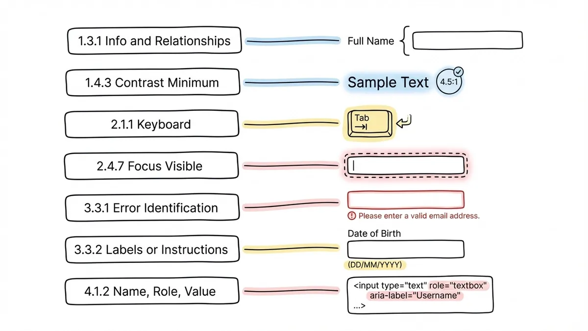
- 1.3.1 Info and Relationships: The structure and relationships conveyed visually (like a label next to a field) must also be conveyed programmatically. Screen readers need to know which label belongs to which input.
- 1.4.3 Contrast (Minimum): Text must have a contrast ratio of at least 4.5:1 against its background. Large text (18px+ bold or 24px+ regular) can get away with 3:1.
- 2.1.1 Keyboard: All functionality must be operable through a keyboard. No exceptions.
- 2.4.7 Focus Visible: When an element receives keyboard focus, there must be a visible indicator. Users need to know where they are.
- 3.3.1 Error Identification: When an input error is detected, the error must be identified and described to the user in text.
- 3.3.2 Labels or Instructions: Labels or instructions are provided when content requires user input.
- 4.1.2 Name, Role, Value: For all user interface components, the name and role can be programmatically determined.
That’s a lot of criteria. The good news is that most of them boil down to a handful of practical patterns. Let’s go through them.
Labels: the foundation of accessible forms
Every form field needs a label. Not a placeholder. Not a nearby heading. A proper <label> element that’s programmatically associated with its input using the for attribute (or by wrapping the input inside the label).
This sounds basic, and it is. But it’s also the single most common accessibility failure in web forms. WebAIM’s annual accessibility analysis of the top million websites consistently finds that missing or improperly associated form labels are among the top five errors, year after year.
Here’s why it matters so much: when a screen reader user tabs to a form field, the screen reader announces the field’s label. If there’s no associated label, the screen reader might announce “edit text” or “text field” with no context. The user has no idea what information to enter.
Placeholder text is not a substitute. Placeholders disappear when the user starts typing, which creates problems for sighted users with short-term memory issues and for anyone who needs to double-check what a field is asking for. Screen readers handle placeholder text inconsistently across browsers, so you can’t rely on it being announced at all.
A few rules that cover most cases:
- Every
<input>,<select>, and<textarea>gets a visible<label>with a matchingfor/idpair - Group related fields (like first name and last name) inside a
<fieldset>with a<legend> - Radio buttons and checkboxes each get their own label, and the group gets a
<fieldset>and<legend> - If a field has specific format requirements, include that in the label or in associated help text using
aria-describedby
If you’re using a form builder like Fomr, the label associations are handled automatically when you add fields through the editor. That removes one of the most common sources of accessibility bugs. But it’s still worth checking the output, especially if you’re embedding forms into pages with complex layouts.
Keyboard navigation and focus management
Not everyone uses a mouse. People with motor disabilities often rely on keyboards, switch devices, or other assistive technology that maps to keyboard inputs. WCAG 2.1.1 requires that all form functionality be operable through a keyboard alone.
In practice, this means:
Tab order must be logical. Users press Tab to move forward through a form and Shift+Tab to move backward. The order should follow the visual layout: top to bottom, left to right (in LTR languages). If your form’s tab order jumps around because of CSS positioning or misused tabindex values, keyboard users will get lost.
The safest approach is to let the DOM order match the visual order and avoid setting tabindex to anything other than 0 or -1. Positive tabindex values (like tabindex="5") override the natural order and almost always create confusion.
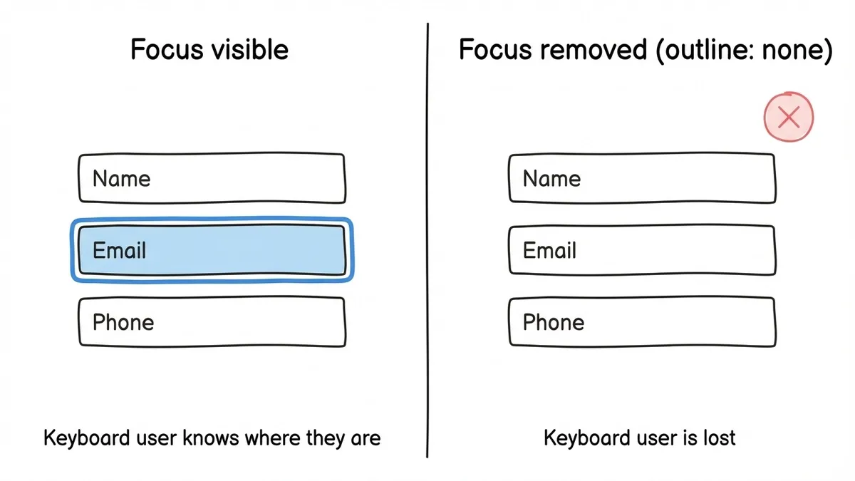
Focus must be visible. When a user tabs to a field, they need to see where they are. Browsers provide default focus outlines, but many designers remove them with outline: none because they find the blue ring ugly. This is one of the most harmful CSS patterns on the web. If you remove the default focus indicator, you must replace it with a custom one that’s at least as visible.
A good focus style has sufficient contrast against the background and is distinct from the field’s default border. A 2px solid outline in a contrasting color works well. The :focus-visible pseudo-class lets you show focus rings only for keyboard navigation, not for mouse clicks, which addresses the aesthetic concern without sacrificing accessibility.
Focus management after actions. When a user submits a form and gets an error, where does focus go? If it stays at the bottom of the page on the submit button while the error messages appear at the top, the user might not know anything went wrong. Move focus to the first error, or to a summary of errors at the top of the form. This is especially important for multi-step forms, where the user might need to be taken back to a previous step.
Color contrast and visual design
Color contrast failures are the most common accessibility issue on the web, period. WebAIM’s 2024 report found low-contrast text on 81% of home pages tested. Forms are no exception.
WCAG 1.4.3 sets the minimum contrast ratio at 4.5:1 for normal text and 3:1 for large text. WCAG 1.4.11 (added in 2.1) extends this to user interface components: form field borders, icons, and focus indicators also need at least a 3:1 contrast ratio against their background.
What this means in practice:
- Light gray placeholder text on a white background almost certainly fails. If your placeholder is
#999on#fff, that’s a 2.85:1 ratio. Below the threshold. - Thin, light-colored field borders can fail too. A 1px border in
#cccon a white background has a 1.6:1 ratio. Users with low vision may not be able to see where the field is. - Error states that rely only on color (turning a field border red) fail WCAG 1.4.1 (Use of Color). About 8% of men have some form of color vision deficiency. A red border looks identical to a gray border for some of them.
Always pair color with another indicator. An error icon, an error message in text, or a change in the field’s label. The color reinforces the message, but it shouldn’t be the only signal.
Tools like the WebAIM Contrast Checker let you test specific color combinations. Chrome DevTools also has a built-in contrast checker in the color picker. Use them before you finalize your form’s color scheme.
When you’re customizing form themes (Fomr gives you control over colors, fonts, and backgrounds), run your chosen palette through a contrast checker first. A beautiful form that nobody can read isn’t beautiful. It’s broken.
Error messages that work with assistive technology
Error handling is where many otherwise-decent forms fall apart on accessibility. The form validates, finds a problem, and shows an error. But how it shows that error determines whether assistive technology users can actually fix it.
Identify errors clearly
WCAG 3.3.1 requires that errors be identified and described in text. “Invalid input” is technically text, but it’s useless. “Please enter a valid email address (e.g., [email protected])” tells the user exactly what’s wrong and how to fix it.
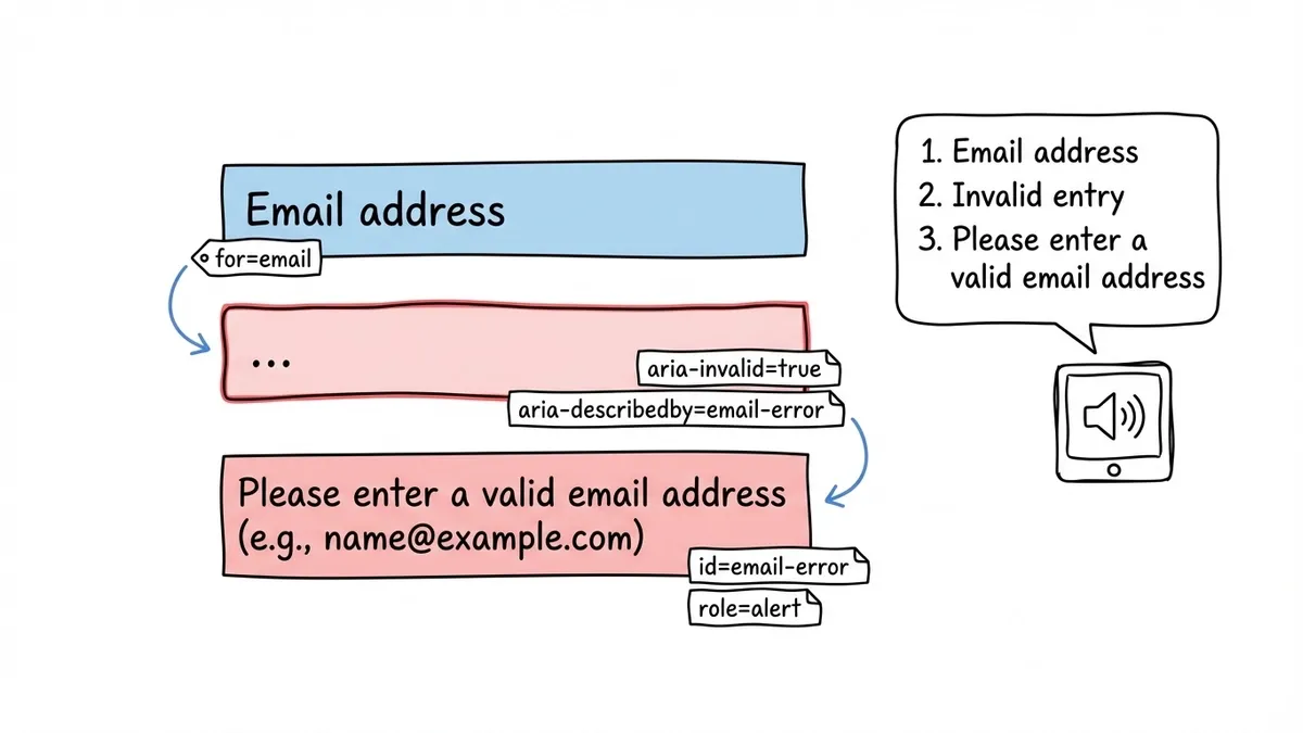
Each error message should be associated with its field using aria-describedby. This way, when a screen reader user focuses on the field, they hear both the label and the error message.
<label for="email">Email address</label><input id="email" type="email" aria-describedby="email-error" aria-invalid="true"/><span id="email-error" role="alert"> Please enter a valid email address (e.g., [email protected])</span>Use aria-invalid to mark fields with errors
Setting aria-invalid="true" on a field tells screen readers that the current value is wrong. Without it, a screen reader user might not realize there’s a problem even if a visual error message is displayed right next to the field.
Announce errors dynamically
If errors appear after the user interacts with a field (inline validation), use role="alert" or aria-live="assertive" on the error container. This causes screen readers to announce the error immediately, without the user having to navigate to it. Be careful with aria-live="assertive" on forms with many fields, though. If every field validates on blur and announces errors aggressively, the experience becomes overwhelming. For inline validation, aria-live="polite" is often the better choice, letting the announcement wait until the screen reader finishes its current output.
For a deeper look at validation patterns and timing, the form UX best practices post covers when to validate (on blur, on submit, or hybrid) and the trade-offs of each approach.
ARIA: when to use it and when to leave it alone
ARIA (Accessible Rich Internet Applications) attributes can make complex interfaces accessible. They can also make simple interfaces worse if used incorrectly. The first rule of ARIA, as stated in the W3C’s ARIA authoring practices, is: if you can use a native HTML element that already has the semantics you need, use it instead of adding ARIA.
A <button> is better than a <div role="button">. A <label> is better than aria-label. A <fieldset> with a <legend> is better than role="group" with aria-labelledby. Native elements come with built-in keyboard handling, focus management, and screen reader support. ARIA attributes are a patch for situations where native elements aren’t enough.
That said, there are cases where ARIA is the right tool:
aria-required="true"on required fields (in addition to therequiredattribute, which some screen readers handle inconsistently)aria-describedbyto associate help text or error messages with a fieldaria-invalid="true"to mark fields that have validation errorsaria-liveregions for dynamic content that updates without a page reload (like inline validation messages or character counters)aria-labelfor fields that have a visual label but no<label>element (icon-only search fields, for example)
One common mistake: adding aria-label to a field that already has a visible <label>. This can cause screen readers to ignore the visible label and only announce the aria-label, which creates a disconnect between what sighted users see and what screen reader users hear. If the visible label is correct, just associate it properly and skip the ARIA.
Testing your forms for accessibility
You can follow every guideline in this post and still have accessibility issues if you don’t test with actual assistive technology. Automated tools catch about 30-40% of accessibility issues, according to research by the Government Digital Service. The rest require manual testing.
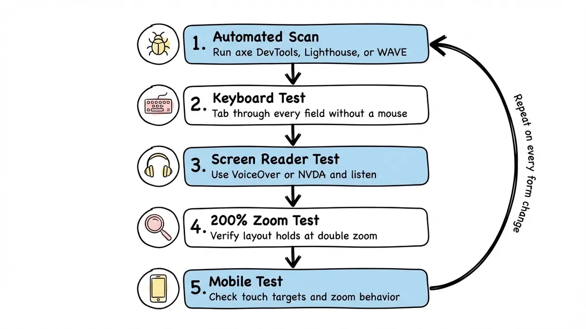
A practical testing approach:
- Run an automated scan. Use axe DevTools, Lighthouse, or WAVE. These catch missing labels, contrast failures, and missing ARIA attributes quickly. Fix everything they flag before moving on.
- Tab through the entire form. Put your mouse aside and complete the form using only your keyboard. Can you reach every field? Is the tab order logical? Can you see where focus is at all times? Can you submit the form and navigate error messages?
- Test with a screen reader. VoiceOver (built into macOS and iOS) and NVDA (free on Windows) are the two most practical options. Tab through the form and listen. Are labels announced correctly? Are required fields identified? Are error messages read when they appear?
- Check at 200% zoom. WCAG 1.4.4 requires that content be usable at 200% zoom. Does your form still work? Do fields overlap? Does text get cut off?
- Test on mobile. Touch targets, zoom behavior, and screen reader interaction all work differently on phones. Our guide to mobile-friendly forms covers the specifics.
Don’t treat accessibility testing as a one-time audit. Build it into your process. Every time you add a field, change a layout, or update error handling, run through the keyboard and screen reader checks again. It takes five minutes and catches problems before your users hit them.
A quick form accessibility checklist
For reference, here’s a condensed checklist you can use when building or reviewing any form:
Labels and structure
- Every field has a visible, programmatically associated label
- Related fields are grouped with
<fieldset>and<legend> - Placeholder text supplements labels but never replaces them
- Required fields are indicated in the label text (not just with color or an asterisk alone)
Keyboard and focus
- All fields and buttons are reachable via Tab
- Tab order matches visual order
- Focus indicators are visible and have sufficient contrast
- Focus moves to errors after failed submission
Color and contrast
- Text meets 4.5:1 contrast ratio (3:1 for large text)
- Field borders and UI components meet 3:1 contrast ratio
- Color is never the sole means of conveying information
Errors and validation
- Error messages are specific and actionable
- Errors are associated with fields via
aria-describedby - Fields with errors use
aria-invalid="true" - Dynamic errors are announced via live regions
ARIA and semantics
- Native HTML elements are used wherever possible
- ARIA attributes supplement, not replace, native semantics
- No conflicting labels (
aria-labeloverriding a visible<label>)
Accessible forms are just better forms
There’s a tendency to frame accessibility as a compliance burden. Something you do because you have to, not because you want to. That framing misses the point.
Every accessibility improvement listed in this post also improves the experience for people without disabilities. Clear labels reduce confusion for everyone. Logical tab order helps power users fly through forms. High contrast text is easier to read in any lighting condition. Specific error messages reduce frustration regardless of whether someone is using a screen reader.
The design decisions that boost completion rates overlap heavily with accessibility requirements. That’s not a coincidence. Good form design and accessible form design are the same discipline, viewed from different angles.
If you’re building forms and want to start from a foundation that handles label associations, keyboard navigation, and responsive layouts correctly, give Fomr a try. You can build a form without creating an account and see how it works before committing to anything.
The real goal isn’t checking boxes on a compliance checklist. It’s making sure that when someone needs to fill out your form, they actually can.