Every school, college, and training program runs on forms. Enrollment applications, course evaluations, field trip permission slips, parent surveys, scholarship applications, student feedback, event signups, academic advising requests. The list never stops growing, and the deadlines never stop coming.
Most educators default to Google Forms because it’s free and familiar. That’s a reasonable starting point, but it’s also where a lot of institutions get stuck. They build hundreds of forms that all look the same, with the same bland purple header, the same limited question types, and the same “Google Forms” branding that makes your university’s admissions process look like a homework assignment.
There are better options. A good form builder for education should handle the specific needs that schools and universities face: multi-page applications, branded designs that match your institution, FERPA-conscious data handling, and a price tag that doesn’t eat into already-tight budgets. Here’s how to figure out what you actually need.
The forms that schools and universities can’t avoid
Before comparing tools, it helps to map out what you’re building. Education institutions cycle through a predictable set of form types, some running year-round and others spiking at specific points in the academic calendar.
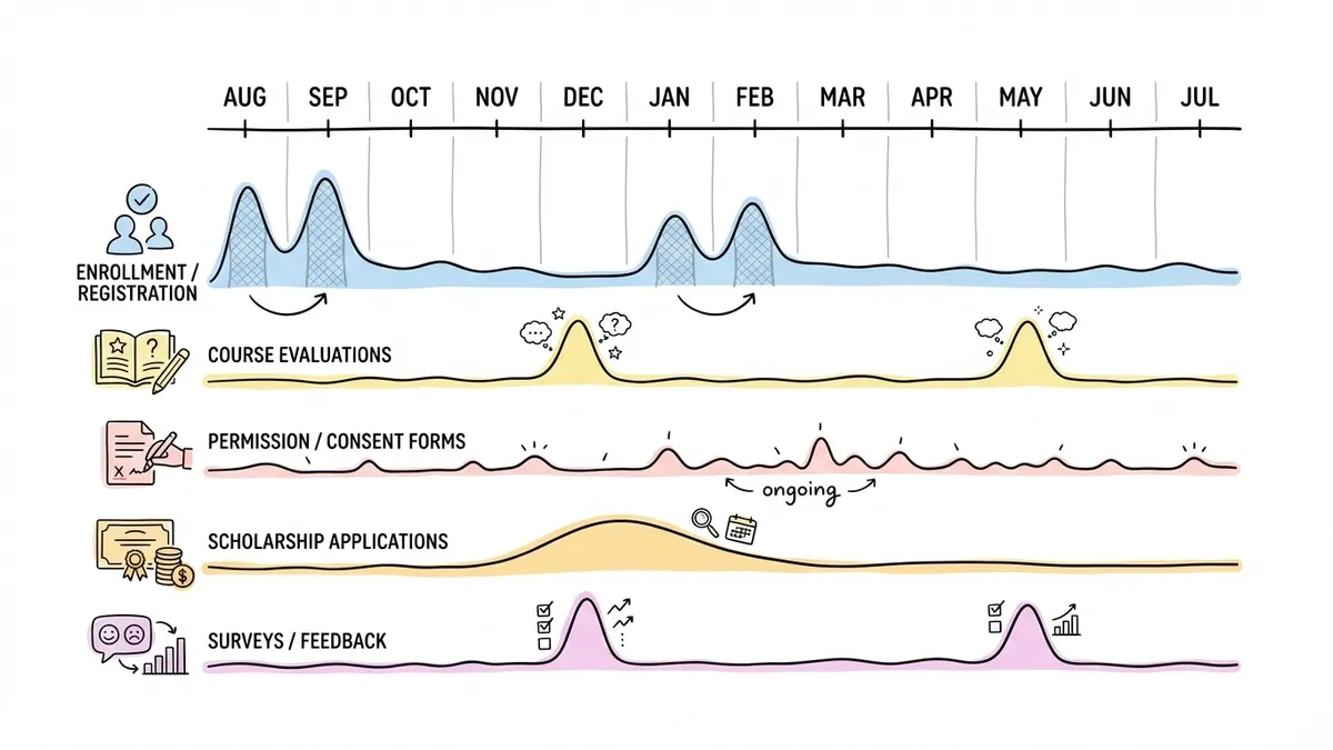
Enrollment and registration forms
These are the highest-stakes forms in education. A confusing or ugly enrollment form can literally cost your institution students. Prospective families are comparing you to other schools, and the application experience is part of that comparison.
A student registration form typically needs personal details, contact information, prior academic history, program selection, and sometimes emergency contacts or medical information. That’s a lot of fields, which means you need multi-page layouts to keep things manageable. Dumping 20 fields on a single page is a guaranteed way to lose applicants halfway through.
We wrote a detailed guide on building registration forms that covers field planning and layout structure. The principles apply directly to academic enrollment.
Course evaluation forms
End-of-semester evaluations are required at most institutions, and they’re notoriously hard to get students to complete. The form itself is part of the problem. A wall of identical Likert scales with no visual variety produces survey fatigue before students finish the first section.
Good course evaluation forms mix question types: rating scales for quantitative tracking, multiple choice for logistics, and a few targeted open-ended questions for the feedback that actually helps instructors improve. Our guide on creating course evaluation forms goes deeper on question design and timing.
Permission and consent forms
Field trips, photo releases, medical treatment authorizations, technology use agreements. K-12 schools send these home constantly, and the paper-based process is a nightmare. Forms get lost in backpacks, signatures are illegible, and tracking who has and hasn’t returned their slip requires a spreadsheet that someone has to maintain manually.
Digital permission forms solve most of this. Parents fill them out on their phones, submissions are timestamped, and you can see at a glance who still needs to respond. The catch is that these forms often collect sensitive information about minors, which brings up compliance considerations I’ll cover below.
Scholarship application forms
These tend to be the longest and most complex forms in education. Applicants need to provide personal information, academic records, financial details, essay responses, and sometimes references. A single-page form for all of this is unusable.
Multi-page forms with clear section labels (“Personal Information,” “Academic Background,” “Financial Need,” “Essay Questions”) make the process feel structured instead of overwhelming. If you’re building scholarship forms, our scholarship application guide walks through the full process.
Surveys and feedback forms
Student satisfaction surveys, parent feedback forms, alumni engagement surveys, campus climate assessments, event feedback. Education institutions collect a staggering amount of survey data, and most of it goes through forms.
The key with surveys is keeping them short enough that people actually finish them. Five to eight questions for a quick feedback form. Ten to fifteen for a more detailed assessment. Anything beyond that and your completion rate drops off a cliff. We covered survey design fundamentals in our guide on creating surveys from scratch.
Where Google Forms falls short for education
Google Forms is fine for a quick classroom poll or a simple signup sheet. But once you’re building forms that represent your institution publicly, its limitations become obvious.
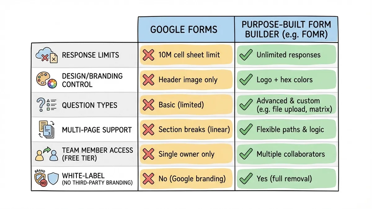
No real design control
You get a header image, a color picker, and four font options. That’s it. Every Google Form looks like a Google Form, which is a problem when your enrollment application should look like it belongs to your school, not to Google. You can’t match your institution’s brand guidelines, add your logo in a prominent position, or create a visual experience that feels intentional.
This matters more than people think. Parents evaluating private schools, prospective students comparing universities, donors considering contributions — they notice when your forms look generic. Design signals professionalism and attention to detail.
Response limits on the ecosystem level
Google Forms itself doesn’t cap responses, but the data flows into Google Sheets, which has a 10-million-cell limit. For a single form that’s rarely an issue. But institutions running dozens of forms across departments, all feeding into shared Google Workspace accounts, can hit storage and organizational limits faster than expected.
The bigger problem is data organization. When every department creates forms independently in Google Workspace, you end up with forms scattered across individual accounts, shared drives, and forgotten folders. There’s no central dashboard showing all active forms across the institution.
Limited question types
Google Forms gives you about a dozen question types. That covers the basics, but education forms often need more. Ranking questions for course preference selection. Matrix grids for multi-criteria evaluations. Date and time pickers that actually work well on mobile. Rating scales with custom labels. Some of these exist in Google Forms in basic form, but they’re clunky compared to purpose-built alternatives.
No branding removal
Every Google Form says “Google Forms” at the bottom. For internal use, nobody cares. For parent-facing enrollment forms, donor surveys, or public-facing applications, it looks unprofessional. You’re a university with a 50-year reputation, and your application form has another company’s branding on it.
What to look for in an education form builder
Not every feature matters equally for schools. Here’s what I’d prioritize based on how education institutions actually use forms.
A free tier that doesn’t punish you for having lots of students
Education budgets are tight. IT departments have procurement processes that take months. If you need to get forms running quickly, you need a free plan that actually works at scale.
Watch out for response caps. A form builder that limits you to 100 responses per month is useless for a university course evaluation that might get 300 responses in a week. Same for form limits — a school district with 15 buildings might need dozens of active forms at any given time.
Fomr offers unlimited forms, responses, fields, and team members on the free plan. That last point is relevant for education specifically, because you probably have multiple administrators, department heads, and staff members who need to create or manage forms. Paying per seat gets expensive fast when your team includes part-time coordinators and student workers.
Design control that matches your institution
Your forms should look like they belong to your school. That means custom colors (matching your school’s exact hex codes), font choices beyond the four defaults, your logo, and background options that create a cohesive visual identity.
This isn’t vanity. A study from Stanford’s Persuasive Technology Lab found that design quality is one of the top factors people use to evaluate credibility of online content. When a parent opens your enrollment form and it looks polished and intentional, they trust the process more. When it looks like a default template, they wonder how much care goes into the rest of the school’s operations.
Multi-page forms that don’t feel like a chore
Education forms tend to be longer than business forms. A scholarship application might have 15-20 fields. An enrollment form could have even more. Cramming all of that onto one page creates a scroll-of-doom experience that drives people away.
Multi-page layouts with progress indicators let applicants see how far they’ve come and how much is left. Group related fields on the same page: personal info on page one, academic history on page two, essay questions on page three. Each page feels manageable even if the total form is substantial.
Easy sharing across channels
Schools distribute forms through every channel imaginable. Email blasts to parents. Links posted in the LMS. QR codes on flyers in the hallway. Embedded forms on the school website. Shared in parent Facebook groups.
Your form builder should support all of these without friction:
- Shareable links for email and messaging
- Embed widgets for your school website (lightweight JavaScript, not clunky iframes)
- Popup forms triggered by buttons on specific pages
- QR codes for printed materials and physical signage
That QR code option is underrated in education. A poster outside the guidance counselor’s office with a QR code linking to a scheduling form gets more responses than an email that sits unread in a student’s inbox.
Mobile-first design
Students live on their phones. Parents check school communications on their phones. If your form doesn’t work well on a 6-inch screen, you’re losing responses from the people you most need to hear from.
Good mobile form design goes beyond responsive layouts. Phone number fields should trigger the numeric keyboard. Date fields should show native date pickers. Tap targets need to be large enough for thumbs. Text areas should expand as people type. These details sound small, but they’re the difference between a form that feels smooth and one that feels like a chore.
FERPA and data privacy considerations
This is where education forms differ meaningfully from business forms. Schools that receive federal funding are subject to FERPA (the Family Educational Rights and Privacy Act), which governs how student education records are handled.
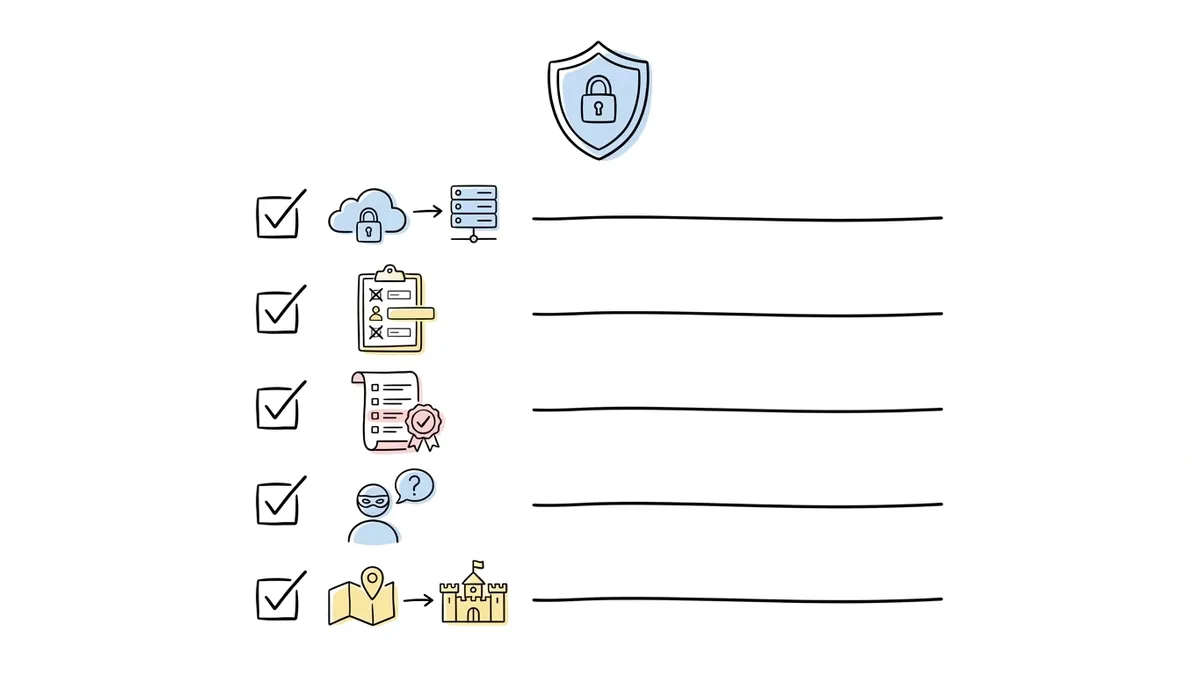
FERPA doesn’t ban you from using online form builders. But it does mean you need to think about where student data is stored, who has access to it, and whether your form builder’s data practices align with your institution’s compliance requirements.
A few practical considerations:
Check the form builder’s security posture. Look for HTTPS encryption (non-negotiable), SOC 2 compliance, and clear data processing documentation. If the tool stores data on servers in jurisdictions with different privacy laws, that’s worth understanding before you collect student records through it.
Limit what you collect. This is good form design advice regardless of compliance, but it’s especially important with student data. Don’t ask for Social Security numbers, detailed medical information, or other sensitive data through a general-purpose form unless you’ve confirmed the tool meets your institution’s security requirements for that data type.
Understand your institution’s policies. Many universities and school districts have approved vendor lists or data processing agreements that need to be in place before you use a third-party tool for student data. Check with your IT department before rolling out a new form builder across campus. This step is annoying but necessary.
Consider anonymity for evaluations. Course evaluations and campus climate surveys should be anonymous whenever possible. Students give more honest feedback when they’re not worried about their instructor seeing their name attached to a critical comment. Make sure your form builder supports truly anonymous submissions, not just “we won’t show the name” but actually not collecting identifying information.
Common mistakes schools make with forms
Building everything in one tool’s ecosystem
Some institutions go all-in on Google Workspace and use Google Forms for everything because it’s “already included.” The problem is that “already included” doesn’t mean “best fit.” When your enrollment form looks identical to your lunch menu survey, you’ve optimized for convenience at the expense of quality.
Use the right tool for each job. Google Forms is fine for internal, low-stakes forms. For anything parent-facing, student-facing, or public-facing, use a builder that gives you design control and a professional appearance.
Making forms too long
I’ve seen school enrollment forms with 30+ fields on a single page. Emergency contact, medical history, transportation preferences, lunch account setup, technology agreement, photo release, and demographic information all crammed together. Parents start filling it out, get overwhelmed, and close the tab.
Split long forms into focused sections. Better yet, split them into separate forms entirely. Collect enrollment essentials first, then send follow-up forms for transportation, medical details, and other secondary information. You’ll get higher completion rates on every form.
Ignoring the mobile experience
A surprising number of school forms are still designed desktop-first, with tiny radio buttons, long horizontal scales that require sideways scrolling, and text that’s too small to read on a phone. Test every form on a phone before you publish it. If you wouldn’t want to fill it out on your own phone, your parents and students won’t either.
Forgetting the confirmation page
Someone submits your permission slip form. Then they see a generic “Your response has been recorded” message. Did it work? Will they get a confirmation email? What happens next?
Customize your confirmation page. “Thanks! Your permission slip for the October 15 field trip has been submitted. You’ll receive a confirmation email shortly. Contact Mrs. Rodriguez at [email] with questions.” That takes two minutes to set up and prevents a dozen follow-up emails from confused parents.
Getting started without a procurement process
Here’s the practical path if you want to improve your institution’s forms without waiting for a six-month vendor evaluation:
-
Audit your current forms. List every form your school or department uses, who manages it, and where it lives. You’ll probably find duplicates, outdated forms still collecting responses, and forms that nobody remembers creating.
-
Identify the high-impact forms. Which forms are public-facing? Which ones have the lowest completion rates? Which ones generate the most complaints from parents or students? Start there.
-
Pick a form builder with a free plan that doesn’t cap responses. Test it with one form before committing. Build your highest-impact form and see how the process feels.
-
Set up your institution’s brand kit. Upload your logo, set your school colors, choose fonts that match your website. Apply this to every form so they all look consistent and professional.
-
Migrate forms one at a time, starting with the ones that matter most. Don’t try to move everything at once.
The whole process can start with a single afternoon and one form. Once you see the difference between a branded, well-designed form and a default Google Form, you’ll want to migrate the rest.
Pick the tool, then get back to teaching
Choosing a form builder shouldn’t consume weeks of committee meetings. Find something that’s free, looks professional, handles the volume your institution needs, and lets multiple staff members build forms without a steep learning curve. Then move on to the work that actually matters.
If you want to test things without creating an account or going through procurement, Fomr’s guest editor lets you build a form right now. No signup, no credit card, no IT ticket required. Build your next course evaluation or enrollment form and see if it fits.