Enterprise companies have IT departments that evaluate software for months. They run pilots, write requirements documents, and negotiate contracts. You run a small business. You need a form on your website by Thursday.
That gap between enterprise buying and small business reality is where most form builder marketing falls apart. Tools advertise hundreds of features you’ll never touch while burying the three things you actually care about: Can I build this myself? Will it look professional? How much does it cost?
Here’s a practical guide to choosing a form builder for small business use, based on what actually matters when your budget is tight and your time is tighter.
The forms small businesses actually need
Before comparing tools, it helps to get specific about what you’re building. Most small businesses need some combination of these five form types, and almost nothing else:
Contact forms. The baseline. Every business website needs one, and it should take five minutes to build. If your form builder makes a simple contact form complicated, that’s a red flag.
Lead capture forms. A step beyond contact forms. These collect specific information from potential customers, like what service they’re interested in, their budget range, or their timeline. Good lead generation forms are short, focused, and tied to a clear offer.
Appointment or booking requests. Salons, consultants, repair shops, tutors. If your business runs on appointments, you need a form that collects date preferences, service type, and contact details without overwhelming people.
Customer feedback and surveys. Post-purchase surveys, NPS scores, “how did you hear about us” forms. These don’t need to be fancy. They need to be easy to fill out on a phone.
Order forms. Product-based businesses, catering companies, print shops. Customers pick items, specify quantities, and submit a request. These forms tend to be longer, so the builder needs to handle multi-page layouts well.
If your needs fit neatly into these categories, you don’t need an enterprise form platform. You need something simple, affordable, and good-looking enough that customers don’t question your professionalism.
What to look for in a small business form builder
Not every feature matters equally. Here’s what I’d prioritize if I were picking a tool today, ranked roughly by importance.
A free plan that’s actually usable
This is the single biggest differentiator for small businesses. Many form builders advertise a free tier, then cap you at 10 or 100 responses per month. That’s not a free plan. That’s a free trial with extra steps.
Look for tools where the free plan lets you collect unlimited responses. You shouldn’t have to worry about hitting a wall during your busiest month. Some builders, like Fomr, offer unlimited forms, responses, fields, and even team members on their free tier. Others, like Google Forms, are free but give you almost no design control. The tradeoff is real, and it depends on how much your forms’ appearance matters to your brand.
We did a full comparison of free form builders if you want the detailed breakdown.
Drag-and-drop editing that doesn’t require a tutorial
If you need to watch a 20-minute YouTube video to build a contact form, the tool has failed at its job. The editor should feel obvious. Drag a field, drop it where you want it, type your label, done.
Pay attention to how the editor handles rearranging fields, adding pages, and previewing on mobile. These are the actions you’ll repeat dozens of times. Small friction here compounds fast.
Design control beyond color pickers
This one gets overlooked, but it matters more than most people think. Your form is often the first interactive thing a potential customer touches on your website. If it looks like a generic gray box with default fonts, it sends a message about your business, and not a good one.
Look for control over fonts, colors, backgrounds, spacing, and logo placement. Some builders give you a handful of preset themes. Others let you match your exact brand guidelines. The difference shows up in how professional your forms feel to the people filling them out.
Mobile performance
Over half your form submissions will come from phones. This isn’t a nice-to-have. If the form builder doesn’t render well on mobile, or if the editor doesn’t let you preview the mobile experience, walk away.
Test this yourself before committing. Open the form on your phone. Try filling it out with one thumb. If any field is hard to tap, any text is too small to read, or the layout breaks, you’ve found your answer.
Embedding options
Most small businesses don’t want to send people to a separate form page. They want the form embedded on their existing website, whether that’s WordPress, Squarespace, Wix, or a custom site.
Check how embedding works. Some tools use simple JavaScript snippets you paste into your site. Others require plugins or iframes that can be finicky. The best option is a lightweight embed script that loads fast and doesn’t mess with your page layout.
What you can safely ignore (for now)
Small business form builder guides love to list 50 features. Most of them won’t matter to you until much later, if ever. Here’s what I’d skip when evaluating tools:
Advanced conditional logic. Yes, it’s useful for complex forms. But if you’re building a contact form and a feedback survey, you don’t need branching logic on day one. Get the basics right first.
Payment processing built into forms. It sounds convenient, but dedicated payment tools (Stripe, Square, PayPal) are almost always better for actual transactions. Form-based payments work for simple cases like event registration fees, but they’re not a replacement for proper e-commerce.
Hundreds of integrations. You probably need email notifications and maybe a connection to your CRM or spreadsheet. You don’t need 500 Zapier integrations. Most small businesses use three to five tools total.
AI form generation. Several builders now offer AI that creates forms from a text prompt. It’s a neat demo, but the forms it generates usually need so much editing that you would have been faster building from scratch.
The pricing trap to watch for
Form builder pricing is confusing on purpose. Here’s how to read it without getting burned.

Per-response pricing is the most common gotcha. You sign up for a plan that seems affordable, then discover you’re paying per form submission. For a business that gets 500 contact form submissions a month, this adds up fast. Always check whether responses are capped on the plan you’re considering.
Branding removal fees are another one. Many free plans stamp the form builder’s logo on every form. Removing it costs $20-35/month on most platforms. If brand consistency matters to you (and it should), factor this into the real cost.
Per-seat pricing hits growing teams. You hire a second person and suddenly your form builder costs twice as much. Look for tools that include team members in the base price rather than charging per user.
Here’s a rough comparison of what popular form builders actually cost for a typical small business:
| Tool | Free plan responses | Remove branding | Team members (free) | Starting paid price |
|---|---|---|---|---|
| Fomr | Unlimited | Pro ($17/mo) | Unlimited | $17/mo |
| Google Forms | Unlimited | N/A | Via Google Workspace | Free |
| Typeform | 10/month | No | 1 | $25/mo |
| Jotform | 100/month | No | 1 | $34/mo |
| Tally | Unlimited | Pro ($29/mo) | 1 | $29/mo |
Google Forms wins on price because it’s completely free, but the design limitations are severe. Everything looks like a Google Form, and there’s no way around it. For internal forms or quick surveys where appearance doesn’t matter, it’s fine. For anything customer-facing, you’ll want more control.
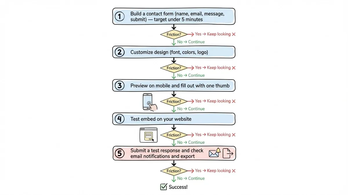
How to evaluate a form builder in 15 minutes
You don’t need a week-long trial. Here’s a quick test that tells you most of what you need to know:
-
Build a contact form from scratch. Name, email, message, submit button. Time yourself. If it takes more than five minutes, the editor is too complicated for everyday use.
-
Customize the design. Change the font, adjust the colors to match your brand, add your logo. If you can’t do this on the free plan, or if the options feel limited, you’ll be frustrated later.
-
Preview on mobile. Open the form on your phone. Fill it out. Note anything that feels awkward.
-
Test the embed. If you have a website, try embedding the form. Check that it loads quickly and doesn’t break your page layout.
-
Check the submission experience. Submit a test response. See where it goes. Can you get email notifications? Can you export responses to a spreadsheet?
If a tool passes all five steps without friction, it’s probably a good fit. If you hit a wall on any of them, keep looking.
Fomr has a guest editor that lets you run through this entire test without creating an account. That’s useful if you want to evaluate the editor before committing your email address to yet another SaaS product.
Common mistakes small businesses make with forms
After watching hundreds of small businesses set up their forms, a few patterns keep repeating.
Asking for too much information
Every field you add reduces your completion rate. A HubSpot study found that reducing form fields from four to three increased conversions by almost 50%. Ask yourself: do you really need their phone number? Their company name? Their mailing address? If you’re not going to use the data, don’t collect it.
Ignoring the thank-you page
The confirmation screen after someone submits a form is valuable real estate. Most businesses leave it as a generic “Thanks for your submission” message. Use it to set expectations (“We’ll respond within 24 hours”), offer something useful (“Download our pricing guide while you wait”), or redirect to a relevant page on your site.
Using one form for everything
A single “Contact Us” form handling sales inquiries, support requests, partnership proposals, and job applications means nobody gets a good experience. Build separate forms for separate purposes. It takes ten minutes per form and dramatically improves how you handle incoming requests.
Never looking at the data
Building the form is step one. Actually reviewing submissions, spotting patterns, and improving the form based on what you learn is where the value compounds. If 40% of people drop off on page two, that page has a problem. If nobody uses the phone number field, remove it.
Picking the right tool for where you are now
The best form builder for your small business is the one that fits your current needs without locking you into costs you can’t justify. Here’s how I’d think about it:
If you just need basic internal forms and surveys, Google Forms is free and functional. Don’t overthink it.
If your forms are customer-facing and brand matters, look for a builder with real design control and a generous free plan. Fomr fits here well, with unlimited forms and responses on the free tier, 1,700+ fonts, and full visual customization. It doesn’t have conditional logic or integrations yet (those are coming), so if you need those today, check out our comparison of top form builders to find the right fit.
If you need complex workflows with payments, file uploads, and deep integrations right now, Jotform or Typeform will cover more ground, but expect to pay $25-50/month for the features you actually need.
The honest answer is that no single tool is perfect for everyone. But for most small businesses, the priority list is short: easy to build, looks professional, works on phones, and doesn’t charge you per response. Start there, and upgrade when your needs outgrow your tools.
Start building
You don’t need to spend a week researching form builders. Pick one, build your first form, and see how it feels. If it works, great. If it doesn’t, switching is easy when you only have a few forms.
If you want to test without signing up for anything, try the Fomr guest editor. Build a contact form, customize the design, and see if it fits your workflow. No account required, no credit card, no commitment.
Your forms are waiting. Go make them.