Most volunteer coordinators lose potential helpers before they even show up. Not because people aren’t interested, but because the volunteer form is a mess. It asks for too much, looks like it was built in 2008, or buries the submit button under 20 fields that have nothing to do with stacking chairs at a food bank.
A good volunteer form does two things: it captures the information you need to place someone in the right role, and it gets out of the way fast enough that motivated people don’t lose interest. Here’s how to create a volunteer form that actually accomplishes both.
Figure out what you need to ask (and what you don’t)
The biggest mistake with volunteer application forms is treating them like job applications. Volunteers are giving you their time for free. Asking them to fill out a 25-field form with references, essay questions, and a background check authorization before they’ve even committed is a great way to end up with zero volunteers.
Start with the bare minimum:
- Full name
- Email address
- Phone number (for day-of coordination)
- Availability (dates, times, or general schedule)
- Areas of interest or preferred roles
That’s five fields. For most volunteer programs, that’s enough to get someone matched and scheduled.
Some organizations genuinely need more. Youth programs may require emergency contacts and age verification. Medical volunteering needs certifications. Events with vulnerable populations might need background check consent. Those are legitimate additions. But be honest about whether you need that information at the sign-up stage or if it can come later in an onboarding email.
A volunteer interest form should feel like raising your hand, not filling out a tax return.
Group your fields by purpose
If you do need more than five or six fields, organize them into logical sections. Contact details first, then availability, then role preferences, then anything extra. This mirrors how a conversation would go if someone walked up to your table at a community event and said “I want to help.”
For longer forms, consider splitting them across multiple pages. A multi-page form with three fields per page feels much lighter than a single page with nine fields stacked on top of each other.
Pick the right fields for each section
The field types you choose affect both the volunteer’s experience and the quality of data you get back. Free-text fields are flexible but messy. Structured fields are clean but rigid. The trick is using the right type for each question.
Contact information
Use dedicated field types here. An email field validates the format automatically. A phone field shows the right keyboard on mobile. These small details prevent typos that make it impossible to reach your volunteers later.
For the name, a single “Full name” field works fine for most volunteer registration forms. Splitting it into first and last name is only worth it if your volunteer management system requires separate fields for import.
Availability and scheduling
This is where most volunteer sign up forms get clunky. Avoid open-ended text fields like “When are you available?” You’ll get answers ranging from “weekends” to “Tuesdays after 3pm except the second Tuesday of the month.” That’s a nightmare to sort through when you’re trying to staff a Saturday cleanup event.
Use checkboxes or a multi-select dropdown instead. List specific shifts, dates, or time blocks. “Saturday mornings (9am-12pm)” is something you can actually work with. If your volunteer program runs year-round with flexible scheduling, a simple choice between “Weekdays,” “Weekday evenings,” “Weekends,” and “Flexible” covers most cases.
Skills and role preferences
A dropdown or checkbox list of available roles works better than asking people to describe their skills in a text box. “Kitchen prep,” “Event setup,” “Registration desk,” “Social media,” “Driving/delivery” gives volunteers a clear picture of what’s available and gives you structured data you can filter.
If you want to know about special skills or certifications, add one optional text field at the end: “Any relevant skills, certifications, or experience you’d like us to know about?” One field. Not five.
The “how did you hear about us” question
This one is worth including but should always be optional. It helps you understand which recruitment channels work, but it’s not worth losing a volunteer over. Put it last, mark it optional, and use a dropdown with common sources (social media, friend/family, website, community board, other).
Design the form so it doesn’t look like homework
The visual design of your volunteer form matters more than most coordinators realize. A form that looks professional and clean signals that your organization is well-run. A form that looks thrown together signals the opposite.
Here are the design choices that actually move the needle:
Use your organization’s colors and logo. Volunteers should recognize your brand the moment they open the form. If your nonprofit’s website is blue and white, your form shouldn’t be default gray with a generic font. Consistency builds trust, and trust matters when you’re asking someone to give up their Saturday.
Single-column layout. Side-by-side fields look efficient on desktop but cause problems on phones. Since a significant chunk of your volunteers will find your form through a social media post and open it on their phone, single-column is the safer bet. More on this in our form design tips guide.
Short, clear labels. “Preferred volunteer role” beats “Please select the volunteer role or roles that you would be most interested in participating in.” People scan forms. They don’t read them word by word.
A welcoming intro. Add a brief paragraph at the top of your form: what the volunteer program is about, roughly how much time commitment is expected, and what happens after they submit. Two or three sentences. This context reduces the “what am I signing up for?” anxiety that causes people to close the tab.
Build the form step by step
Once you know your fields and layout, the actual building process is straightforward. Here’s the practical walkthrough.
1. Open your form builder
You can use any form builder that supports custom design and multiple field types. Fomr is a solid option because the free plan has no limits on forms, responses, or fields, which matters for nonprofits and community organizations watching their budget. You can also try the guest editor to build a form without creating an account first.
Whatever tool you pick, make sure it gives you enough design control to match your organization’s branding. A volunteer form template can save time, but you’ll almost always need to customize it.
2. Set up your pages
For a simple volunteer sign up form (under 8 fields), a single page works fine. For anything longer, split it into two or three pages:
- Page 1: Contact information (name, email, phone)
- Page 2: Availability and role preferences
- Page 3: Optional questions (how they heard about you, additional notes)
This structure follows the same progressive disclosure approach that works well for event registration forms. Lead with the easy stuff, save the thinking for later.
3. Add your fields and configure them
Drag in each field, set the label, and decide whether it’s required or optional. Be conservative with required fields. Name and email should be required. Phone number is debatable. Everything else can usually be optional without hurting your ability to place volunteers.
For choice-based fields (role preferences, availability), pre-populate the options with your actual needs. Don’t make volunteers guess what roles exist. List them out.
4. Write your confirmation message
The thank-you screen after submission is an underrated opportunity. Don’t just say “Thanks for submitting.” Tell them what happens next: “We’ll review your information and reach out within 3 business days to discuss available roles and scheduling.” Setting expectations reduces follow-up emails from eager volunteers wondering if their form went through.
Share the form where volunteers actually are
Building a great volunteer registration form means nothing if nobody sees it. Think about where your potential volunteers spend their time and meet them there.
Your website. Embed the form directly on your volunteer page. An embedded form converts better than a link that opens a new tab because it removes a click from the process. If you’re not sure how to do this, our guide to embedding forms walks through the options.
Social media. Share the direct link to your form on Instagram, Facebook, and LinkedIn. Write a short post explaining what you need help with and how much time it takes. Specific asks (“We need 12 volunteers for a 3-hour park cleanup on March 15th”) outperform vague ones (“We’re looking for volunteers!”) by a wide margin.
Email lists. If you have a newsletter or donor list, include the form link in your next send. People who already support your organization financially are often willing to give time too.
Printed materials. Generate a QR code that links to your form and put it on flyers, posters, and event handouts. This bridges the gap between physical outreach and digital sign-up.
Partner organizations. Share the form link with schools, churches, community centers, and corporate volunteer coordinators. Make it easy for them to forward to their networks.
Common mistakes that kill volunteer form completion
After watching dozens of organizations struggle with volunteer recruitment, a few patterns keep showing up.
Asking for a resume or cover letter. This isn’t a job. Unless you’re recruiting for a highly specialized role (pro bono legal counsel, medical professionals), skip it. A simple skills checkbox or optional text field covers what you need.
No mobile optimization. If your form doesn’t work on a phone, you’re excluding the majority of people who find it through social media shares. Test your form on an actual phone before publishing it.
Burying the form behind account creation. Requiring volunteers to create an account on your website before they can fill out a form adds friction that kills sign-ups. Use a standalone form link instead.
Vague role descriptions. “General volunteer” tells people nothing. List specific roles with brief descriptions so volunteers can self-select into positions that match their interests and abilities.
No follow-up plan. The form is just the beginning. If someone submits a volunteer application form and doesn’t hear back for two weeks, they’ve moved on. Have a system in place to respond within 48 hours, even if it’s just an automated email confirming receipt and outlining next steps.
Adapt the form for different volunteer programs
A one-size-fits-all volunteer form rarely works well. The fields you need for a weekend food drive are different from what you need for an ongoing mentorship program.
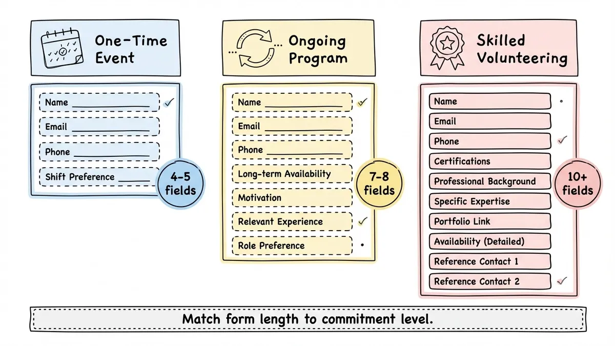
One-time events need minimal information: name, contact, and which shift they can work. Keep it to 4-5 fields. Speed matters because you’re competing with the volunteer’s impulse to help, and that impulse fades fast.
Ongoing programs can ask for more because the commitment is bigger. Add questions about long-term availability, motivation, and relevant experience. A registration form approach works well here since you’re essentially enrolling someone in a program.
Skilled volunteering (pro bono consulting, medical missions, technical projects) justifies a longer form. Ask about certifications, professional background, and specific expertise. People expect more questions when the role requires specialized knowledge.
The key is matching form length to commitment level. A 3-field form for a 2-hour cleanup. A 10-field form for a year-long mentorship. Anything else feels disproportionate.
After the form: what happens next
Collecting volunteer sign-ups is only half the job. What you do with the responses determines whether those people actually show up.
Export your responses regularly and sort them by availability and role preference. Build a simple spreadsheet or use your volunteer management system to track who’s been contacted, who’s confirmed, and who’s been placed.
Send a personal welcome email within 48 hours. Not a mass blast. Something that references their specific interests: “Thanks for signing up, Sarah. We noticed you’re interested in kitchen prep. Our next food bank shift is March 12th, and we’d love to have you.” That kind of specificity makes people feel seen, and people who feel seen show up.
For recurring programs, consider sending a short signup form for each specific event or shift rather than relying on a single master volunteer list. It’s easier to manage and gives volunteers a clear action to take each time.
Start building your volunteer form
You don’t need a perfect form. You need one that’s clear, quick, and respectful of your volunteers’ time. Five to eight well-chosen fields, clean design that matches your brand, and a distribution plan that puts the form where your volunteers already are.
If you want to get started quickly, Fomr’s free plan gives you everything you need: unlimited forms and responses, custom branding, multi-page layouts, and sharing options including embeds and QR codes. No credit card, no response caps, no catch.
The volunteers are out there. Make it easy for them to raise their hand.