Signup forms are deceptively simple. Name, email, password, done. But the gap between a signup form that converts at 10% and one that converts at 40% is enormous, and it rarely comes down to the product behind the form. It comes down to the form itself.
The worst offenders ask for too much too soon. They want your phone number, company name, job title, and a blood sample before you’ve even seen what the product does. The best signup forms feel like a two-second speed bump, not a toll booth. Here’s how to create a signup form that falls into the second category.
Decide what you actually need to collect
Before you touch a signup form builder, answer one question: what’s the minimum information you need to create an account and deliver value?
For most products, that’s an email address. Maybe a name. Maybe a password (though plenty of apps now use magic links or OAuth instead). That’s the whole list.
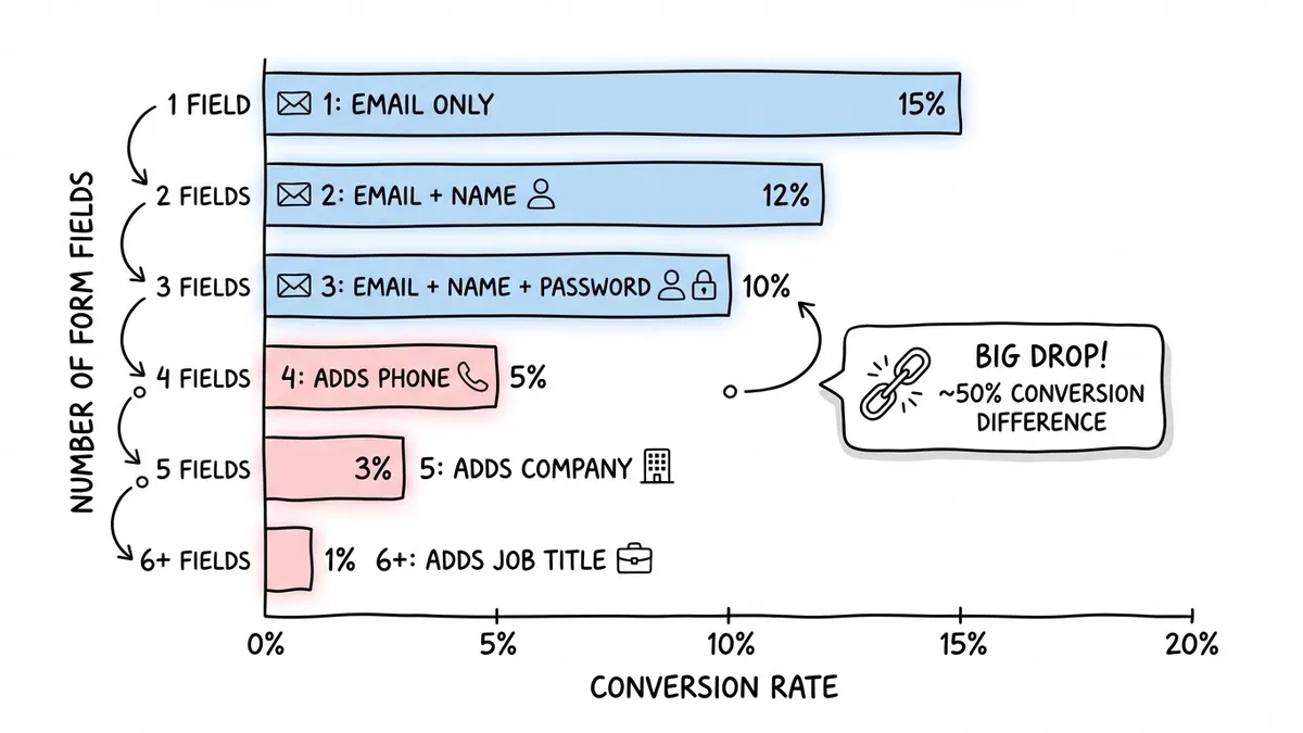
Every field you add beyond the essentials costs you signups. The data on this is consistent across studies: HubSpot found that reducing form fields from four to three increased conversions by almost 50%. That’s not a rounding error. That’s half your potential users walking away because you asked one question too many.
Here’s a quick framework for deciding what stays and what goes:
- Email address is non-negotiable. It’s your primary identifier and communication channel.
- Name is useful for personalization but can be collected later during onboarding.
- Password depends on your auth strategy. If you support social login or magic links, you can skip it entirely on the signup form.
- Phone number, company name, job title should almost never appear on a signup form. Collect these after the user has experienced your product and has a reason to stick around.
If you’re building an email signup form for a newsletter or waitlist, you can get away with a single field. One field. That’s it. The fewer decisions someone has to make, the more likely they are to finish.
Pick the right form builder
You have two paths: code it yourself or use a form builder. Unless you have specific technical requirements (custom validation logic, direct database writes, complex conditional flows), a form builder saves you hours and gives you a better result.
What to look for in a signup form builder:
- A drag-and-drop editor so you can iterate quickly without touching code
- Design customization beyond just swapping colors (fonts, backgrounds, spacing, layout)
- Mobile-responsive output by default, not as an afterthought
- Embed options so you can drop the form into your website, landing page, or popup
- No artificial limits on responses, because a signup form that caps out at 100 submissions per month is useless
Fomr checks all of these boxes on its free plan, with no limits on forms, responses, or fields. You can also try the guest editor to build a form without creating an account first, which is a nice way to test the waters before committing.
That said, pick whatever tool fits your workflow. The principles below apply regardless of which builder you use.
Structure the form for speed
A user signup form should feel fast. Not “fast for a form.” Actually fast. The goal is to get someone from “I want to try this” to “I’m in” with as little friction as possible.
Keep it to one page
Multi-step forms work well for registration forms with lots of fields, but signup forms should almost always be a single page. There’s not enough content to justify multiple steps, and adding a progress bar to a three-field form feels silly.
Put the form above the fold
If someone has to scroll to find your signup form, you’ve already lost a chunk of your audience. The form should be visible the moment the page loads, especially on mobile. Pair it with a short headline that explains what they’re signing up for and what they’ll get.
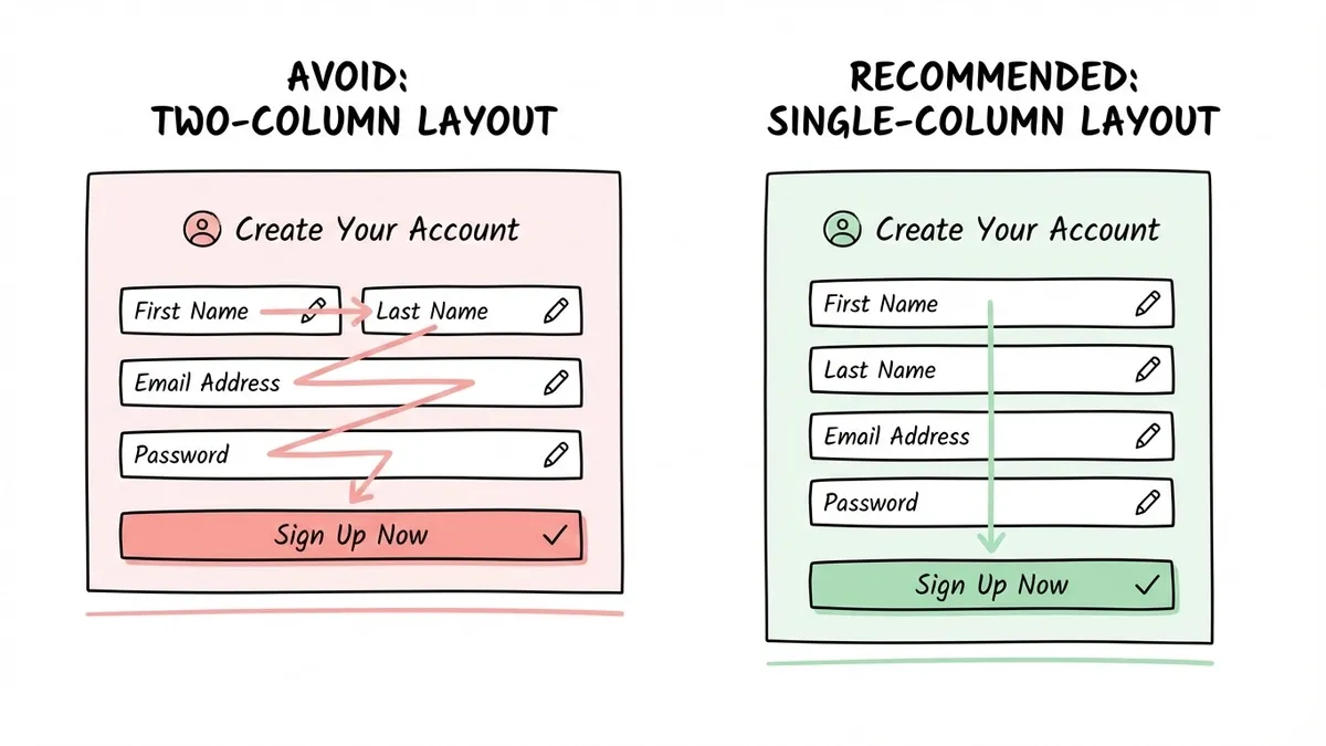
Use a single-column layout
Side-by-side fields save vertical space but slow people down. Eye-tracking studies consistently show that single-column forms are completed faster because users don’t have to zigzag across the page. Stack your fields vertically.
Write labels and copy that reduce friction
The words on your signup form matter more than you’d think. Vague labels create hesitation, and hesitation kills conversions.
Field labels
Be specific and conversational:
- “Email” works. “Email Address” is slightly clearer. “Your Email” feels friendlier.
- “Password” is fine. Add a brief note about requirements below the field: “At least 8 characters.” Don’t make people guess.
- Avoid “Username” unless your product genuinely needs one. Most people don’t want to invent a username in 2026.
Placeholder text
Use it for format hints, not as a replacement for labels. “[email protected]” inside an email field is helpful. “Enter your email address” is redundant. And placeholder text that disappears when you start typing is a usability problem if it’s the only label, because people forget what the field was asking for mid-sentence.
The submit button
“Submit” is the worst possible button text. It tells the user nothing about what happens next.
Better options for a signup form:
- “Create my account”
- “Get started free”
- “Sign up”
- “Start building” (if your product is a tool)
The button text should match the action and set expectations. If clicking it creates an account, say so. If it sends a confirmation email, mention that below the button.
Design the form to match your brand
A signup form that looks like it was built in 2012 undermines trust before anyone types a single character. Your form is often the first interactive experience someone has with your product. It should look like it belongs.
This doesn’t mean you need to go wild with gradients and animations. It means:
- Use your brand’s fonts and colors consistently
- Match the form’s visual style to the page it lives on
- Give fields enough padding and spacing so they don’t feel cramped
- Make the submit button visually prominent (contrasting color, large enough to tap easily)
If you’re using a form builder, look for one that gives you real design control. Being able to pick from 1,700+ fonts, set custom colors, and add your own background or logo makes a real difference. Generic-looking forms with default styling signal “I didn’t care enough to customize this,” which isn’t the first impression you want.
For more on this, our guide on form design tips to boost completion rates goes deeper into the visual side.
Handle errors without punishing users
Nothing kills a signup flow faster than bad error handling. Someone fills out your form, hits submit, and gets a vague red banner that says “Please fix the errors below” without pointing to the actual problem.
Good error handling for signup forms:
- Validate email format in real time, before the user hits submit. Show a small checkmark or a gentle “That doesn’t look like an email address” message as they type.
- If a password doesn’t meet requirements, show which requirements are met and which aren’t. A checklist that updates live is better than a wall of red text after submission.
- If the email is already registered, say so clearly and offer a link to the login page. Don’t make them guess why the form isn’t working.
- Never clear the form on error. If someone made a typo in one field, don’t wipe out everything they entered. That’s a guaranteed bounce.
Social login as a shortcut
Offering “Sign up with Google” or “Sign up with GitHub” alongside your email signup form can boost conversions significantly. It eliminates the password field entirely and reduces the form to a single click. Not every product needs this, but if your audience is tech-savvy or you’re competing for attention, it’s worth considering.
Place the form where people are ready to act
A signup form on a blank page with no context converts poorly. People need to understand what they’re signing up for before they’ll hand over their email.
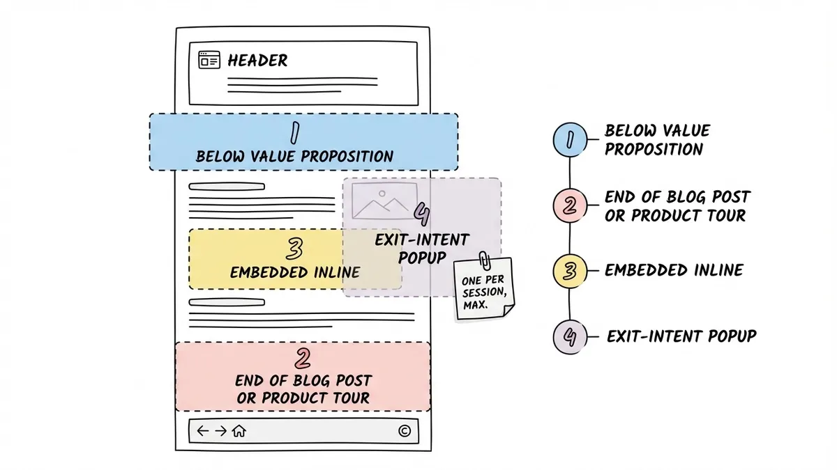
The highest-converting placements:
- Below a clear value proposition on a landing page. Headline explains the benefit, form sits right underneath.
- At the end of a blog post or product tour where someone has already learned about your product and is primed to try it.
- As an embedded form on your homepage, pricing page, or feature pages. Inline forms that live within the page content tend to outperform forms hidden behind a “Sign Up” button that opens a new page.
- As a popup triggered by intent signals (scroll depth, exit intent, time on page). These can be effective but annoying if overused. One popup per session, max.
If you’re embedding a signup form on an existing website, you’ll want a form builder that supports clean embed options. A JavaScript widget that drops into your page is much better than an iframe that creates scrolling issues and looks out of place. Our guide on how to embed a form on any website covers the technical details.
Common signup form mistakes to avoid
I’ve reviewed hundreds of signup forms across SaaS products, newsletters, and communities. The same mistakes show up over and over.
Asking for a credit card upfront. Unless you have no free tier at all, requiring payment information during signup is a conversion killer. Let people try the product first. You can ask for payment when they hit a usage limit or want to upgrade.
CAPTCHA overkill. Yes, you need to prevent bot signups. But aggressive CAPTCHAs that make real humans identify traffic lights across 12 images are hostile. Use invisible reCAPTCHA or honeypot fields instead. They catch bots without punishing legitimate users.
No confirmation of what just happened. After someone submits a signup form, they should immediately know what to do next. “Check your email for a confirmation link” or “You’re in! Here’s your dashboard.” A blank page or a generic “Thank you” with no next step is a wasted opportunity.
Hiding the privacy policy. People are increasingly cautious about where their email goes. A small line below the submit button that says “We won’t share your email. Privacy policy” goes a long way toward building trust. You don’t need a paragraph, just a sentence.
Making the form too clever. Animated fields that fly in from the sides, forms that auto-advance before you’re ready, submit buttons that change color on hover in distracting ways. Keep it simple. The best signup forms are boring in the best sense: predictable, fast, and easy to complete.
Measure and improve over time
Creating a signup form online is not a one-and-done task. You should be tracking at least two metrics:
- Conversion rate: the percentage of people who see the form and complete it. If you’re below 20% on a simple signup form, something is wrong.
- Drop-off point: where people abandon. If 80% of users fill in their email but bail at the password field, that tells you something specific you can fix.
Run small experiments. Try removing one field and see if signups increase. Test different button text. Move the form higher on the page. Change the headline above it. These are low-effort changes that can produce meaningful results.
If you want to go deeper on conversion optimization, our post on lead generation forms that convert covers A/B testing and optimization tactics in detail.
Build your signup form now
You don’t need to overthink this. Start with the minimum fields (email, maybe a name), write clear labels, make the button text specific, and put the form where people are ready to act.
If you want to create a signup form online without writing code, Fomr’s guest editor lets you build one right now, no account required. Drag in your fields, customize the design to match your brand, and share it via link or embed it on your site. The free plan has no limits on forms or responses, so you can experiment as much as you want.
The best signup form is the one that gets out of the way and lets people in.