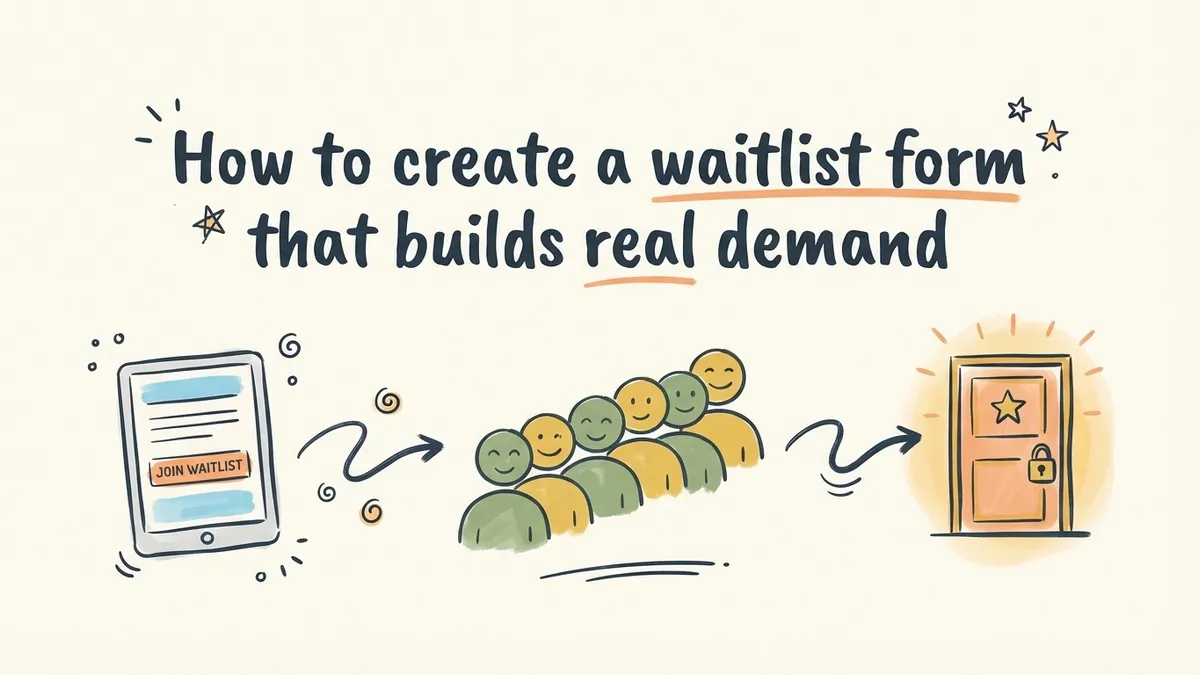
Robinhood added nearly one million people to its waitlist before launching. Not because the app was revolutionary on day one, but because the waitlist itself created a feeling of scarcity that made people want in. A simple form with a referral mechanic turned a stock trading app into a cultural moment.
You probably aren’t building the next Robinhood. But the psychology behind a waitlist form works at any scale. A pre-launch waitlist does three things at once: it validates demand before you ship, it gives you an email list of genuinely interested people, and it creates a sense of exclusivity that makes your launch feel like an event rather than a Tuesday afternoon announcement.
Here’s how to create a waitlist form that actually does those things, step by step.
Why waitlists work (and when they don’t)
A waitlist signup form works because it flips the dynamic between you and your audience. Instead of chasing people with ads and cold emails, they come to you and ask to be let in. That’s a fundamentally different relationship.
Superhuman used this to perfection. Their waitlist ran for years, and getting off it felt like receiving an invitation to an exclusive club. The product was good, but the waitlist made it feel special before anyone had typed a single email in it.
Waitlists work best when:
- You’re launching a new product and want to gauge interest before investing in infrastructure
- You’re rolling out access gradually to manage server load or onboarding capacity
- You want to build an email list of high-intent users you can market to at launch
- You’re creating a referral loop where early signups recruit others
They don’t work when there’s no real constraint. If you slap a waitlist on something that’s already publicly available, people will notice and feel manipulated. The scarcity has to be real, or at least plausible. A product launch waitlist for a beta with limited spots? That’s believable. A waitlist for a blog? That’s silly.
Plan your waitlist form fields
The best email waitlist forms are short. Aggressively short. Every field you add gives someone a reason to close the tab.
For most pre-launch waitlists, you need exactly one field: email address. That’s it. You can collect everything else later through onboarding surveys or follow-up emails once someone is already invested.
If you have a specific reason to ask for more, here’s what might earn its place:
- First name lets you personalize launch emails. Worth it if you plan to send more than one email, but not essential.
- Use case or role (e.g., “What will you use this for?”) helps you segment your list and prioritize access. Superhuman asked what email client people currently used. This gave them both segmentation data and a signal of intent.
- Company name or size matters for B2B products where you want to prioritize enterprise leads.
- Referral source (“How did you hear about us?”) is useful for tracking which channels drive signups, but you can also infer this from UTM parameters without adding a field.
That’s the full menu. If you’re asking for anything beyond these four, you’re probably over-collecting. A waitlist isn’t a registration form where you need detailed information upfront. It’s a handshake. Keep it light.
Build the form
Once you know your fields, building the actual waitlist form takes about five minutes in any decent form builder.
Pick your tool
You want something with a drag-and-drop editor, design customization, and embed options. The form needs to look good on your waitlist landing page, not like a gray rectangle from 2009.
Fomr works well for this because there are no limits on responses (important when a waitlist goes viral) and you get full control over fonts, colors, and backgrounds on the free plan. But use whatever tool you’re comfortable with. The principles are the same regardless.
Set up the fields
Start with your email field. Set it as required. If you’re adding a name field, make it optional so people who want to move fast can skip it.
For a use-case question, a dropdown or short text field both work. Dropdowns are faster to fill out but limit responses to your predefined options. Short text gives you richer data but takes more effort to analyze later. For waitlists under 1,000 signups, short text is fine. Above that, dropdowns save you hours of sorting.
Write the copy around the form
The fields are only half the form. The words around them do the heavy lifting.
Your waitlist landing page needs three things above the fold:
- A headline that explains what the product is and why it matters. “The fastest way to [solve specific problem]” beats “Coming Soon” every time.
- A one-sentence description of what early access includes. “Be the first to try it, free” or “Get 3 months free when we launch” gives people a concrete reason to sign up.
- The form itself, visible without scrolling.
Below the fold, you can add social proof (number of people already on the list, logos of beta testers, testimonials from early users), a brief feature overview, or an FAQ. But the conversion happens above the fold. Everything below is reinforcement.
Nail the submit button
“Submit” is the worst possible button text for a waitlist. It tells people nothing about what happens next.
Better options:
- “Join the waitlist”
- “Get early access”
- “Reserve my spot”
- “Count me in”
The button text should match the energy of your brand. A developer tool can get away with “Request access.” A consumer app might go with something warmer. Just don’t use “Submit.”
Design the form to match your brand
A waitlist form is often someone’s first interaction with your product. If the form looks generic, they’ll assume the product is generic too.
This is where most free form builders fall short. They give you a white box with blue buttons and call it a day. Your waitlist form should feel like a natural extension of your landing page, not something bolted on from a different website.
Things that matter:
- Font consistency. Use the same typeface as your landing page. If your site uses Inter, your form should use Inter. Mismatched fonts are jarring.
- Color matching. Your form’s accent color, button color, and background should pull from your brand palette.
- Spacing and layout. A form crammed into a tiny container looks cheap. Give it room to breathe. A single-column layout with generous padding converts better than a dense multi-column grid.
If you’re using Fomr, you get access to 1,700+ fonts and full color customization on the free plan, so matching your brand is straightforward. You can also set a background image or color that blends with your landing page.
One thing I’d skip: heavy animations or transitions on the form itself. They look flashy in a demo but slow down the experience on mobile. Your waitlist form should load instantly and feel snappy.
Set up a confirmation experience
What happens after someone joins your waitlist matters almost as much as the form itself. This is your first real interaction with a potential customer, and most companies blow it with a generic “Thanks for signing up” message.
The thank-you page
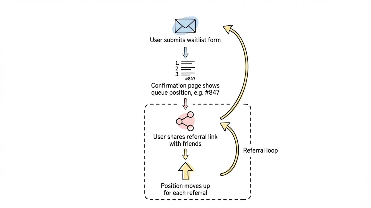
Your form’s confirmation page should do two things: confirm the signup worked and give the person something to do next.
Good confirmation pages include:
- Their position on the waitlist (even an approximate number creates engagement)
- A referral mechanic (“Move up the list by sharing with friends”)
- Links to your social accounts or a community
- A rough timeline for when they can expect access
Robinhood’s referral waitlist is the gold standard here. After signing up, you saw your position in line and could jump ahead by referring friends. This single mechanic drove massive organic growth because every person on the waitlist became a recruiter.
The confirmation email
Send an immediate email confirming they’re on the list. This isn’t optional. People expect it, and it’s your chance to set expectations. Include when they’ll hear from you next, what early access looks like, and a reminder of what the product does.
Keep the email short. Three to four sentences plus a CTA to follow you on social media or join a community. Nobody wants a novel in their inbox from a product they haven’t used yet.
Embed and share your waitlist form
A waitlist form sitting on a standalone page is fine, but you’ll get more signups by putting it everywhere your audience already hangs out.
Embed on your website
Drop the form directly into your landing page so visitors don’t have to click through to a separate page. Inline embeds convert better than links because they remove a step from the process. Most form builders give you an embed code you can paste into your site’s HTML.
You can also use a popup embed that triggers after a few seconds on the page, or when someone scrolls to a certain point. Popups are polarizing, but for a waitlist they work well because the ask is small (just an email) and the timing is natural.
For more on embedding, check out our guide on how to embed a form on any website.
Share the link directly
Post the form link on Twitter, LinkedIn, Product Hunt, Reddit, Hacker News, or wherever your audience gathers. A direct link to a clean waitlist form converts surprisingly well in social posts because the friction is so low.
QR codes for physical events
If you’re announcing your product at a conference, meetup, or demo day, a QR code that opens your waitlist form is more effective than telling people to “visit our website.” They scan, they type their email, they’re done. Thirty seconds.
Optimize for more signups
Once your waitlist is live, don’t just let it sit there. A few tweaks can meaningfully increase your form response rate.
Add social proof dynamically
“Join 2,847 others on the waitlist” is more compelling than “Join the waitlist.” Update this number regularly. It creates momentum and signals that other people think this is worth their time.
A/B test your headline
The headline above your form has more impact on conversion than the form itself. Test two or three variations. One focused on the problem you solve, one focused on the benefit of early access, one focused on scarcity (“Only 500 beta spots available”). See which resonates.
Reduce to one field
If you launched with three fields and signups are slow, cut to one. You can always survey people later. The lead generation forms that convert best tend to ask for the absolute minimum upfront.
Track where signups come from
Add UTM parameters to every link you share so you know which channels drive the most waitlist signups. This tells you where to double down. If 60% of your signups come from Twitter and 5% come from LinkedIn, that’s a clear signal about where your audience lives.
Common mistakes to avoid
A few patterns I see repeatedly in product launch waitlists that hurt more than they help:
Asking for too much information. A waitlist is not a signup form. You don’t need someone’s phone number, company size, and annual revenue to put them on a list. Every extra field is a leak in your funnel.
No follow-up after signup. If someone joins your waitlist and doesn’t hear from you for three months, they’ve forgotten you exist. Send periodic updates, even if it’s just “We’re still building, here’s what’s new.” Silence kills anticipation.
Fake scarcity. If your waitlist has been “almost full” for six months, people catch on. Be honest about timelines and capacity. Real scarcity converts. Fake scarcity erodes trust.
Ignoring mobile. Over half of your waitlist signups will come from phones, especially if you’re sharing the link on social media. Test your form on an actual phone. If the email field is tiny or the button is hard to tap, fix it before you share the link.
No clear value proposition. “Sign up for our waitlist” isn’t a reason to give someone your email. “Get 3 months free when we launch” is. “Be one of the first 100 users” is. Give people a reason beyond curiosity.
Launch your waitlist today
You don’t need a finished product to start building demand. You need a clear value proposition, a short form, and a plan to keep people engaged after they sign up.
The whole thing takes less than ten minutes to set up. If you want to try it right now, Fomr’s guest editor lets you build and customize a waitlist form without creating an account. Pick your fields, match your brand colors, grab the embed code or share link, and start collecting emails.
The best time to launch a waitlist is before you think you’re ready. The signups you collect today become the launch audience that makes your product’s first day feel like a real event.