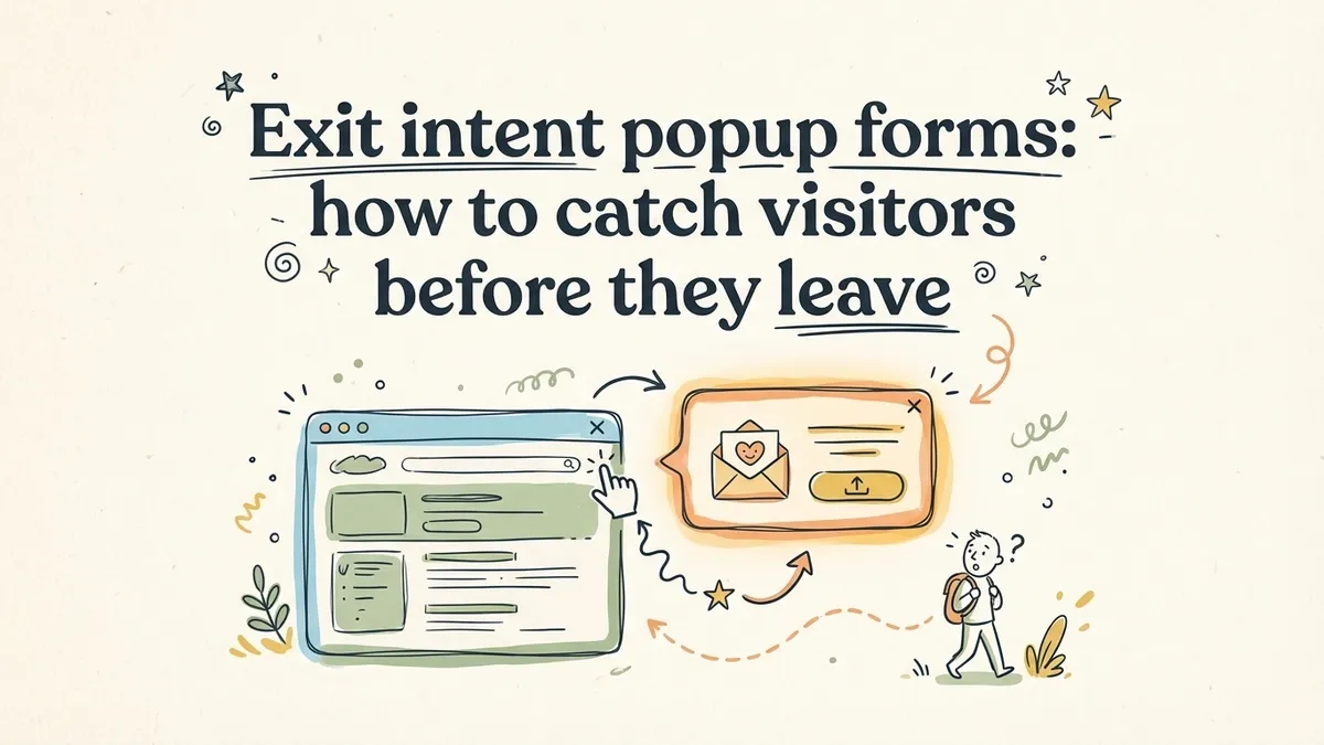
Your visitor read half the page, hovered over a pricing section, maybe even scrolled to the bottom. Then their cursor drifted toward the browser tab. Two seconds later, they were gone. No email. No signup. No way to follow up.
Exit intent popup forms exist to intercept that exact moment. They detect when someone is about to leave and display a form — one last chance to offer something valuable before the tab closes. Research from Beeketing found that well-timed exit popups recover 10-15% of abandoning visitors. On a site with 50,000 monthly visitors and a 70% bounce rate, that’s potentially 3,500-5,000 extra leads per month.
But most exit intent popups get closed instantly. They’re generic, poorly timed, or ask for too much. The gap between an exit popup form that converts and one that irritates comes down to understanding how the technology works and designing around its limitations.
How exit intent detection actually works
Exit intent isn’t magic. On desktop, it’s cursor tracking. A small JavaScript listener monitors the position and velocity of the mouse pointer. When the cursor moves upward past the top edge of the viewport — toward the address bar, the back button, or the tab close button — the script fires an event. That event triggers your popup.
Most implementations track two things: the Y-coordinate of the cursor (is it near the top of the page?) and the speed of movement (is it accelerating upward, suggesting the visitor is heading for the browser chrome rather than just moving to a navigation menu?). Some scripts add a sensitivity threshold so the popup doesn’t fire every time someone reaches for a bookmark.
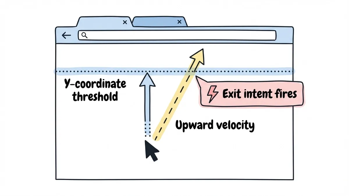
The detection is surprisingly reliable on desktop — it catches the “I’m done here” gesture about 80-85% of the time. The main false positives come from visitors switching tabs or reaching for the address bar, neither of which is a big deal.
Where it falls apart is mobile. There’s no cursor on a phone. That’s a big enough problem that it deserves its own section below.
When exit intent popups make sense (and when they don’t)
Exit intent works best in situations where the visitor has already shown some interest but hasn’t converted. The popup is a safety net, not a first impression.
Good use cases:
- E-commerce product pages where someone browsed but didn’t add to cart. A 10% discount code can tip the decision.
- Pricing pages where a visitor compared plans but didn’t start a trial. A comparison PDF or demo signup gives them a reason to leave their email.
- Long-form content where someone read most of the article. A content upgrade (checklist, template, expanded version) is a natural next step.
- SaaS landing pages where someone scrolled through features but didn’t click the CTA.
Bad use cases:
- Homepage popups for first-time visitors who arrived three seconds ago. They haven’t seen enough to care about your offer.
- Pages where the visitor is clearly trying to complete a task (checkout, account settings, form submission). Interrupting a transaction is a fast way to lose it.
- Any page where you’re already showing another popup, a chat widget, and a cookie banner. Stacking interruptions drives people away faster than any single popup can bring them back.
The general rule: if the visitor has consumed meaningful content on your site and is leaving without converting, an exit popup is worth testing. If they haven’t engaged yet, you’re just adding noise.
Designing an exit intent popup form that converts
The design principles for exit popups overlap with popup forms in general, but a few things matter more when you’re catching someone mid-exit.
You have about 2 seconds
Someone heading for the close button has already decided to leave. Your popup needs to change their mind in the time it takes to glance at a headline. That means one clear message, not a wall of text. The headline does 80% of the work.
Compare these two approaches:
- “Wait! Before you go…” (vague, begging)
- “Grab the 12-point form audit checklist (free PDF)” (specific, valuable)
The second one gives the visitor a reason to pause. The first one just acknowledges they’re leaving, which they already know.
Keep the form to 1-2 fields
This isn’t the place for a detailed lead qualification form. You’re asking someone who was about to leave to do something they weren’t planning to do. The lower the effort, the higher the conversion rate.
Email-only forms convert best for exit popups. If you absolutely need a name, make it optional. Anything beyond two fields and your conversion rate will drop sharply. You can always collect more information in a follow-up email or on a thank-you page. Our guide on lead generation forms that convert covers field optimization in detail, and we wrote separately about how to reduce form abandonment if drop-off rates are a problem.
Match the offer to the page content
A generic “subscribe to our newsletter” popup on every page is lazy, and visitors can tell. The best exit popups are contextual. Someone leaving a blog post about email marketing should see an email marketing resource. Someone leaving a pricing page should see a comparison guide or a discount.
More work than a site-wide popup, but the results justify it. OptinMonster reports that page-level targeting can double popup conversion rates compared to generic popups.
Make closing the popup effortless
A visible X button in the top-right corner. A “No thanks” text link below the CTA. Clicking the overlay to dismiss. Give people multiple ways to close the popup without hunting for the exit.
This sounds counterproductive, but it helps conversions. When visitors feel trapped, they leave the site entirely. When they feel in control, some stick around. Google also penalizes intrusive interstitials that are hard to dismiss, so this is an SEO concern too.
Skip the guilt-trip dismiss copy
You’ve seen these: “No thanks, I don’t want to grow my business” or “I prefer to stay uninformed.” This was clever in 2016. Now it reads as manipulative and slightly desperate. A simple “No thanks” or “Maybe later” respects the visitor’s decision without trying to shame them into converting.
The mobile problem (and what to do about it)
Here’s the uncomfortable truth about exit intent popups: they don’t work on mobile. Not really. There’s no cursor to track, so the core detection mechanism is useless.
Some tools claim “mobile exit intent” by tracking alternative signals. The most common ones:
Back button press. A script intercepts the browser’s back navigation and shows a popup before the page unloads. This is the closest equivalent to desktop exit intent, but it’s unreliable. Many browsers restrict this behavior, and it feels jarring when the visitor tapped back and got a popup instead.
Rapid upward scroll. If someone scrolls quickly to the top, it might mean they’re leaving. But people scroll up for lots of reasons — to re-read something, find the nav menu, check the page title. Too many false positives.
Tab or app switching. Detectable via the Page Visibility API, but a terrible popup trigger. The visitor might be checking a text message and coming right back.
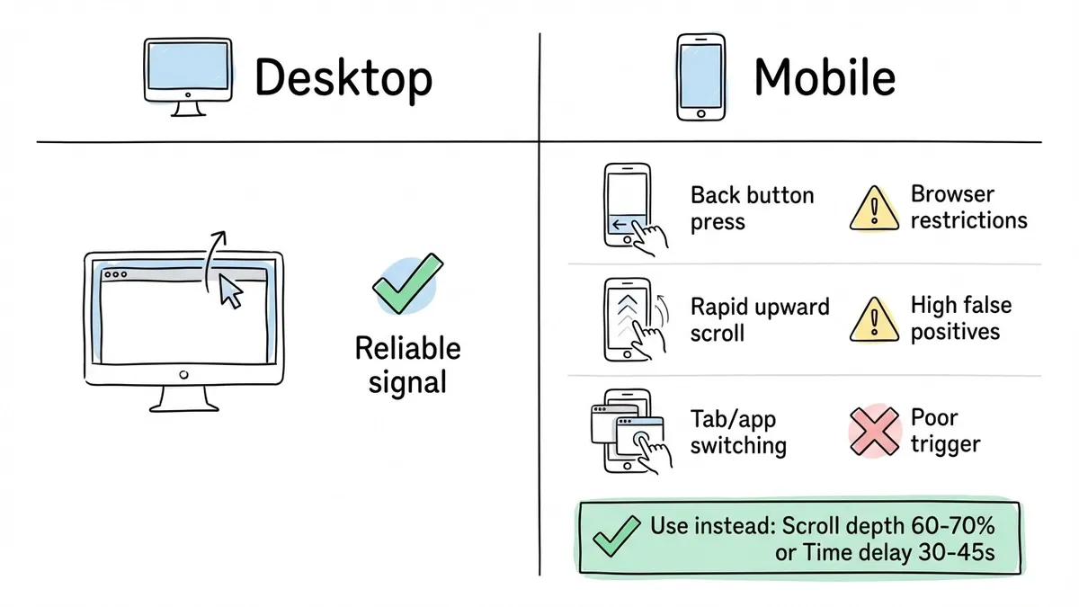
My honest recommendation: don’t try to replicate exit intent on mobile. Use scroll-depth triggers or time-delay triggers instead — they work reliably across all devices.
A scroll-depth trigger at 60-70% is a solid mobile alternative. The visitor has consumed most of your content by that point. A time-delay of 30-45 seconds works too, though it’s a weaker engagement signal.
For mobile specifically, keep your popup under 60-70% of the viewport (a full-screen takeover on a 375px screen feels aggressive) and make all touch targets at least 44x44 pixels per Apple’s Human Interface Guidelines.
One more thing: Google’s mobile interstitial penalty. Since 2017, Google has penalized mobile pages that show intrusive popups immediately after a user arrives from search. The safest approach is to wait until mobile visitors from organic search have scrolled at least 30% of the page.
A/B testing your exit intent popup timing
The default settings on most popup tools are mediocre starting points, not optimal configurations. Testing is where the real gains happen.
What to test first
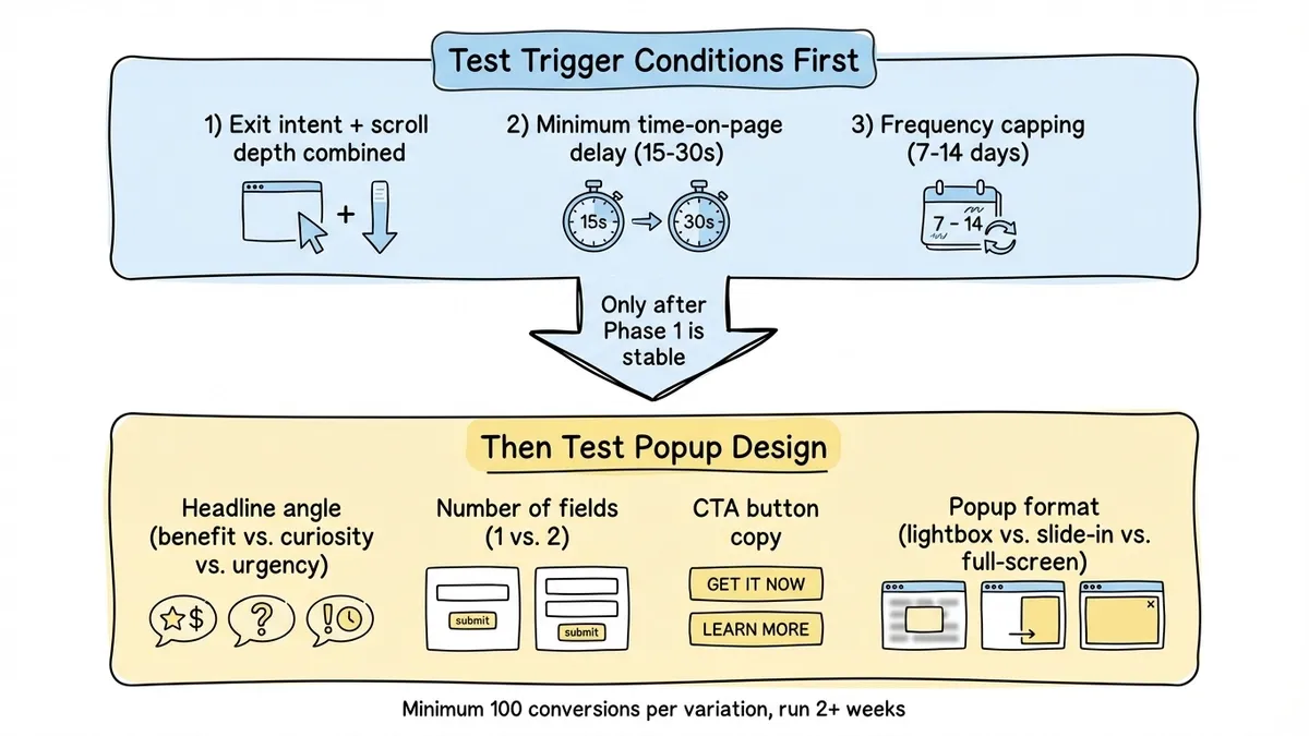
Start with the trigger conditions, not the design. The trigger determines who sees the popup, and showing it to the wrong people at the wrong time will tank your results regardless of how good the form looks.
Test these variables in order of impact:
-
Exit intent only vs. exit intent + scroll depth. Try requiring both exit intent AND at least 40% scroll depth before the popup fires. This filters out visitors who bounced immediately and only shows the popup to people who actually engaged with your content.
-
Delay after page load. Add a minimum time-on-page requirement (15-30 seconds) before exit intent can trigger. Visitors who land and immediately leave were never going to convert.
-
Frequency capping. Once per session vs. once per week vs. once per month. For most sites, once every 7-14 days after a dismissal is the right balance.
What to test next
Once your trigger conditions are solid, test the popup itself:
- Headline variations. Benefit-focused (“Get the free template”) vs. curiosity-driven (“The #1 mistake in form design”) vs. urgency-based (“Last chance: 20% off ends tonight”). The winner varies by audience.
- Number of fields. Email-only vs. name + email. The extra field usually drops conversion by 20-30%, but leads may be higher quality.
- CTA button copy. “Get it free” vs. “Download now” vs. “Send me the guide.” Specific copy that describes what happens next tends to win.
- Popup format. Lightbox vs. slide-in vs. full-screen. Full-screen can convert better for exit intent since the visitor was leaving anyway.
How long to run tests
You need statistical significance, not a gut feeling. Aim for at least 100 conversions per variation before drawing conclusions. Don’t call a test after three days because one version is “winning” — run for at least two full weeks to account for day-of-week variation in traffic.
Setting up an exit intent popup form
The implementation has two parts: the form itself and the trigger logic.
For the form, you want something lightweight that loads fast and looks like it belongs on your site. Fomr handles this well — you build the form in the visual editor with your brand’s fonts and colors, then embed it as a popup using a JavaScript widget. No iframes, no heavy dependencies. The popup mode uses data-fomr-type="popup" on a trigger element, and the form opens as a centered overlay.
For the exit intent trigger, dedicated popup tools like OptinMonster or Sumo include detection built in. If you’re using a form builder like Fomr for the form itself, you’d pair it with a small script that detects the exit gesture and programmatically triggers the popup. A basic exit intent listener is about 20 lines of JavaScript.
Here’s the general pattern:
- Build your form with 1-2 fields and a strong headline
- Set up the popup embed on your site
- Add exit intent detection that triggers the popup
- Set a cookie on dismissal so the popup doesn’t show again for 7-14 days
- Track impressions, conversions, and dismissals from day one
If you want a broader overview of popup types and when to use each one, our popup forms guide covers lightbox, slide-in, full-screen, and notification bar formats in detail.
Mistakes that kill exit intent popup performance
A few patterns come up repeatedly in underperforming exit popups.
Firing on every page. If someone browses five pages, they shouldn’t see five exit popups. One per session is the maximum. Only trigger on high-value pages (pricing, product, key blog posts) and skip utility pages.
Weak offers. “Subscribe to our newsletter” is not a compelling reason to stop leaving. The offer needs to be specific and immediately valuable. If you can’t articulate why someone should care, the popup shouldn’t exist.
Slow-loading popups. If the popup takes 500ms to render after the exit gesture, the visitor is already gone. Preload the form and its assets so the popup appears instantly when triggered.
No suppression for converted visitors. Someone who already gave you their email last week should never see the same popup again. Use cookies or local storage to suppress it permanently after conversion.
Ignoring the data. You need to know your popup’s impression count, conversion rate, and dismissal rate from day one. A popup with a 98% dismissal rate is doing more harm than good. We go deeper on measurement in our form conversion optimization guide.
Start with one page, one offer
Don’t try to build an exit intent strategy for your entire site at once. Pick your highest-traffic page with a clear conversion goal. One popup, one strong offer. Set up tracking. Run it for two weeks and look at the numbers.
If you need a form builder that handles popup embeds without per-response fees eating into your results, Fomr’s free plan gives you unlimited forms and responses. Build the form, grab the embed code, pair it with an exit intent script, and you can have a working exit popup live in under 30 minutes.
The visitors leaving your site right now aren’t coming back on their own. Recovering even 10% of them changes the math on every page you run it on.